Lexend Tera Font
Free for Commercial UseAbout
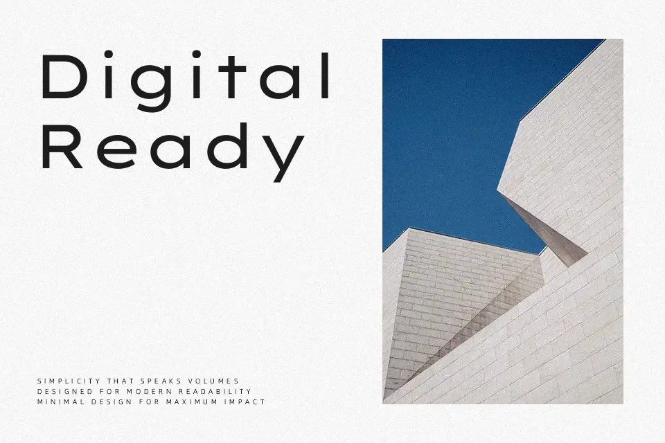
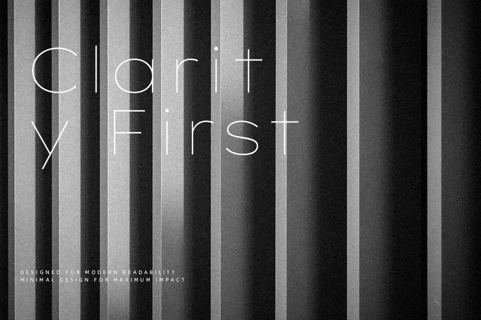
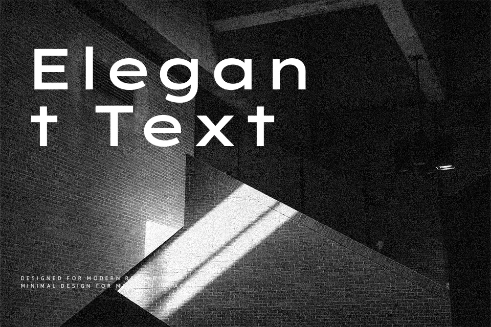
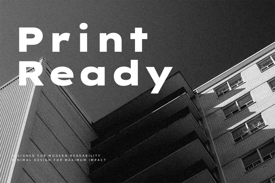
Lexend Tera sits at the heavy, expanded end of the Lexend family, with broad letterforms, low contrast strokes, and noticeably open spacing that keeps dense headings from feeling cramped. Its structure is geometric yet friendly, so large titles read clearly on screens and projectors where many fonts start to blur. I find it works especially well for data-heavy interfaces, learning platforms, and presentation slides where you want strong emphasis without shouting. Because of its width and weight, it can feel overpowering in long body text or narrow mobile layouts, so I’d reserve it for headlines, callouts, and UI labels rather than full articles.
Best For:
bold interface headlines
education and e‑learning screens
presentation and dashboard titles
accessible web headings
Not Ideal For:
long-form paragraphs
narrow mobile layouts
formal print documents
dense multi-language text blocks
Perfect for advertising, editorial, and headline, with a bold and expanded style.
License
Gallery