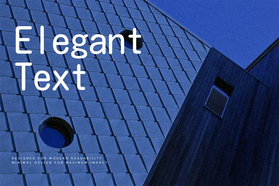
Kosugi Maru Font
Free for Commercial UseAbout
Kosugi Maru combines a Gothic-style structure with rounded terminals and even stroke weight, so text feels calm and approachable rather than stiff. Its metrics are monospaced, which keeps vertical columns and grids tidy, especially in UI components, captions, and small labels where alignment matters. The shapes lean slightly functional rather than cute, so it works when you want warmth without slipping into overtly playful territory. I would reach for it in Japanese–Latin interfaces, app settings screens, kids’ product interfaces, or signage mockups where clarity and softness have to coexist. It can feel repetitive in dense, book-length reading or highly expressive editorial design, where a more nuanced text family might serve better.
Best For:
UI labels and menus
bilingual Japanese–Latin interfaces
kids product interfaces
app onboarding screens
Not Ideal For:
long-form book typography
highly formal corporate documents
expressive editorial headlines
dense data tables
Perfect for body text, headline, and kids, with a calm and rounded style.
License
Gallery