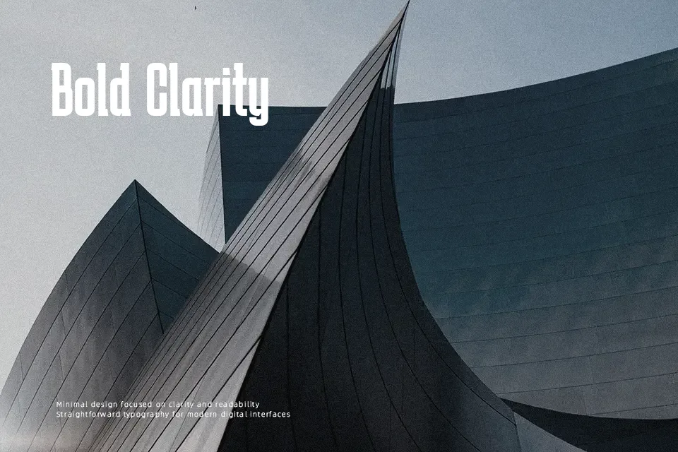
Karantina Font
Free for Commercial UseAbout
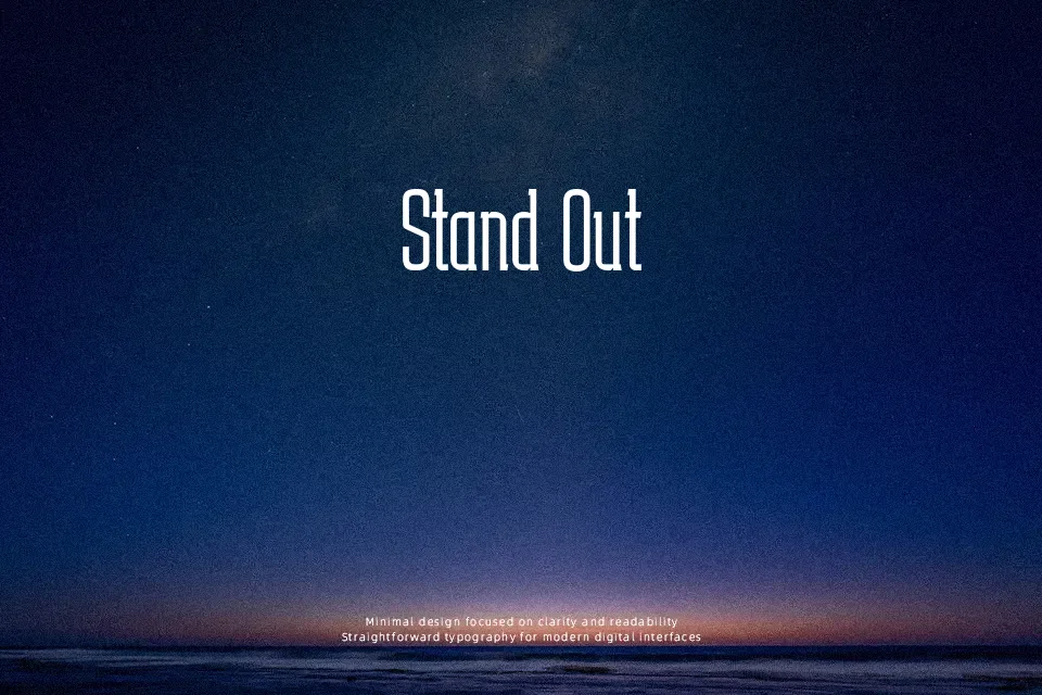
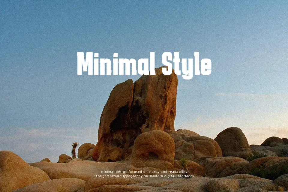
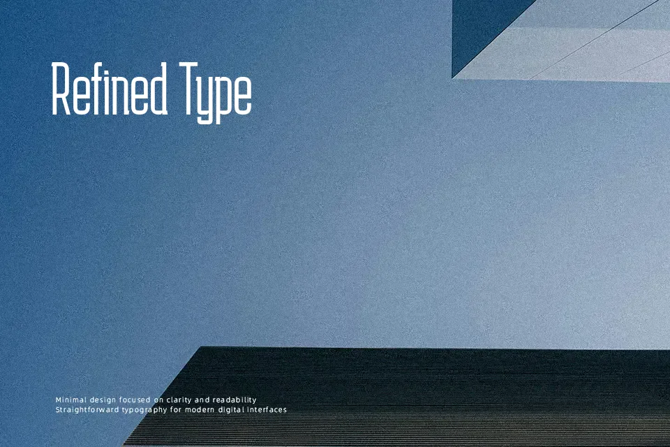
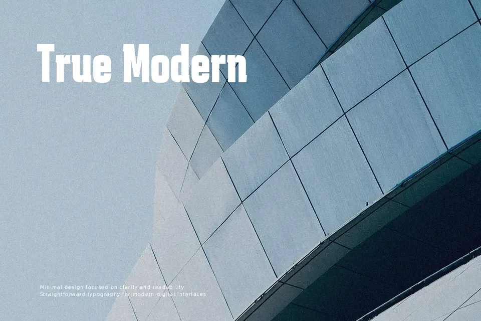
Karantina combines chunky, compact letterforms with rough, slightly irregular contours that echo its origin during long quarantine days. Strokes are heavy, counters are tight, and spacing runs narrow, so text blocks quickly build a dense, graffiti-like texture. Across its Light, Regular, and Bold styles, the skeleton stays simple and geometric, which keeps it readable at headline sizes even when you push tracking or stack lines. I find it works well when you want urban energy—think protest posters, gig flyers, or YouTube thumbnails—rather than anything polished or corporate. Because of its weight and texture, it tends to feel noisy in long paragraphs or interface copy, where a calmer sans serif or serif will read more comfortably.
Best For:
streetwear-style logos
music or event posters
YouTube or social thumbnail titles
short, punchy headlines
Not Ideal For:
long paragraphs or body copy
formal business documents
minimalist luxury branding
dense UI text or app interfaces
Perfect for branding, headline, and logo, with a artistic and display style.
License
Gallery