Kaisei Opti Font
Free for Commercial UseAbout
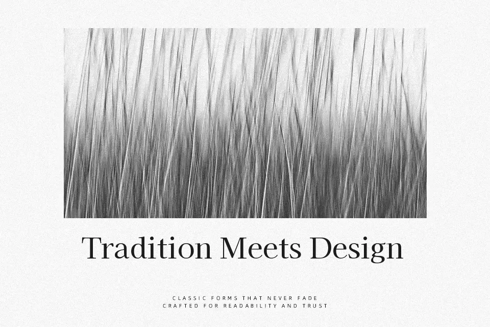
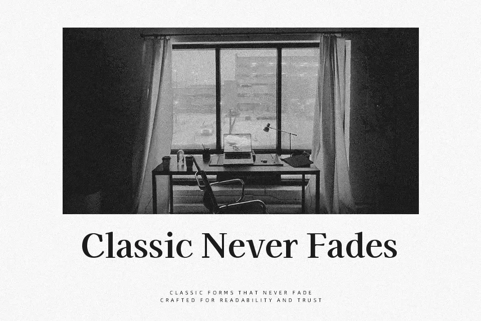
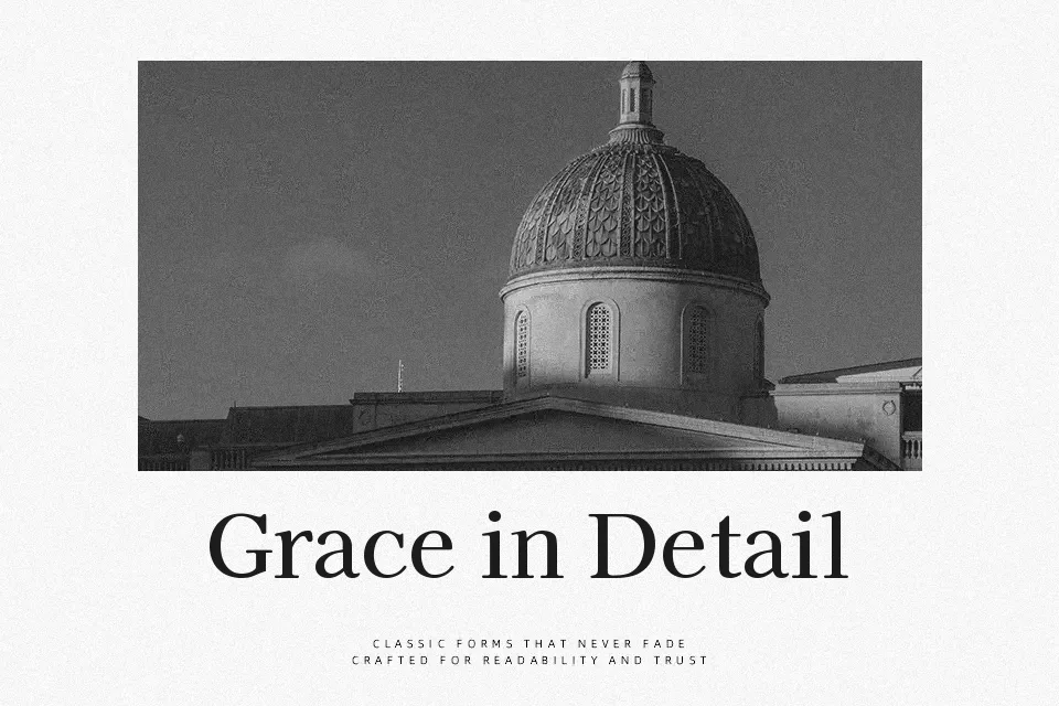
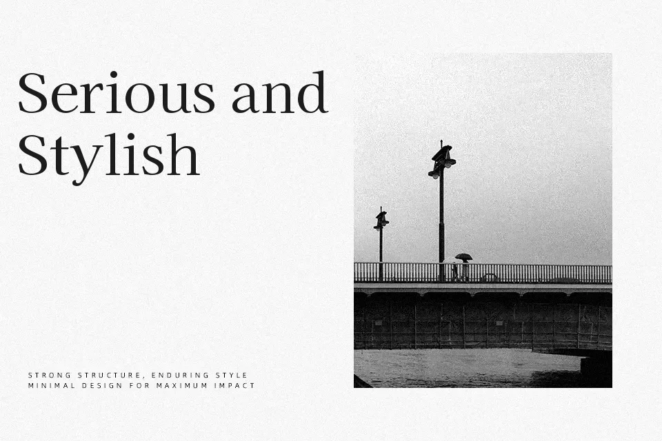
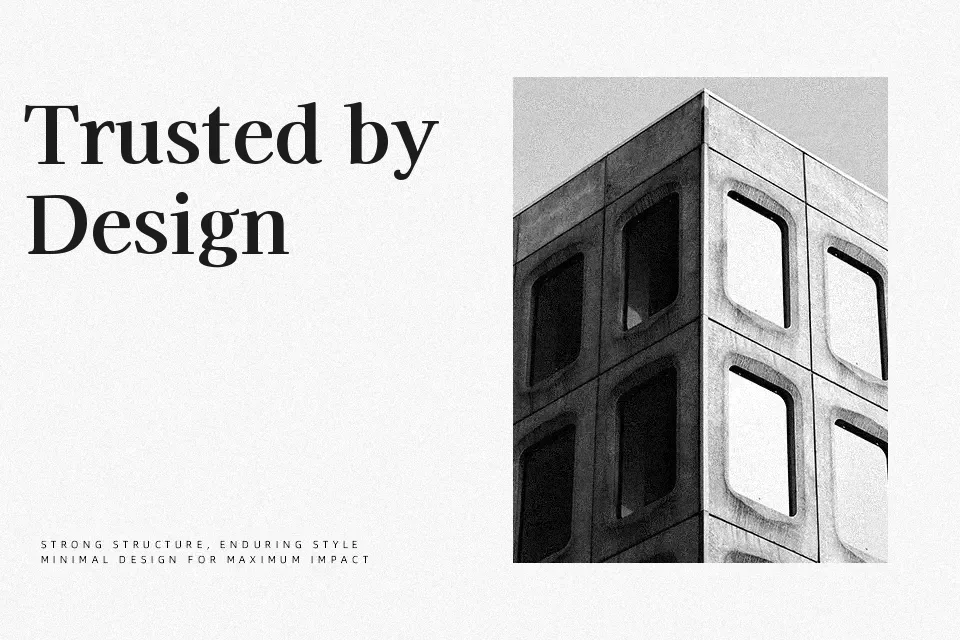
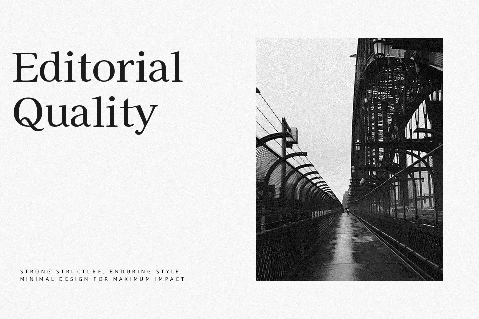
Kaisei Opti delivers a composed serif texture with moderate stroke contrast, sturdy verticals, and slightly rounded details that soften its otherwise formal skeleton. Spacing is generous enough for headings and short passages, while the structure remains tight enough to keep large kanji sets visually organized. The overall impression leans formal and bookish with a subtle modern twist, so it works nicely for cultural event posters, literary covers, museum graphics, or brand systems that need both Japanese and Latin scripts in one family. If you need dense body copy at very small sizes or a highly expressive display look, this typeface can feel a bit reserved and rigid.
Best For:
bilingual Japanese–English headlines
editorial titles and pull quotes
cultural or educational branding
event posters with Japanese text
Not Ideal For:
very small body text
highly playful kids graphics
ultra-expressive logos
Perfect for branding, editorial, and headline, with a classic and serif style.
License
Gallery