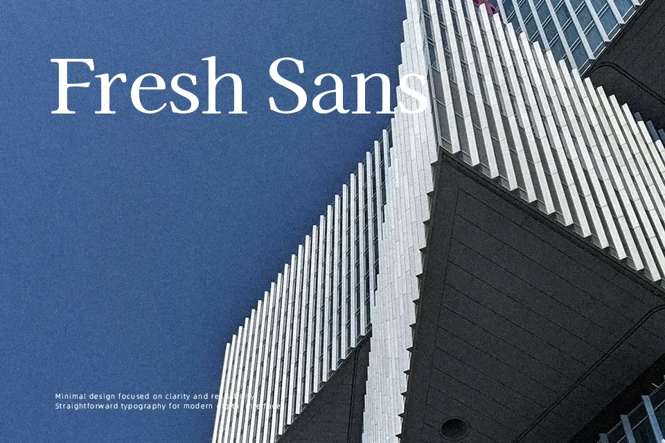
Kaisei HarunoUmi Font
Free for Commercial UseAbout
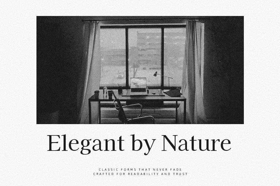
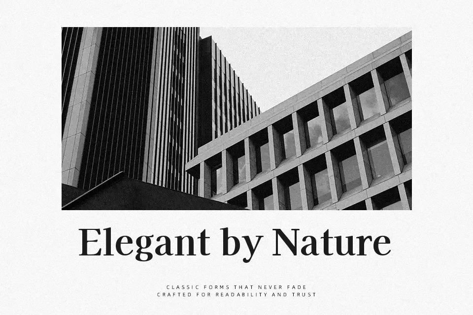
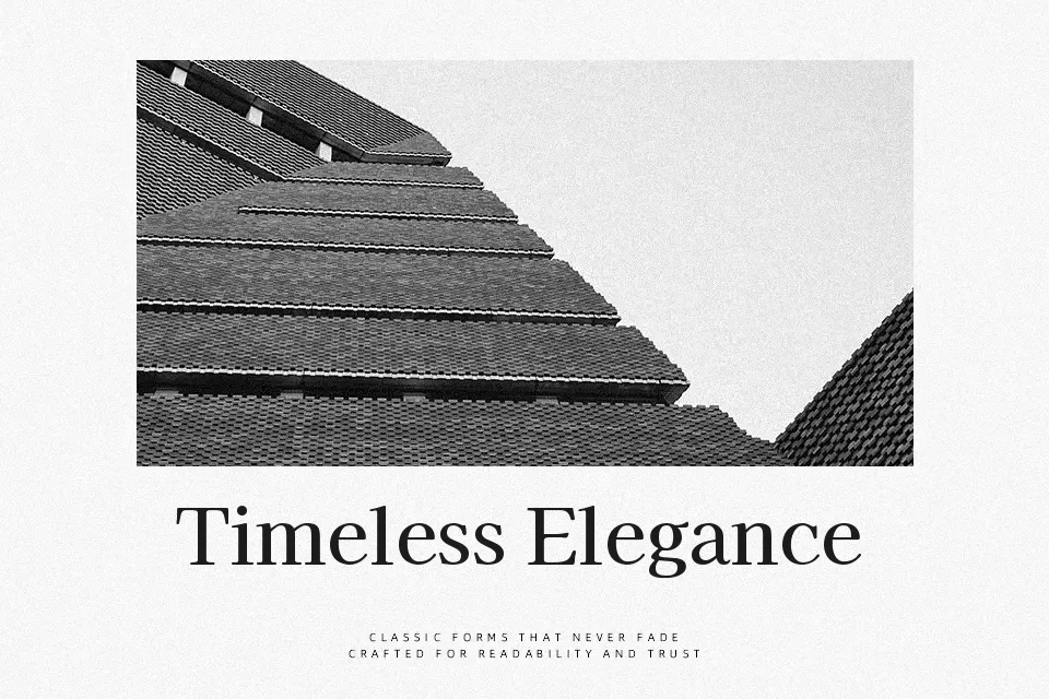
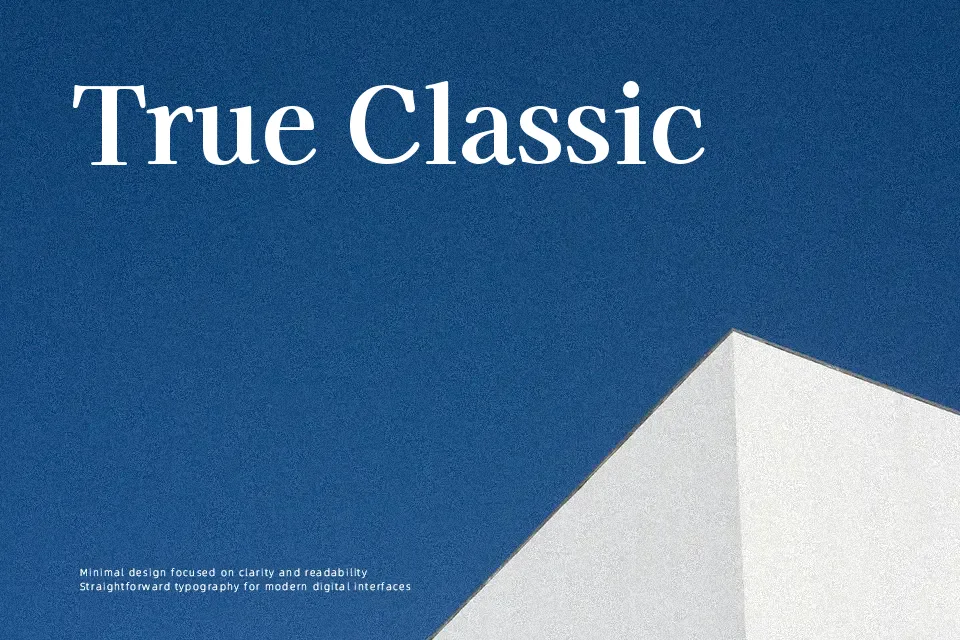
Kaisei HarunoUmi is a Japanese serif typeface with even strokes, moderate contrast, and open counters that keep dense text blocks surprisingly readable. The proportions feel calm and slightly traditional, but the spacing and rhythm are tuned for modern screens as much as print. It really shines in projects that mix Japanese and Latin, since both scripts share a consistent texture and weight progression. I tend to reach for it in long-form articles, product detail pages, or brand guidelines where clarity matters more than flash. Its measured personality is less convincing for loud, highly expressive logos or edgy streetwear graphics; in those cases it can come across as too polite.
Best For:
editorial layouts with Japanese text
brand systems needing bilingual typography
long-form articles and documentation
interface text in content-heavy apps
Not Ideal For:
high-impact display logos
gritty or experimental visuals
very tight micro text on busy backgrounds
Perfect for body text, branding, and editorial, with a calm and serif style.
License
Gallery