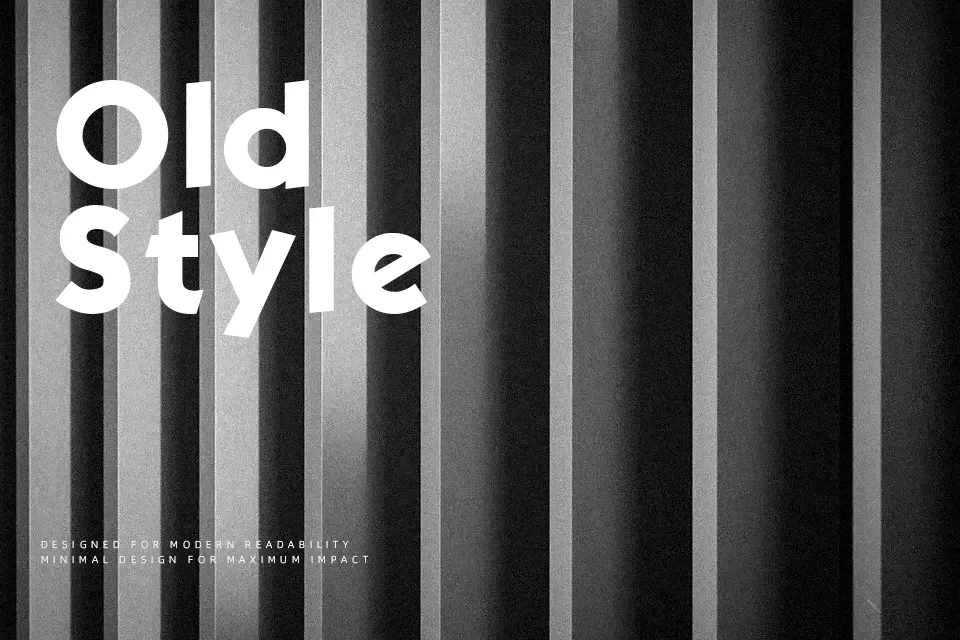
Kabel Font
Free for personal useAbout
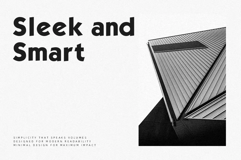
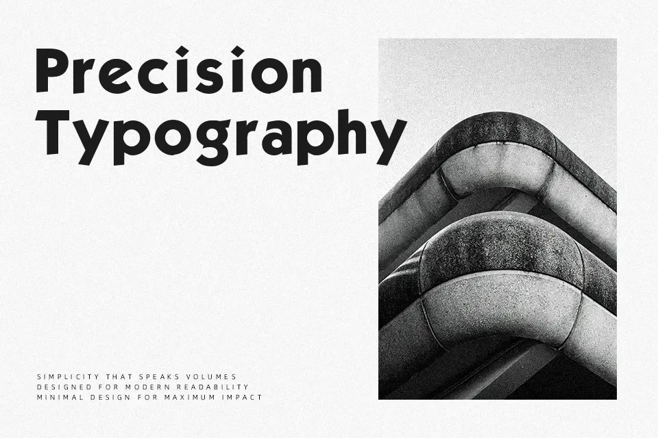
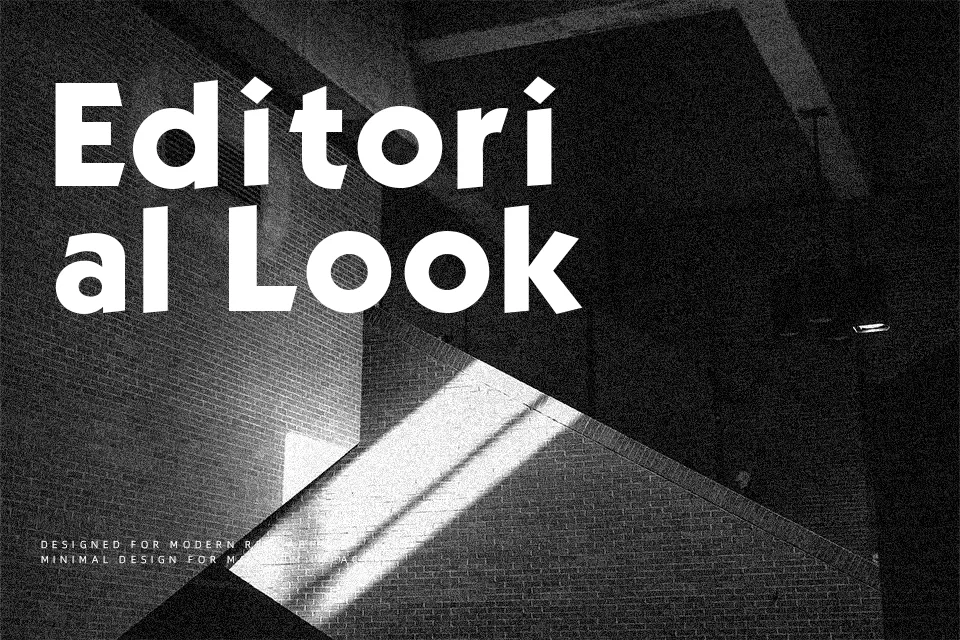
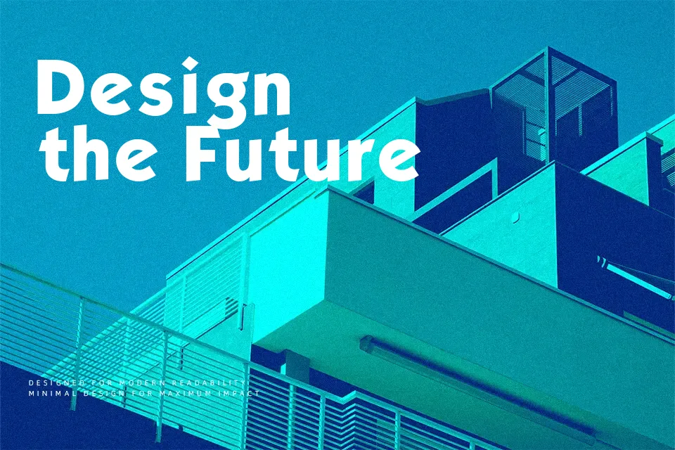
Kabel represents a fascinating intersection of strict geometry and humanist calligraphy. Created by Rudolf Koch, the typeface features stark, compass-drawn circular forms combined with unexpected quirks—like the distinctively angled crossbar on the lowercase ‘e’ and varied stroke terminals. This gives the font a lively, almost art-deco personality that feels significantly warmer and more expressive than rigid alternatives like Futura. Because of its generous apertures and distinctive character, it thrives in large-scale applications such as boutique storefront signage, retro-inspired product packaging, and bold magazine headlines. However, the exact features that make it so charming in display settings—specifically its very low x-height and unusual proportions—severely hinder its performance in long-form reading. Designers should absolutely avoid using Kabel for dense editorial body text or complex mobile interface menus where readability is critical.
Best For:
retro boutique storefront signage
mid-century inspired product packaging
vintage advertising headlines
Not Ideal For:
dense editorial body copy
mobile application menus
formal corporate documents
Perfect for advertising, branding, and headline, with a artistic and display style.
License
Gallery