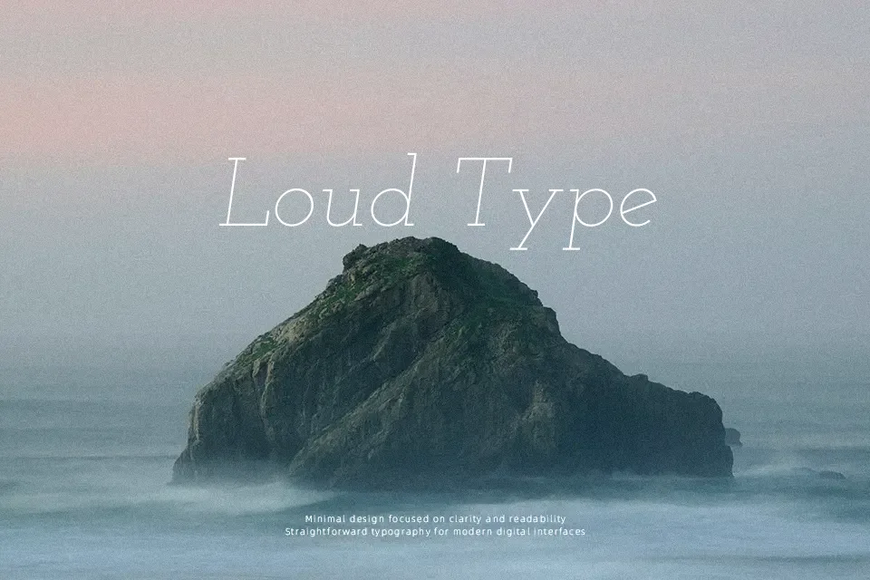
Josefin Slab Font
Free for Commercial UseAbout
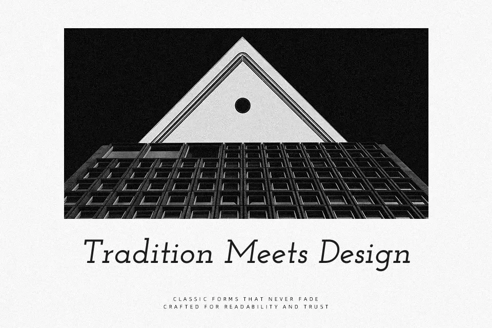
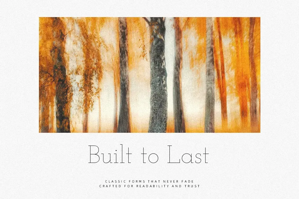
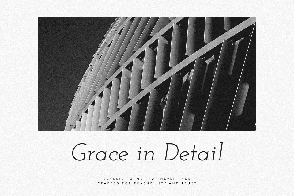
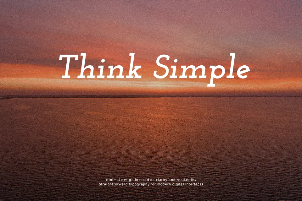
Josefin Slab takes the clean geometry of early twentieth‑century type and turns it into a lean slab serif with a tall x‑height, fine hairlines, and firm, rectangular serifs. Strokes feel relatively light in the thinner styles, with clear vertical stress and generous internal space that keeps letters from feeling cramped. The overall impression is vintage‑meets‑modern: structured enough for editorial work, yet characterful enough for branding that wants a hint of nostalgia. It shines in display sizes—think magazine covers, poster titles, and website hero text—where its details and contrast remain sharp, but the low x‑height and distinctive shapes can become tiring in dense, long‑form reading. If you like the feel of geometric serifs and often bounce between classics like Memphis and more contemporary slabs, Josefin Slab sits comfortably in that space without feeling overly formal.
Best For:
editorial headlines
vintage‑flavored branding
poster titles and hero text
short pull‑quotes or taglines
Not Ideal For:
long paragraphs
highly formal corporate reports
tiny UI labels or captions
Perfect for branding, editorial, and headline, with a classic and serif style.
License
Gallery