Jersey 20 Font
Free for Commercial UseAbout
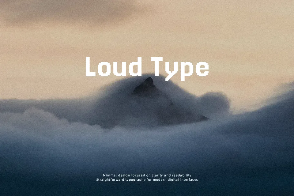
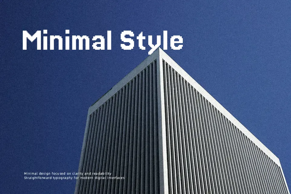
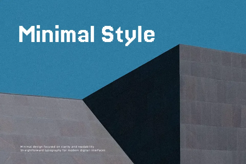
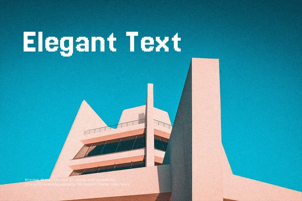
Jersey 20 uses a coarse 20-unit grid, so each letter appears chunky, square, and deliberately low-resolution, echoing early arcade screens rather than smooth vector type. Strokes are fairly even, counters are simplified, and spacing stays tight enough to hold words together without turning into a solid block. The overall impression is casual and decorative, with a strong pixel and jersey-number attitude that suits gaming overlays, retro scoreboards, or sports-themed graphics where you want typography to feel loud and slightly nostalgic. It handles short labels, scores, or titles nicely, but extended paragraphs or formal branding will quickly feel clumsy and tiring to read, so keep it for display moments rather than everyday reading.
Best For:
sports graphics and jersey numbers
retro gaming interfaces and HUD labels
bold scoreboard or timer titles
short, high-impact poster headlines
Not Ideal For:
long paragraphs or body copy
formal reports or corporate documents
delicate luxury branding
small-size UI text with tight space
Perfect for advertising, branding, and headline, with a bold and display style.
License
Gallery