Jersey 10 Font
Free for Commercial UseAbout
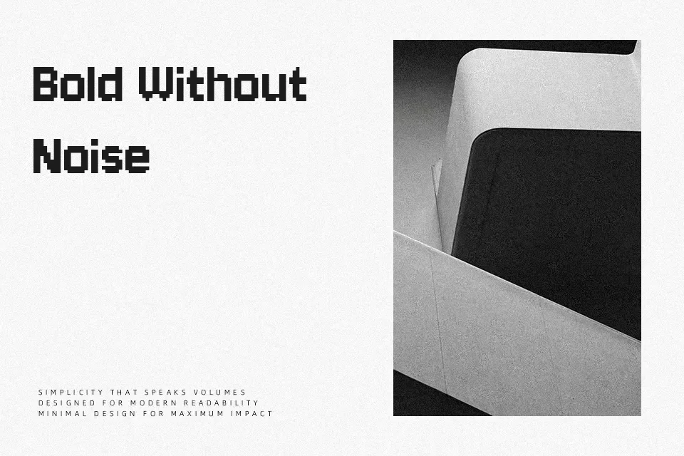
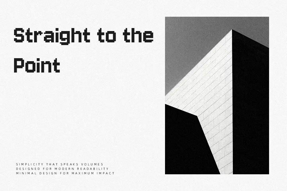
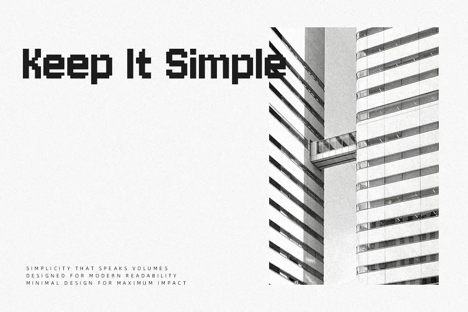
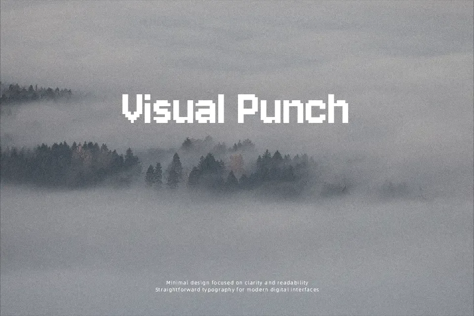
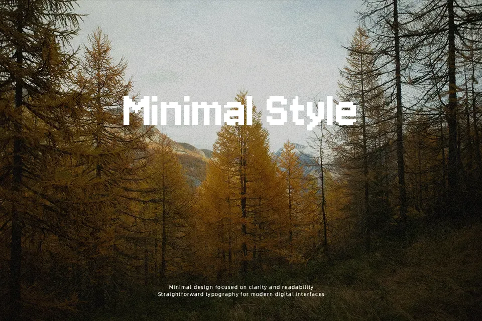
Jersey 10 has blocky strokes with a slightly pixelated, stitched look that mimics jersey lettering while still feeling clean enough for modern layouts. Its structure leans toward a square, monoline build, so numbers and caps read clearly even at a distance, though fine detail is more about texture than subtlety. The overall impression is casual, energetic, and distinctly sporty rather than formal or neutral. I like it for scoreboard graphics, streaming overlays, sports team branding, and any project that wants a retro game console twist without going full bitmap. It tends to feel too loud and characterful for long copy or serious corporate work, so I keep it for short, punchy text.
Best For:
sports headlines
jersey numbers and scores
gaming and streaming graphics
Not Ideal For:
long paragraphs
formal corporate documents
small body text on print
Perfect for branding, headline, and logo, with a bold and display style.
License
Gallery