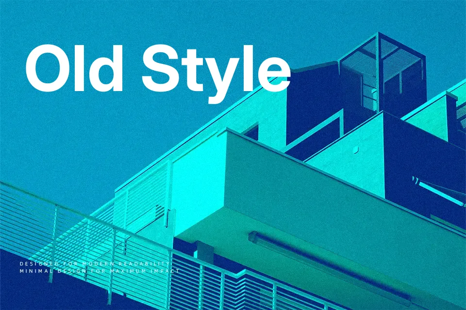
Inter Font
Free for Commercial UseAbout
Inter is a humanist sans serif designed specifically for screens, with relatively tall x-height, open apertures, and carefully tuned spacing that stays readable even at small sizes. Thin to Black weights plus italics give you room to build hierarchy, from quiet captions to punchy UI labels, without changing type families. Visually, it feels neutral and **professional** rather than flashy, so it supports content instead of drawing attention to itself—closer in spirit to Roboto or SF Pro than to geometric display faces. It shines in digital products, dashboards, and content-heavy sites, but if you need expressive branding or characterful editorial headlines, you may find it a bit too restrained and anonymous.
Best For:
UI Design dashboards
App interfaces and product copy
Website body text and menus
Data-heavy screens and design systems
Not Ideal For:
Expressive logo wordmarks
Highly decorative posters
Playful kids or toy branding
Heritage or vintage-themed layouts
Perfect for body text, branding, and headline, with a clean and geometric style.
License
Gallery