Inclusive Sans Font
Free for Commercial UseAbout
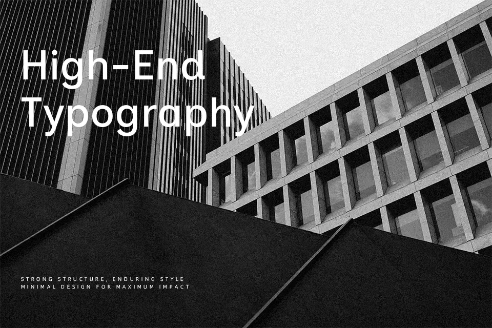
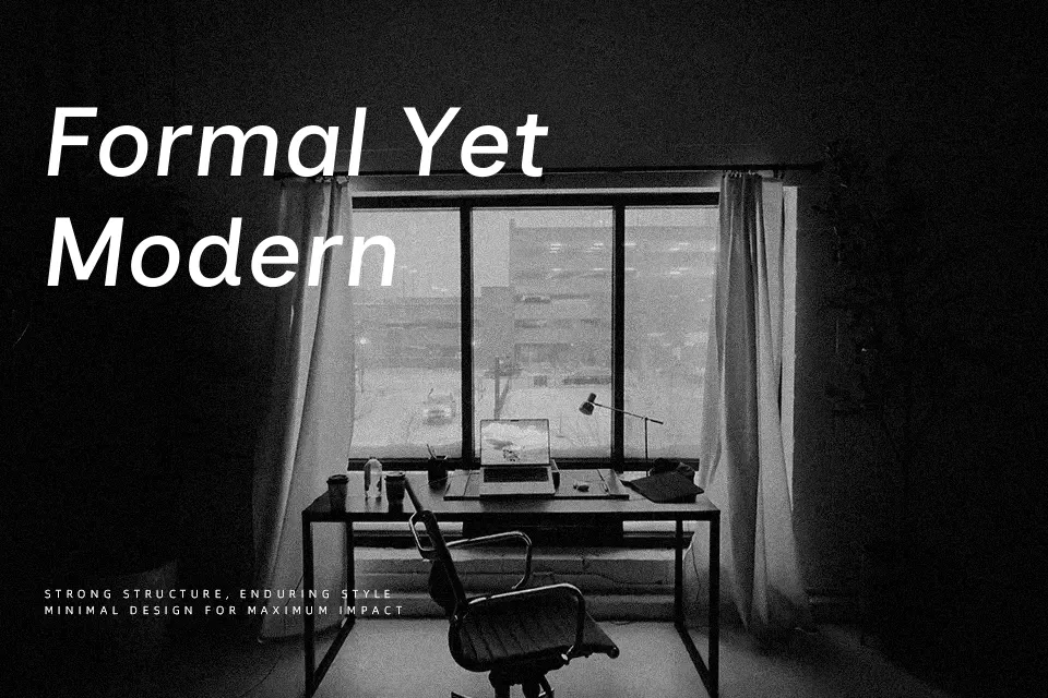
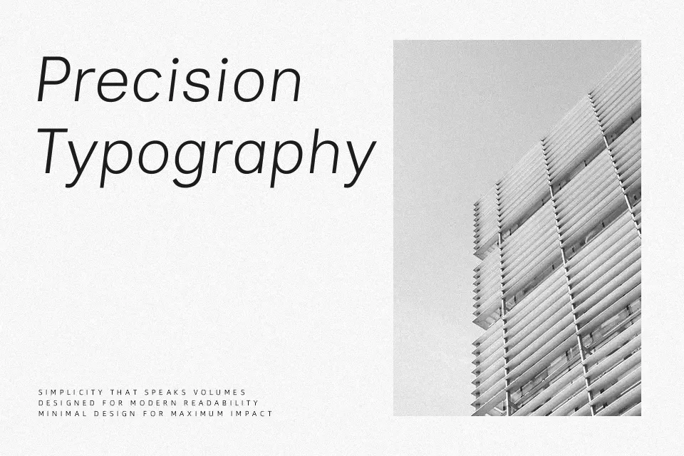
Inclusive Sans is a humanist-leaning neo-grotesque sans serif designed to stay legible when other minimalist fonts start to blur. The strokes are sturdy rather than fragile, with open counters in letters like a, e, c and a generous x-height that keeps small text readable. Wider default letter-spacing and careful differentiation between characters such as I/l/1, O/0 and d/b/p/q make it noticeably easier to scan at a glance, especially in dense interfaces. Visually, it sits in the same family as Helvetica or Arial, but feels warmer and more approachable, which suits brands that care about accessibility without looking overly technical. I would reach for it in UI copy, product dashboards, and documentation; however, if you need highly expressive display typography or classic editorial elegance, this won’t deliver enough personality on its own.
Best For:
accessible UI copy
product dashboards and apps
inclusive branding systems
readable website body text
Not Ideal For:
ornate logo wordmarks
highly decorative posters
luxury editorial layouts
expressive display typography
Perfect for body text, branding, and headline, with a clean and geometric style.
License
Gallery