Gelasio Font
Free for Commercial UseAbout
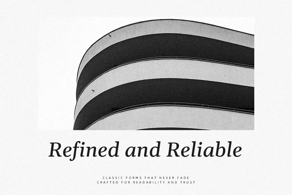
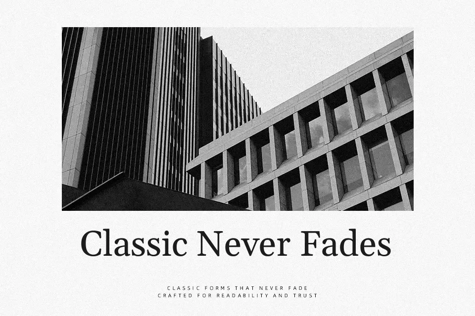
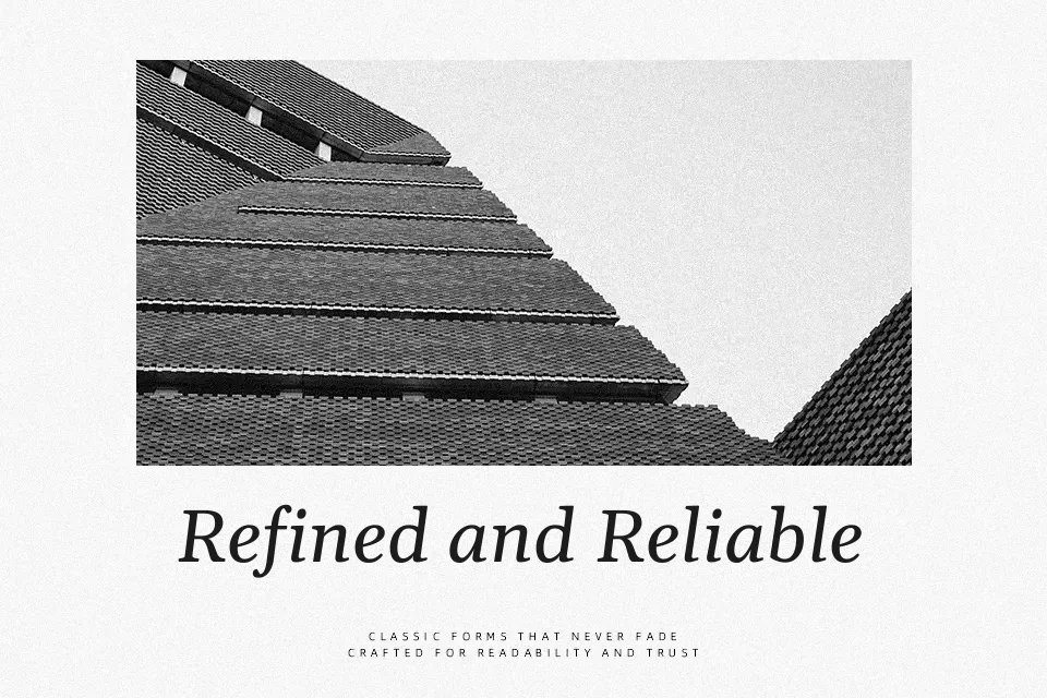
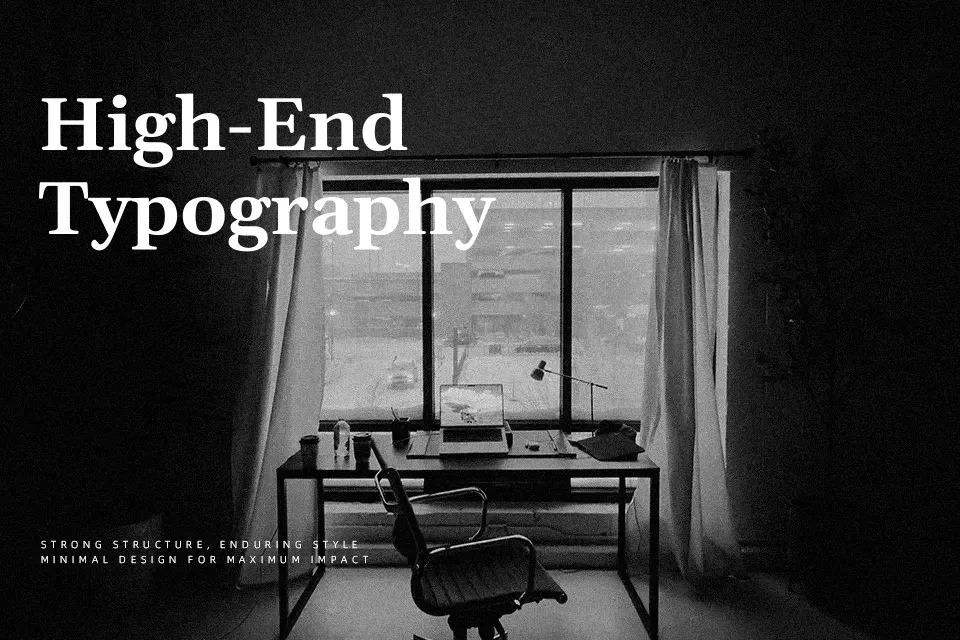
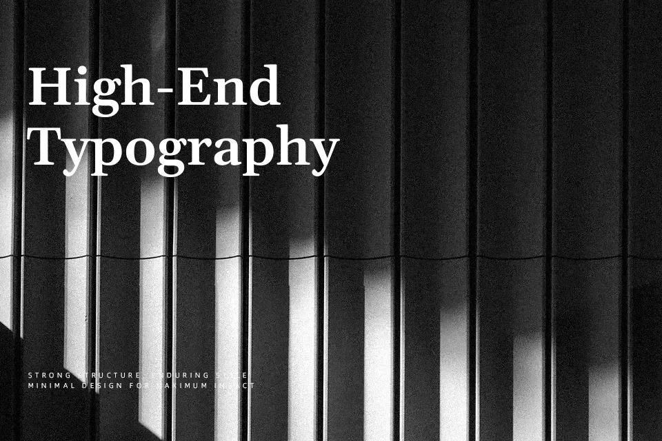
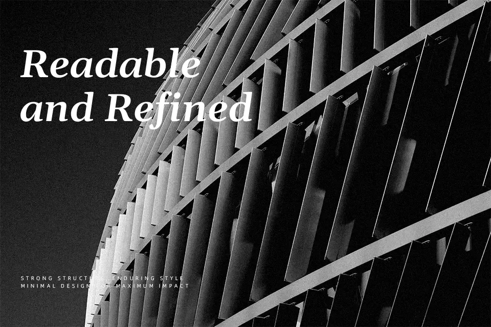
Gelasio carries the proportions and stroke contrast of a classic transitional serif — moderate thick-to-thin transitions, open counters, and even spacing that settles naturally into paragraphs. Unlike decorative serifs that demand attention at display sizes, Gelasio earns its place in running text: magazine-style blog layouts, online documentation, and multi-page editorial spreads where readers stay invested. The Medium and SemiBold additions give designers enough weight range to build typographic hierarchy without switching families. That said, its intentional restraint works against it in contexts that call for personality — brand identity work, packaging headlines, or social campaigns where a typeface needs a distinct voice rather than a reliable one. Think of it as the workhorse alternative to Georgia with a bit more contemporary structure.
Best For:
long-form article body text
editorial website typography
multi-weight text hierarchies
documentation and content publishing
Not Ideal For:
logo and brand identity design
expressive packaging headlines
social media graphic overlays
Perfect for body text, branding, and editorial, with a calm and serif style.
License
Gallery