Freeman Font
Free for Commercial UseAbout
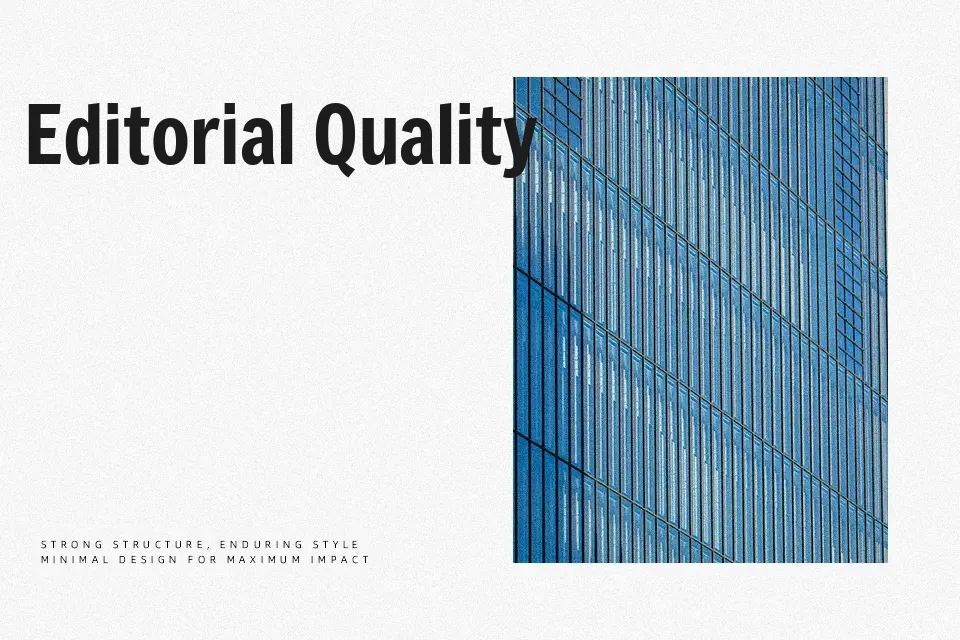
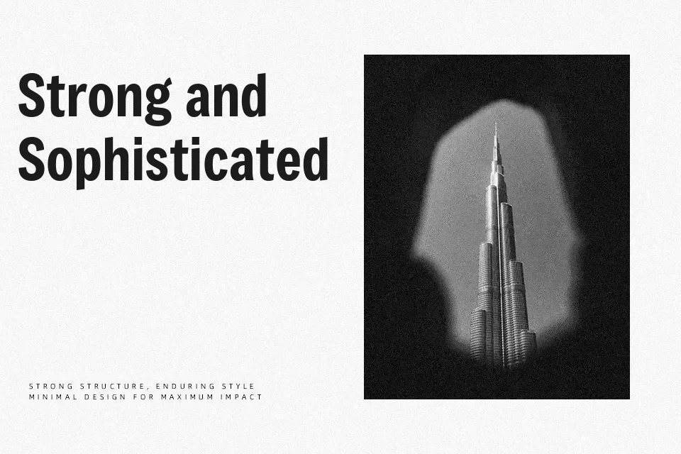
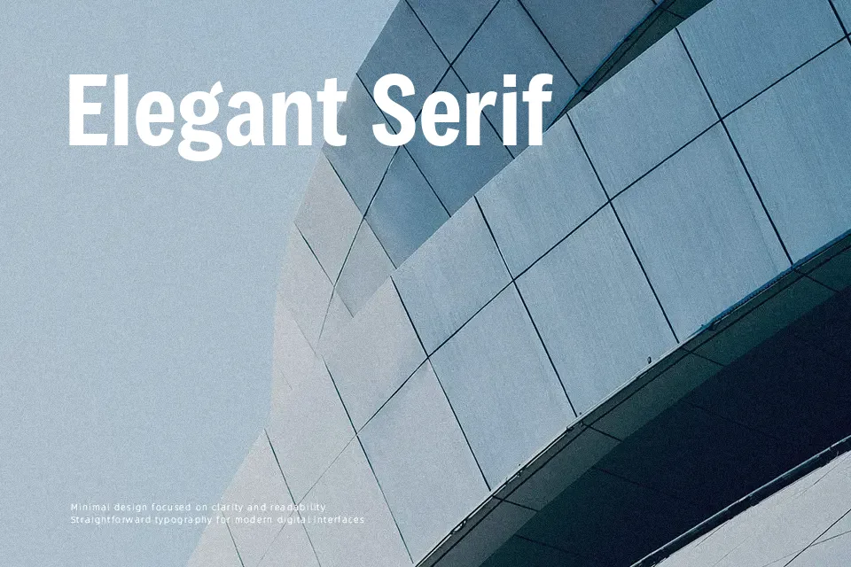
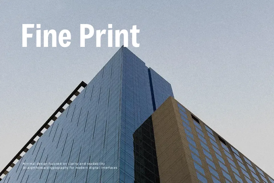
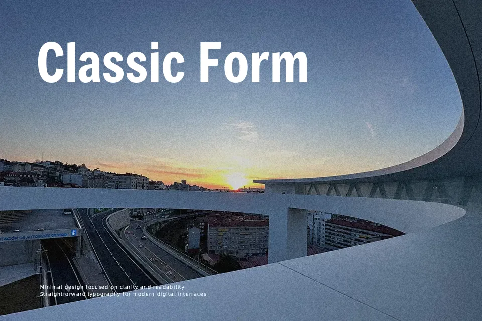
Freeman leans on broad strokes, a tall x-height, and open counters, so letters feel sturdy yet not blocky. Terminals have a gentle slope and slightly organic curves, softening its gothic skeleton and keeping the texture from looking too mechanical. On screen, that mix reads as contemporary and confident, which suits attention-grabbing titles, social visuals, and product-led landing pages that need a bit of personality. It pairs well with a plain sans or serif for body copy, since using Freeman everywhere can quickly feel heavy and shouty. I like it most when it’s allowed to stay large and sparse—once you squeeze it into dense paragraphs, its strong rhythm becomes tiring rather than expressive.
Best For:
bold headlines
characterful branding wordmarks
poster and campaign titles
Not Ideal For:
long paragraphs
formal documents
small UI labels
Perfect for branding, headline, and logo, with a bold and display style.
License
Gallery