Enriqueta Font
Free for Commercial UseAbout
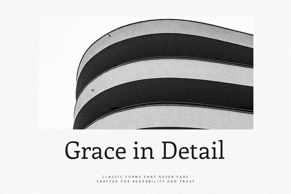
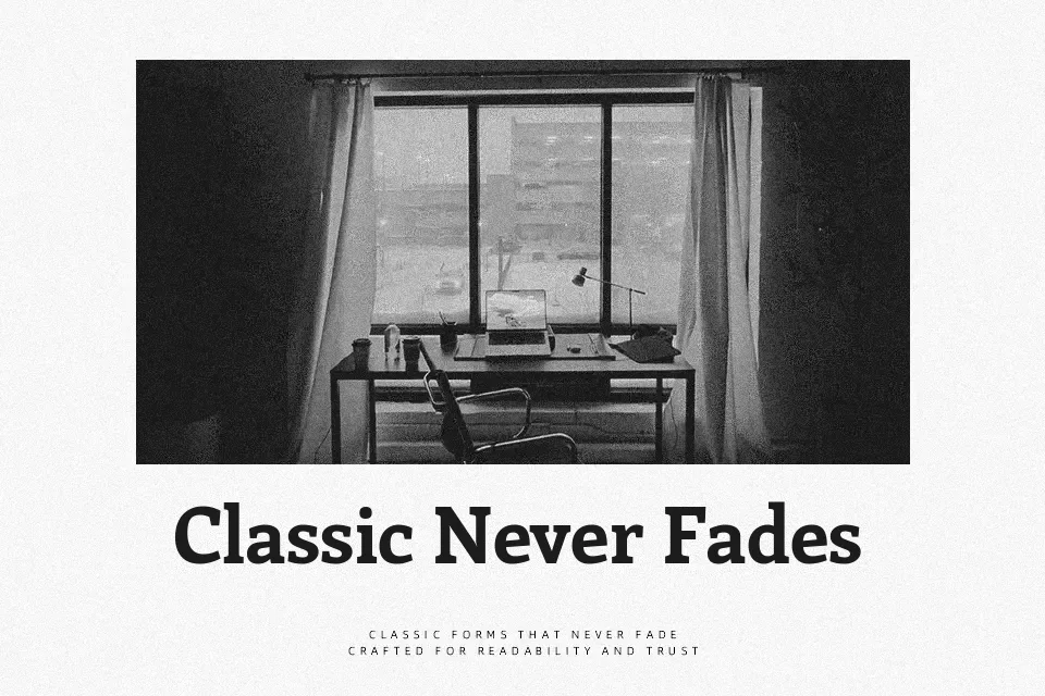
Enriqueta combines chunky, rectangular serifs with a moderate stroke contrast, giving text a solid footprint while still feeling handcrafted. Counters are generous, spacing is steady, and the letterforms lean slightly compact, which helps headlines stay tight without looking cramped. It reads as informal but thoughtful: more relaxed than a classic book serif, yet more disciplined than many decorative slabs. I like it for blog mastheads, editorial pull quotes, and UI labels where you want a human, slightly crafty tone; it’s less convincing for highly formal documents or dense legal copy that demands a more neutral voice. If you’ve used other friendly slabs, this one feels a bit softer and more approachable than many of the “industrial” options.
Best For:
editorial headings and pull quotes
blog branding and article titles
characterful UI labels and buttons
casual poster or flyer typography
Not Ideal For:
formal corporate reports
long, text-heavy books
strictly minimalist luxury branding
highly condensed small-print documents
Perfect for body text, branding, and editorial, with a classic and serif style.
License
Gallery