El Messiri Font
Free for Commercial UseAbout
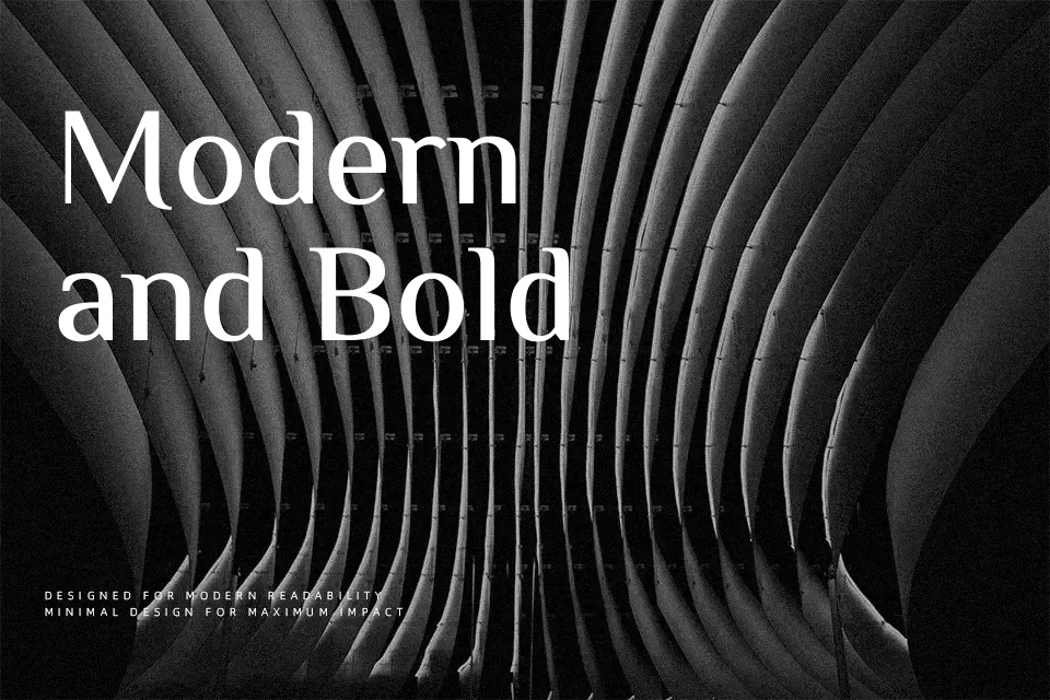
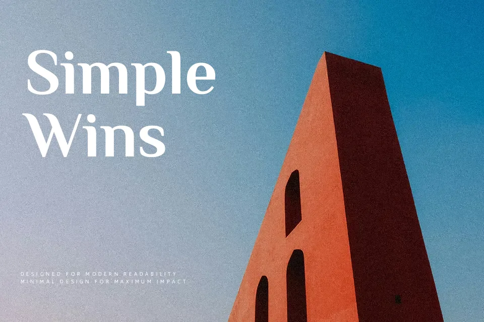
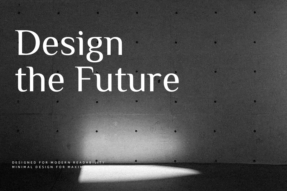
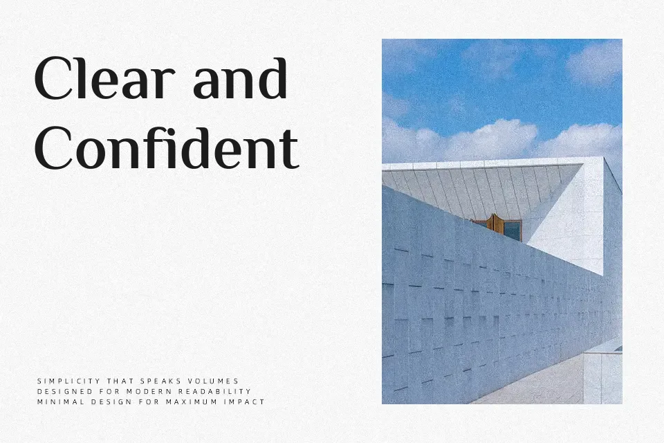
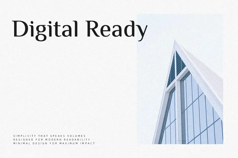
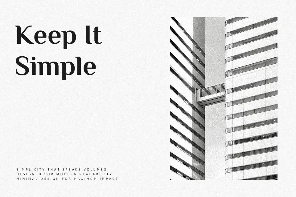
El Messiri combines a brisk, low-contrast stroke with open counters and moderate spacing, so text stays readable even at smaller sizes. The Arabic draws on Naskh influences but softens into rounded, brush-like curves, while the Latin side feels clean and understated rather than flashy. Overall it reads as modern and calm, with just enough personality to stand out in titles, navigation, and product UI where Arabic and Latin need to sit comfortably together. It works especially well for digital products, tech or cultural event posters, and restaurant menus that mix languages on the same line. For long immersive reading or very formal government-style documents, its voice can feel slightly informal, so a more traditional text face may serve better there.
Best For:
bilingual ui elements
app and website headings
arabic latin brand systems
event or menu typography
Not Ideal For:
dense book interiors
highly formal legal documents
tiny footnotes and disclaimers
overly decorative logo wordmarks
Perfect for advertising, branding, and headline, with a calm and sans serif style.
License
Gallery