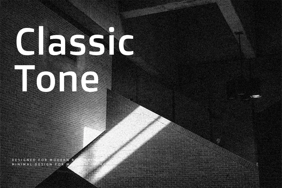
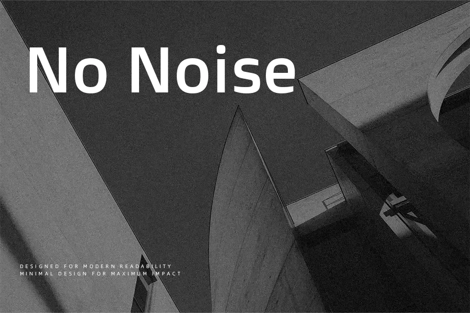
Doppio One Font
Free for Commercial UseAbout
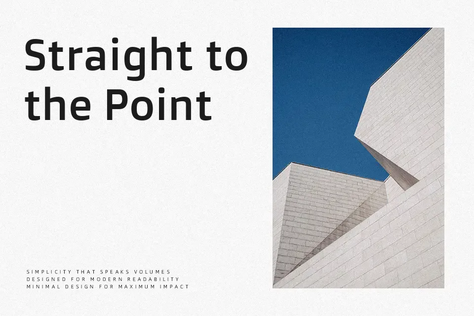
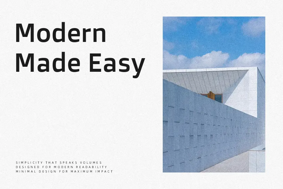
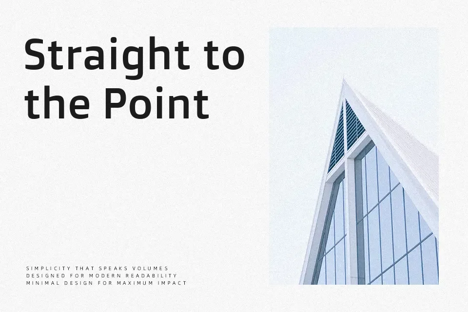
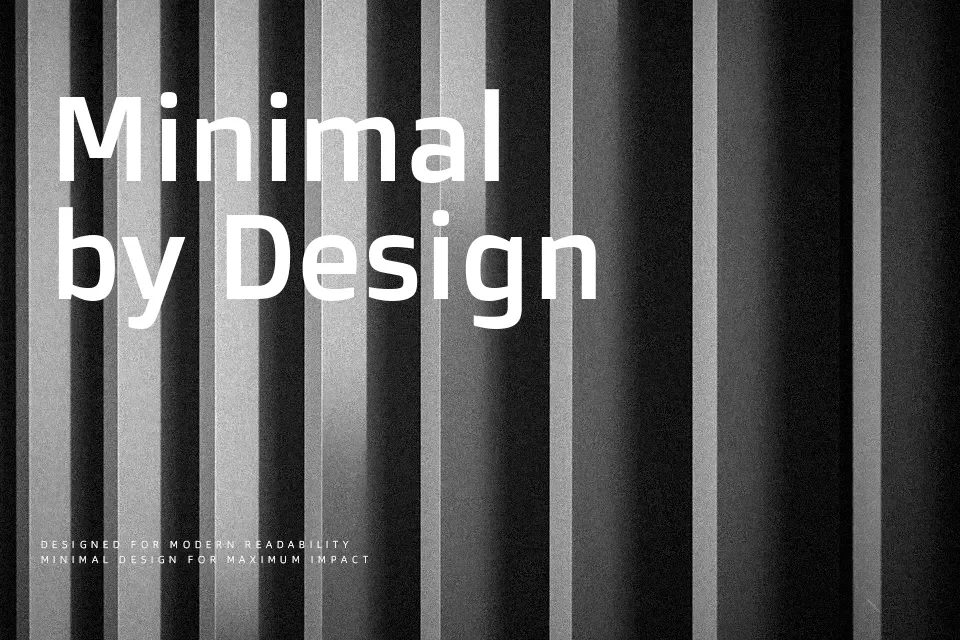
Doppio One has straight-sided curves, modest contrast, and relatively open counters, which give it a solid, almost engineered texture on the page without feeling cold. The spacing is on the tighter side, so lines look compact and organized rather than airy, which helps when screen space is limited. Its character shapes lean toward a humanist sans rather than a purely geometric one, so labels and navigation text stay readable even at small sizes, yet the squared details hold up nicely on bold UI headers or app splash screens. It works well when you want a modern interface or product dashboard to feel structured and confident; for immersive long-form reading or highly traditional print work, the rigid rhythm can feel a bit stiff over many paragraphs.
Best For:
app and web UI labels
dashboard and data tool interfaces
compact headings in digital products
utility-focused branding assets
Not Ideal For:
long editorial paragraphs
formal book typography
highly decorative branding concepts
expressive handwriting-style layouts
Perfect for advertising, branding, and headline, with a bold and geometric style.
License
Gallery