DM Sans Font
Free for Commercial UseAbout
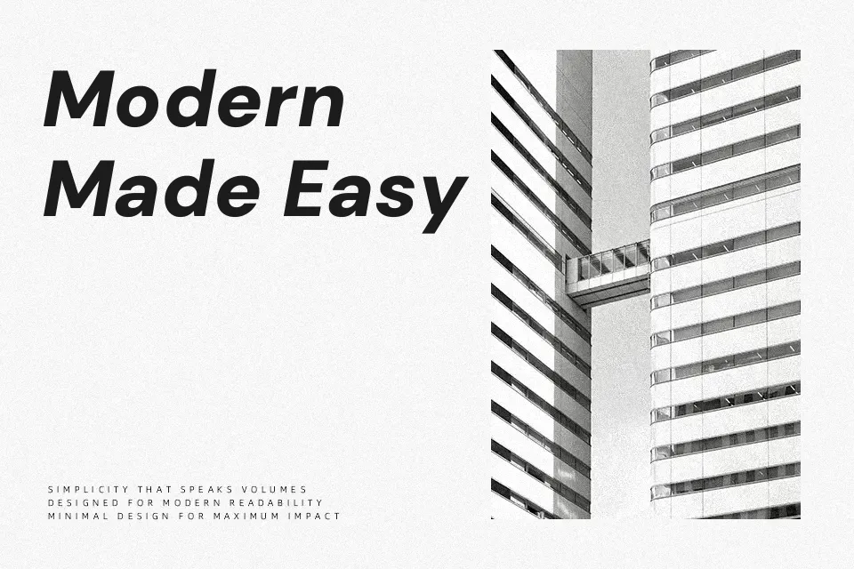
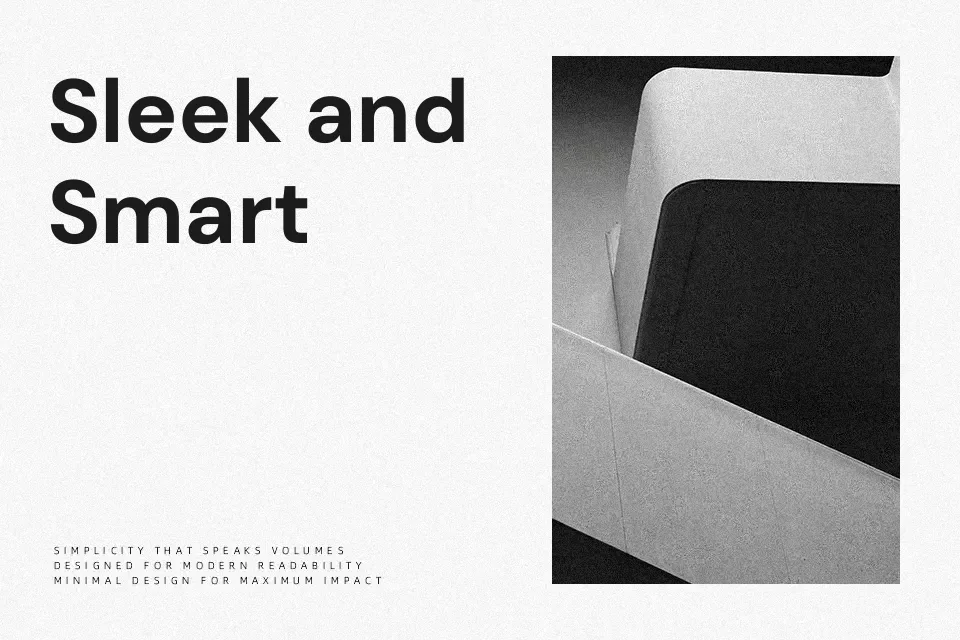
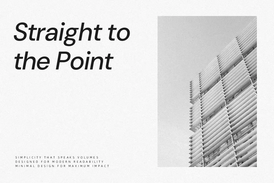
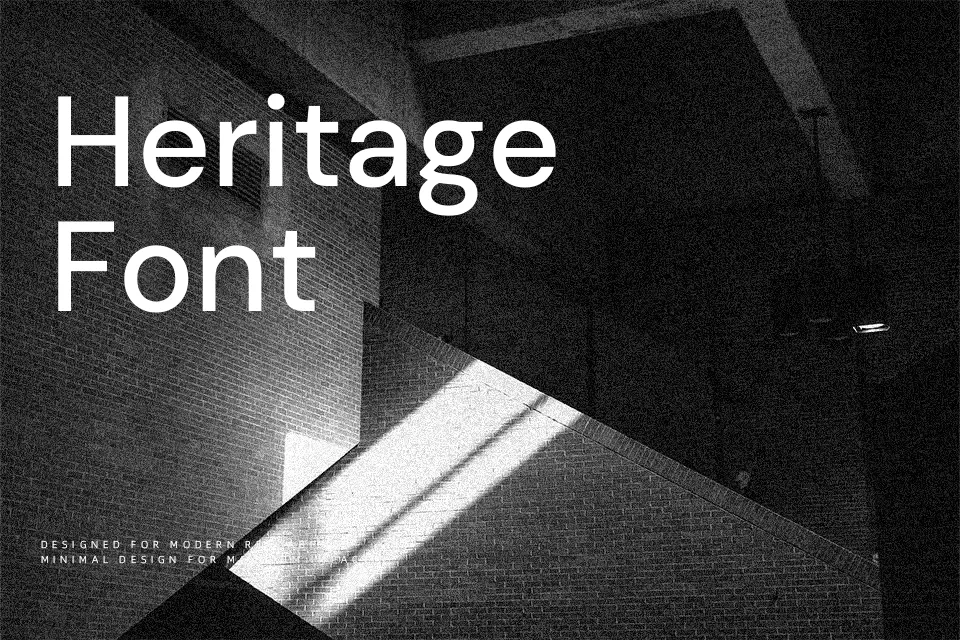
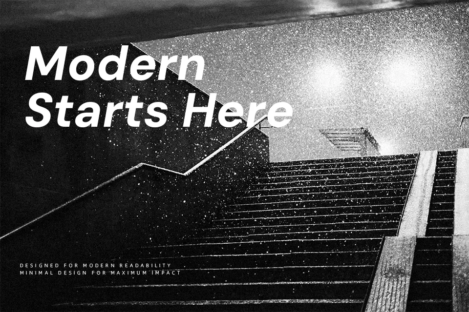
DM Sans is a low-contrast geometric sans serif with open counters, even stroke weights, and calm, rounded forms that stay legible even when the text gets small. The rhythm feels steady rather than flashy, so UI labels, pricing tables, and dashboard metrics read clearly without visual noise. If you push it into huge hero headlines, it can look a bit plain next to more expressive display faces, but that restraint is exactly what helps it disappear in longer product copy or navigation menus. Designers who like the feel of Poppins but want something quieter and more compact often end up using DM Sans instead.
Best For:
interface labels and buttons
product landing page copy
data dashboards and web apps
clean presentation slides
Not Ideal For:
formal editorial layouts
highly expressive logos
long printed novels
ornate luxury branding
Perfect for body text, branding, and headline, with a clean and geometric style.
License
Gallery