DK Zealand Font
Free for personal useAbout
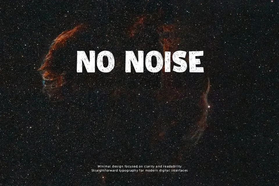
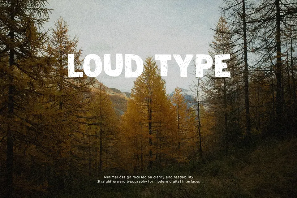
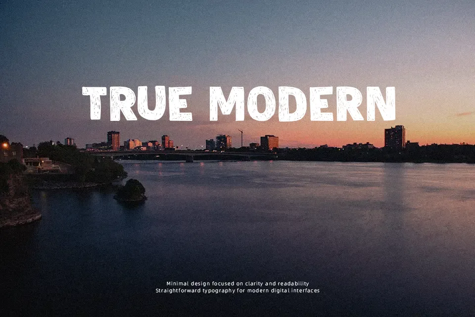
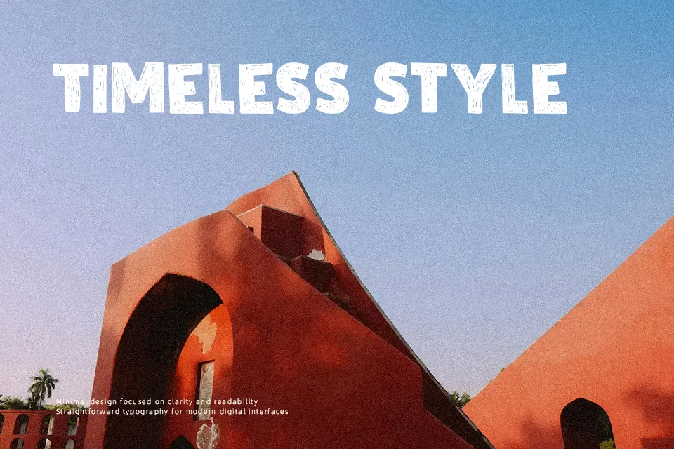
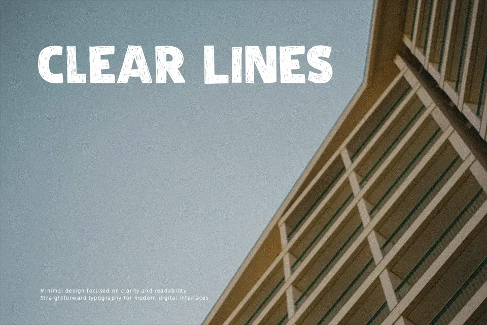
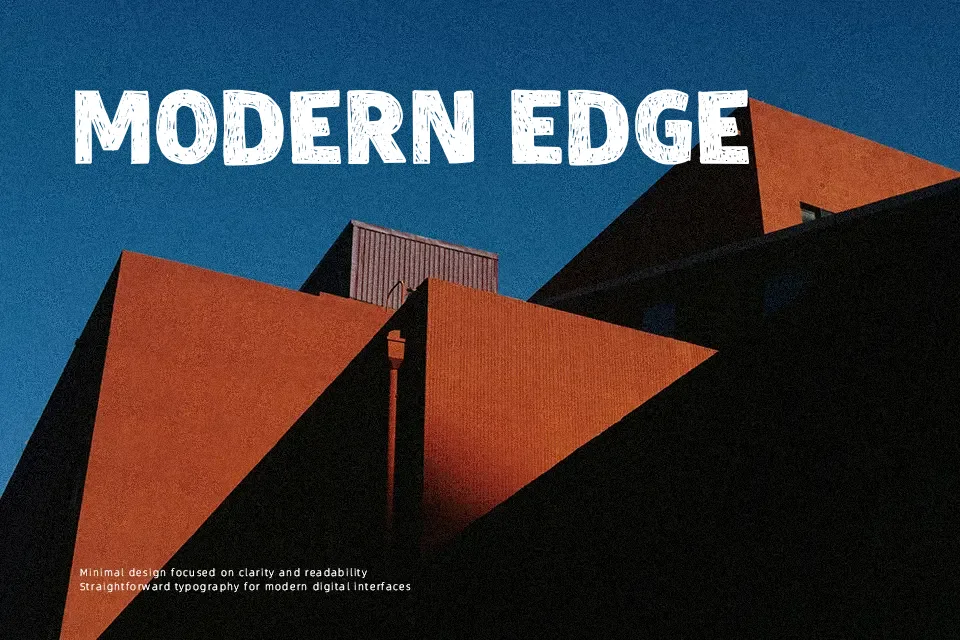
DK Zealand Font is a bold distressed display face with thick blocky forms, uneven texture, and slightly rugged spacing that gives each word a weathered, printed-by-hand feel. The structure is fairly straightforward, so it stays readable in short bursts even with the eroded details. It suits poster headlines, album art, event graphics, and branding that needs a rough human edge rather than polish. I’d reach for it when a layout feels too clean and needs some friction. It is less convincing for body copy, refined editorial work, or UI labels, where the worn texture starts to feel noisy and the spacing can look heavy.
Best For:
concert posters
album artwork
rustic branding
event headlines
Not Ideal For:
body text
small app labels
formal editorial layouts
clean corporate identities
Perfect for branding, headline, and music, with a artistic and decorative style.
License
Gallery