DK Woolwich Font
Free for personal useAbout
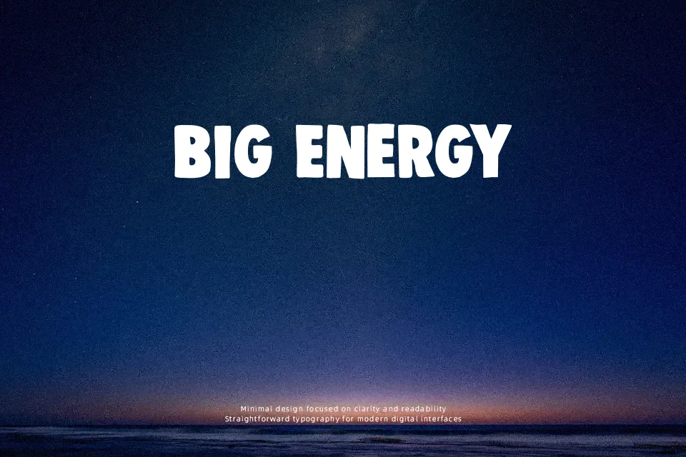
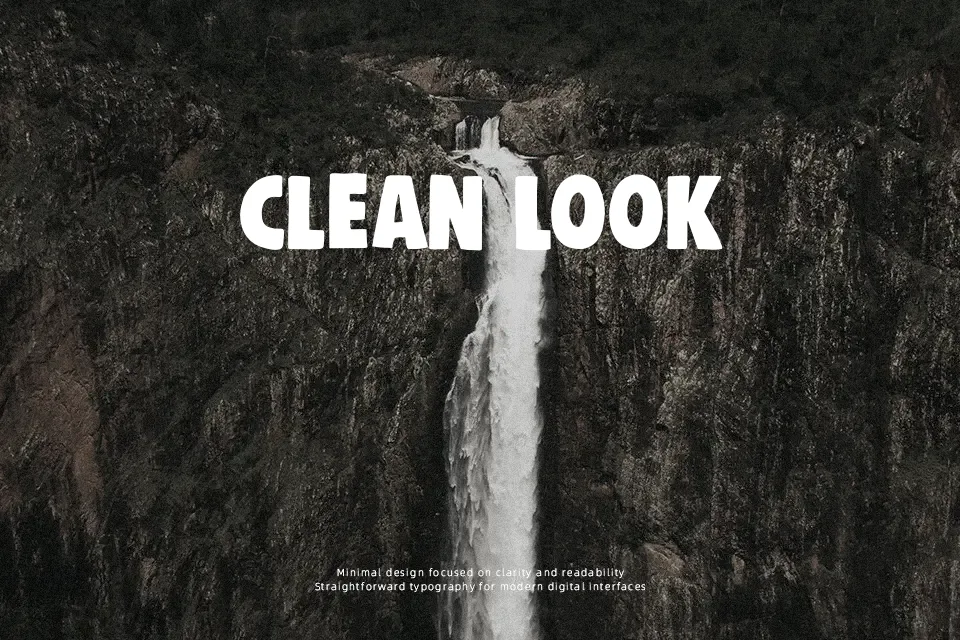
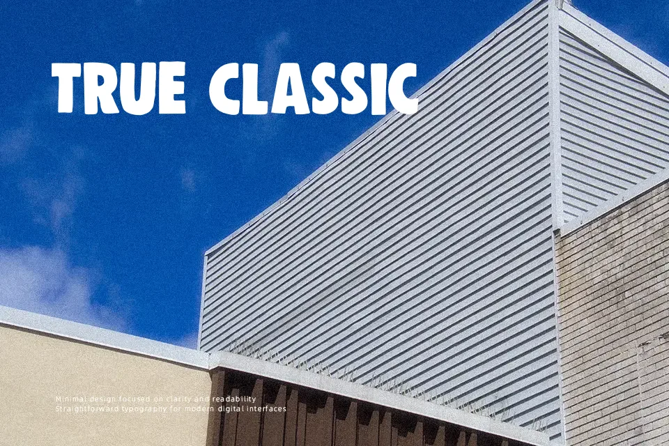
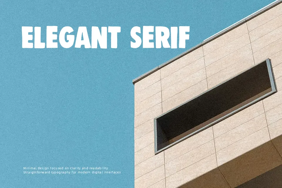
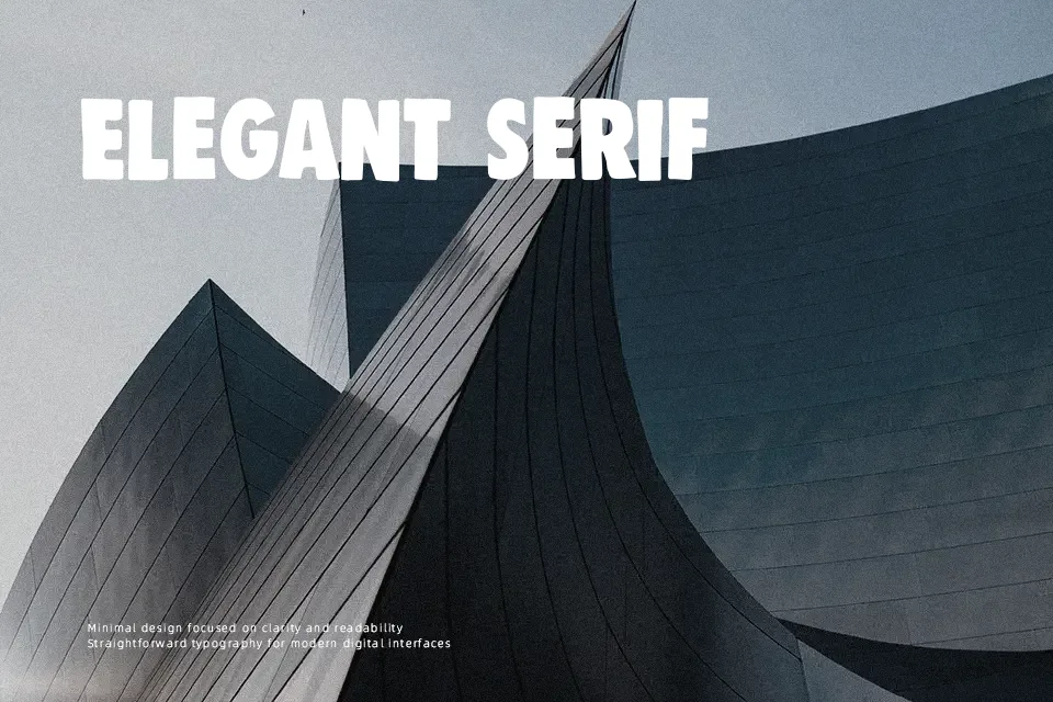
DK Woolwich Font has a thick, compact build with uneven contours, blunt stroke endings, and a slightly distressed silhouette that keeps it from feeling mechanical. The letters sit close and hit hard, so short words carry the most weight. It reads like a handmade display sans with a gritty poster sensibility rather than a clean commercial headline face. I would use it for music flyers, streetwear graphics, packaging that needs a rough edge, or title treatments that should feel loud without going full grunge. It loses clarity in long lines, and the dense shapes can feel heavy in refined layouts or body copy.
Best For:
poster headlines,album artwork,streetwear branding,product packaging
Not Ideal For:
body copy,small ui labels,formal editorial layouts,quiet luxury branding
Perfect for branding, headline, and music, with a bold and decorative style.
License
Gallery