DK Southwark Font
Free for personal useAbout
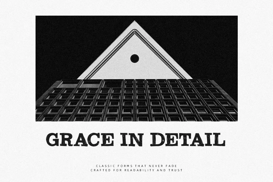
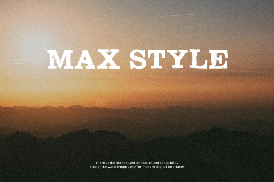
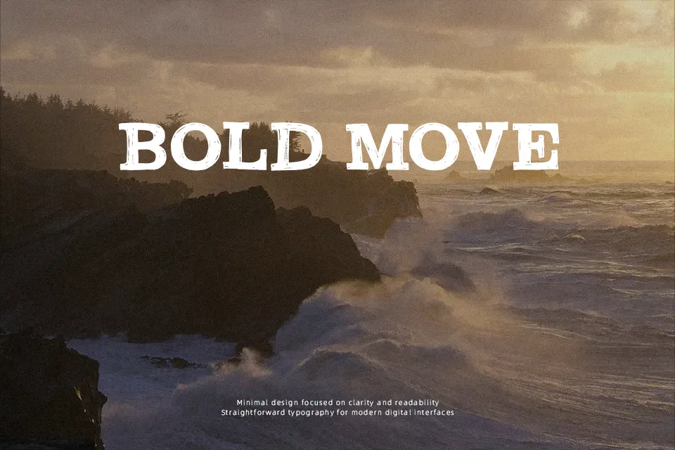
DK Southwark Font has the weight and structure of a Clarendon-style slab serif, then roughs it up with chipped edges and a weathered surface. The letters are broad, sturdy, and tightly commanding, so it holds attention fast in short lines. It feels more pub sign than polished editorial, which is exactly why it works for vintage labels, event posters, shop branding, and dramatic title treatments. The texture gives it character without turning unreadable at display sizes. That said, the distressing can become noisy in small text, and it is not the right fit when you need a clean, refined, or highly technical tone.
Best For:
vintage poster headlines
pub or bar branding
rustic packaging
event title graphics
Not Ideal For:
small body text
clean app interfaces
formal corporate reports
luxury beauty branding
Perfect for branding, headline, and packaging, with a bold and decorative style.
License
Gallery