DK Snemand Font
Free for personal useAbout
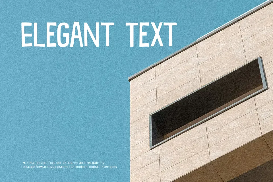
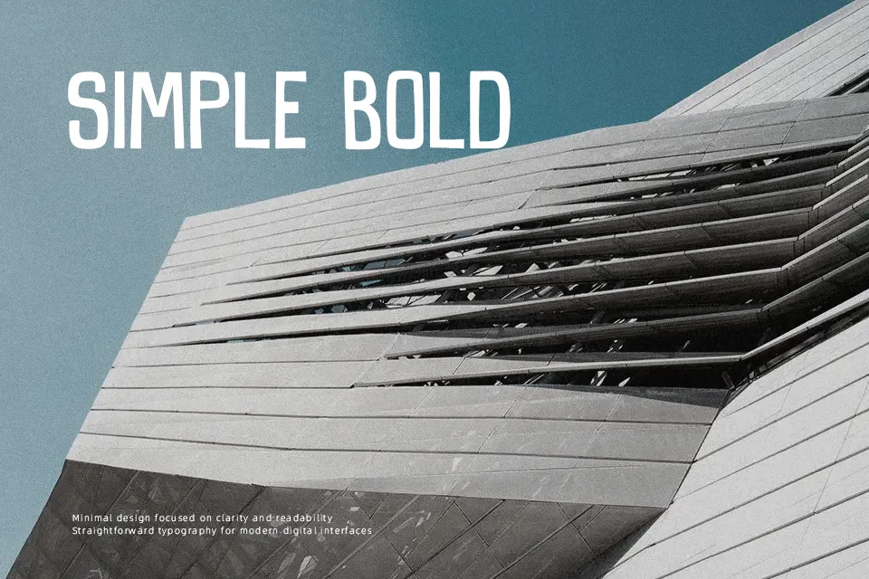
DK Snemand Font has a tall, condensed structure with slightly uneven hand-drawn strokes that keep it casual rather than rigid. The uppercase-heavy look gives it a poster-friendly rhythm, and the spacing feels tight enough to hold attention without turning messy. It leans decorative and playful, with a winter-card personality that makes sense for Christmas signage, seasonal packaging, and children’s event graphics. I would use it when a headline needs charm without becoming overly cute. It is less convincing in body copy, formal branding, or interfaces where clarity at small sizes matters more than character.
Best For:
Christmas posters
holiday packaging
kids event headlines
seasonal social graphics
Not Ideal For:
body text
formal business branding
small UI labels
serious editorial layouts
Perfect for christmas, headline, and kids, with a creative and comic style.
License
Gallery