DK Semarang Kolonial Font
Free for personal useAbout
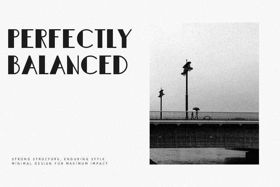
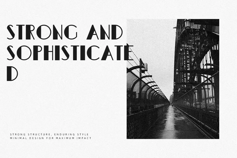
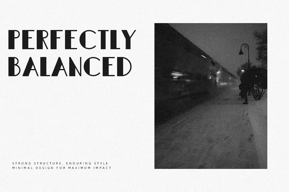
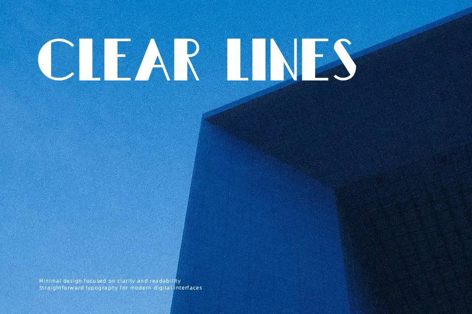
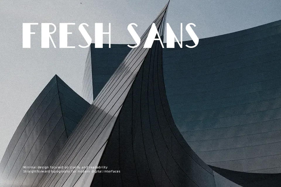
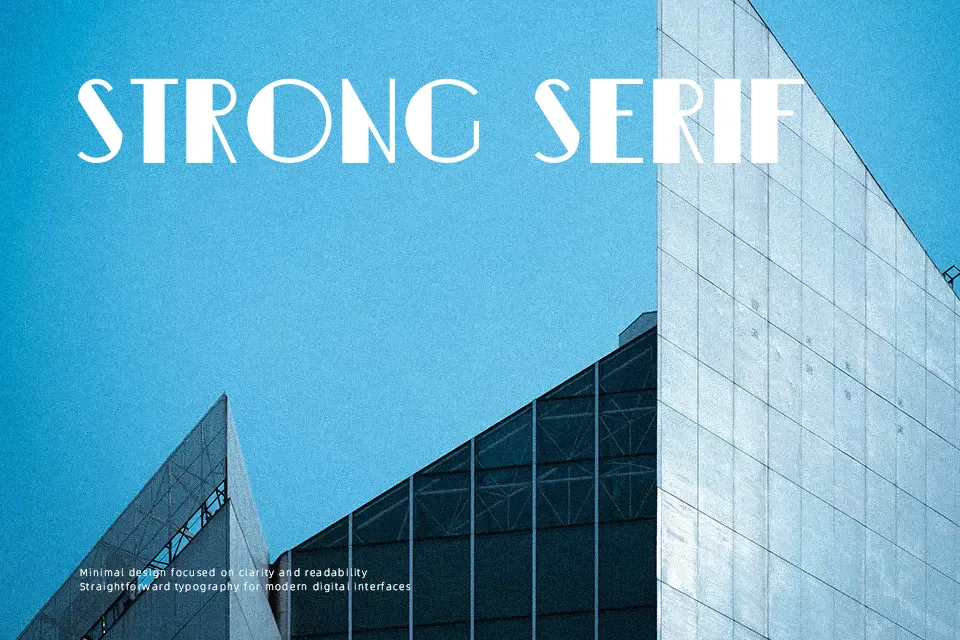
DK Semarang Kolonial uses tall uppercase forms, crisp decorative terminals, and relatively tight spacing to create a retro display look with a formal, slightly colonial Art Deco flavor. I’d reach for it on heritage-style labels, menu headings, travel posters, or editorial openers where a period mood matters more than neutrality. It has character, but it is better kept to short lines; in body copy, small UI text, or dense layouts, the decorative structure starts to feel stiff and less readable
Best For: vintage poster titles; heritage packaging labels; editorial cover lines; menu headings
Not Ideal For: long body paragraphs; small mobile text; minimalist tech branding; dense legal copy
Perfect for branding, editorial, and headline, with a classic and decorative style.
License
Gallery