DK P.I. Font
Free for personal useAbout
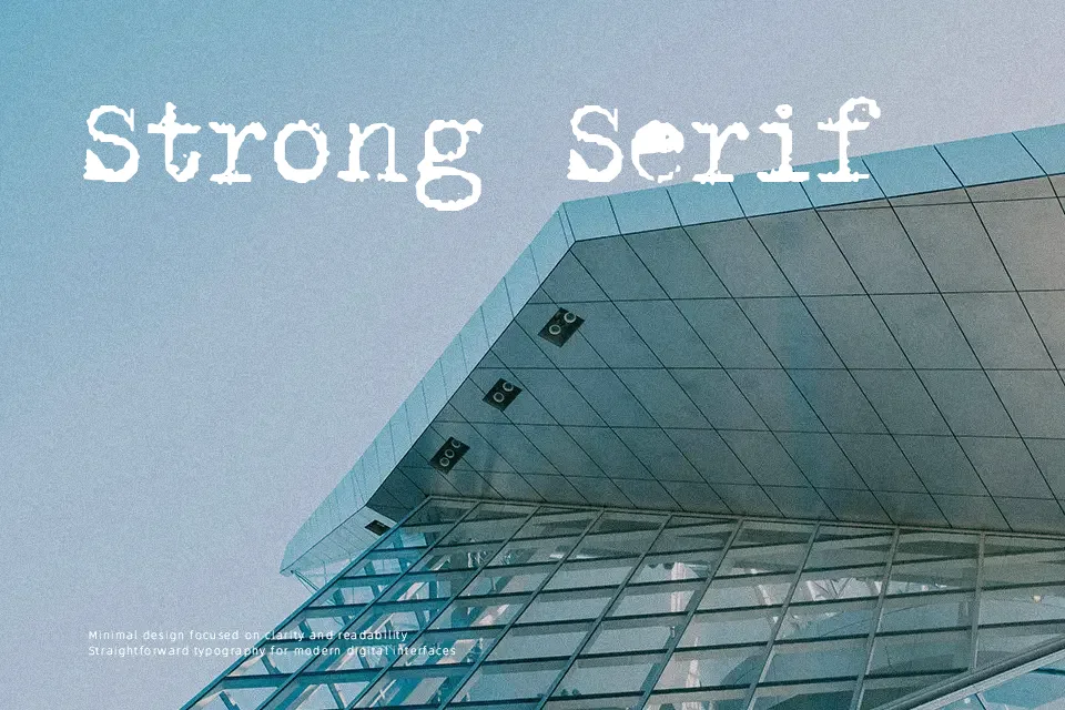
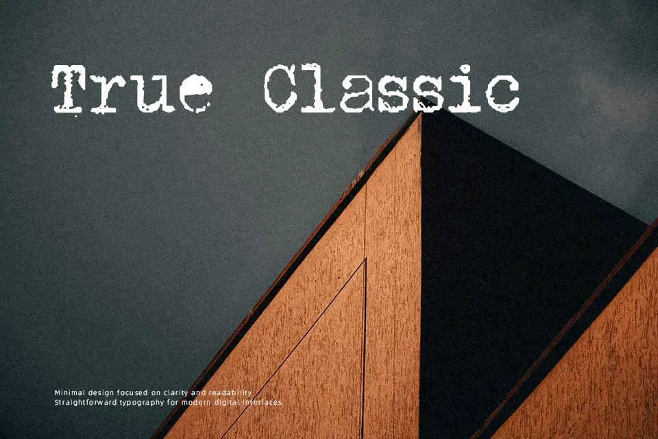
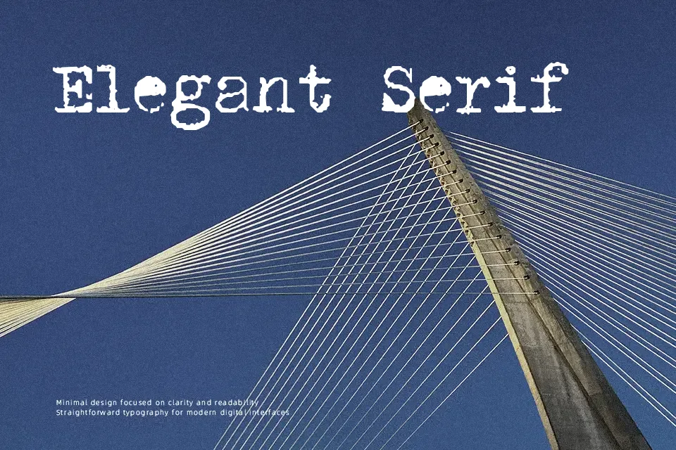
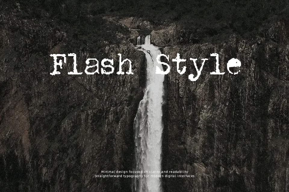
DK P.I. Font has the rough, slightly battered rhythm of an old typewriter ribbon, with irregular edges, modest weight, and tight, practical spacing. The structure stays readable, but the worn texture gives it a used-paper mood rather than a clean office look. It works best when you want a believable analog tone on book covers, detective-themed posters, faux documents, or packaging that leans nostalgic. I would use it for short headlines or stamped-style supporting text, not for interface copy or dense paragraphs. If you need something crisp and neutral, this one will feel too noisy; if you want age and character, it lands quickly.
Best For:
vintage poster headlines
detective themed graphics
faux document styling
nostalgic packaging accents
Not Ideal For:
body text blocks
clean corporate branding
small ui labels
minimal layouts
Perfect for editorial, headline, and packaging, with a artistic and decorative style.
License
Gallery