DK Hyggelig Font
Free for personal useAbout
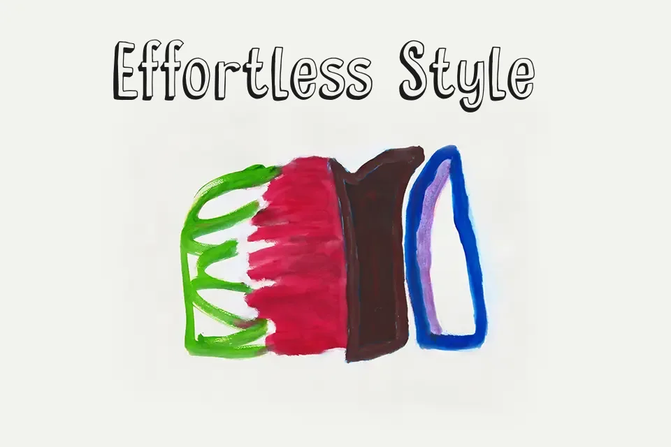
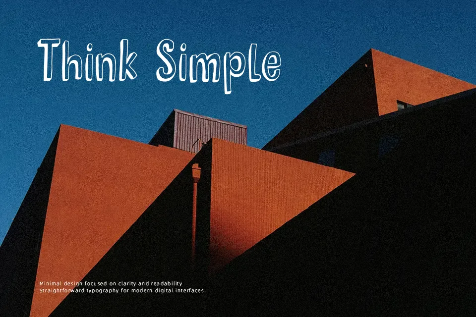
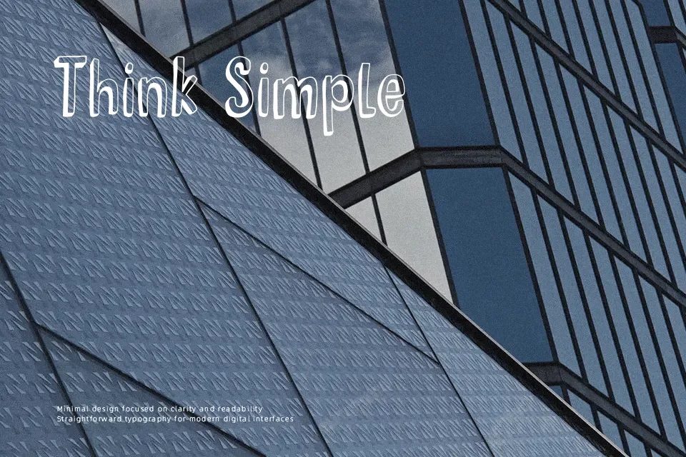
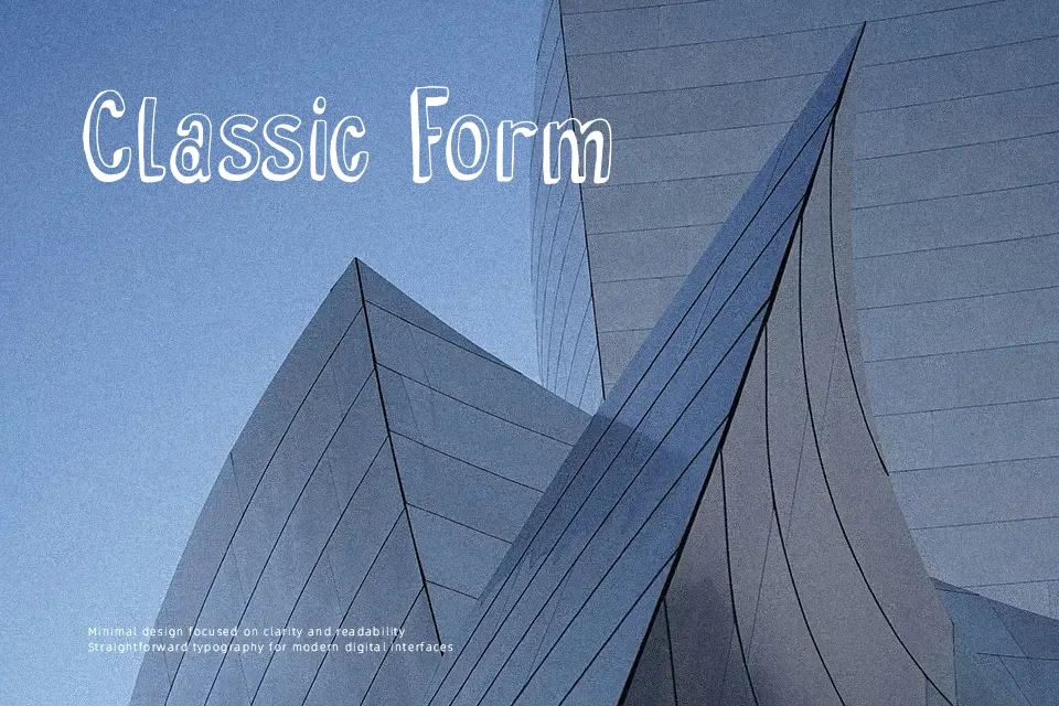
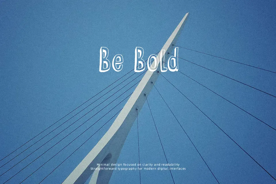
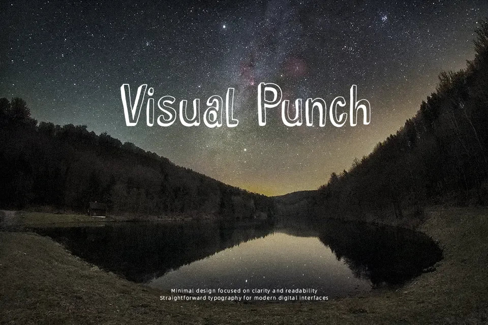
DK Hyggelig Font has tall, narrow letterforms with uneven hand-drawn strokes, open counters, and a chunky outline-plus-shadow construction that gives it a friendly comic-book lift. The spacing feels lively rather than polished, which helps it stand out in short titles, product labels, classroom materials, or playful social graphics. It works best when you want warmth and personality without going full cartoon chaos. The built-in depth also makes it useful on posters where flat lettering can feel dull. It is less convincing for body copy, serious branding, or interfaces where clarity at small sizes matters more than charm.
Best For:
playful poster titles
kids product packaging
classroom display graphics
cheerful social media headers
Not Ideal For:
long reading text
formal business branding
small UI labels
luxury editorial layouts
Perfect for headline, kids, and packaging, with a creative and comic style.
License
Gallery