DK High Tea Font
Free for personal useAbout
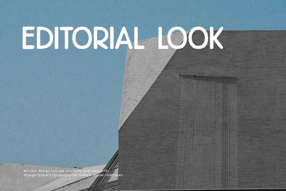
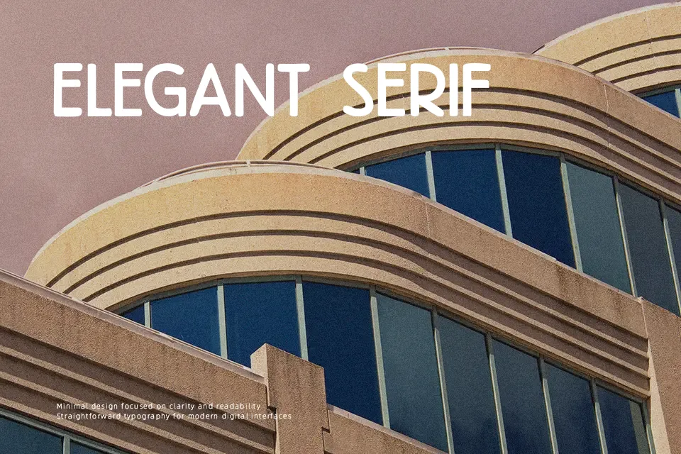
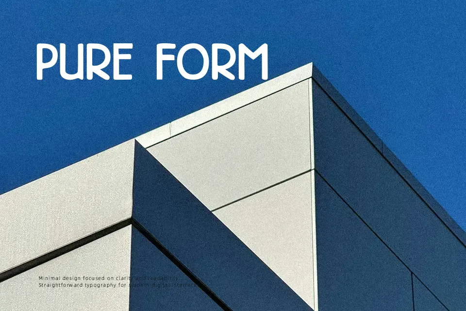
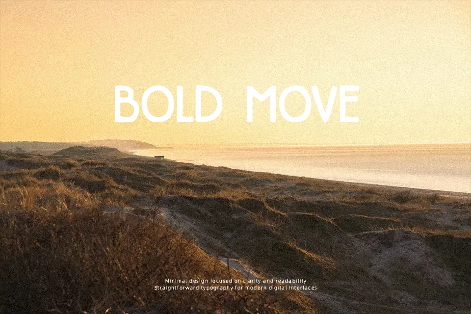
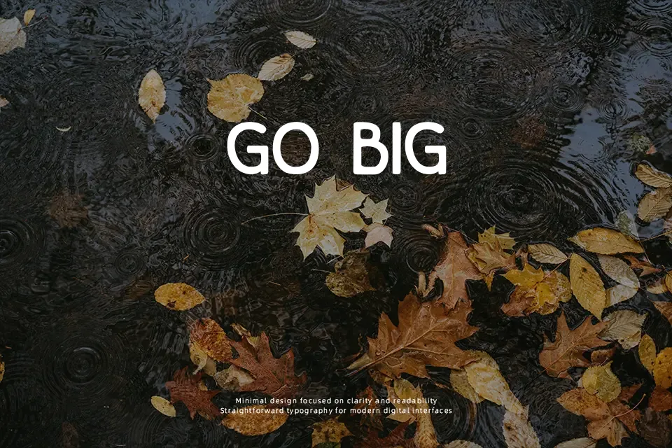
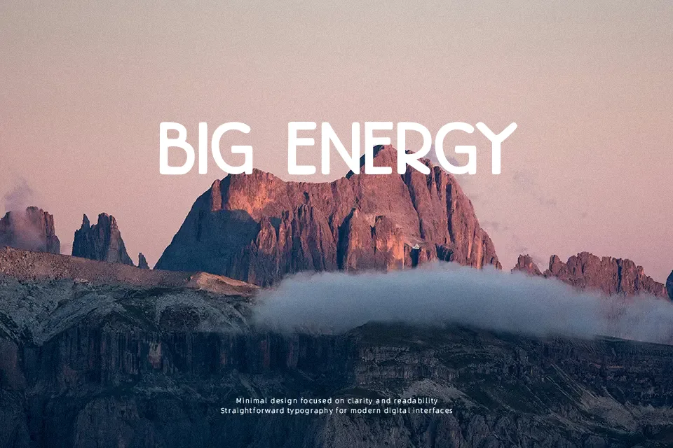
DK High Tea Font has a tall, narrow structure with even stroke weight, clean caps, and slightly hand-drawn edges that keep it from feeling too mechanical. The look leans retro and decorative, with a polished 1930s menu vibe rather than a rugged vintage feel. It suits tea labels, café signage, event stationery, and poster titles where you want period character without heavy ornament. I like it most in short uppercase phrases, especially when spacing is given room to breathe. It is less convincing in body copy, small UI text, or projects that need a neutral modern tone.
Best For:
vintage menu headers
tea packaging labels
event poster titles
boutique invitation pieces
Not Ideal For:
long reading passages
small interface text
sports branding
dense mobile layouts
Perfect for headline, invitation, and packaging, with a classic and condensed style.
License
Gallery