DK Greyfriars Font
Free for personal useAbout
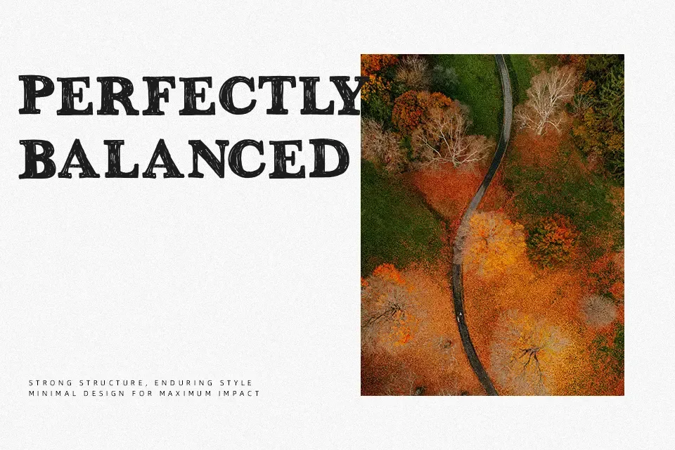
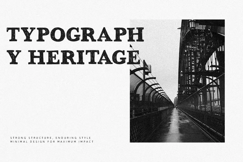
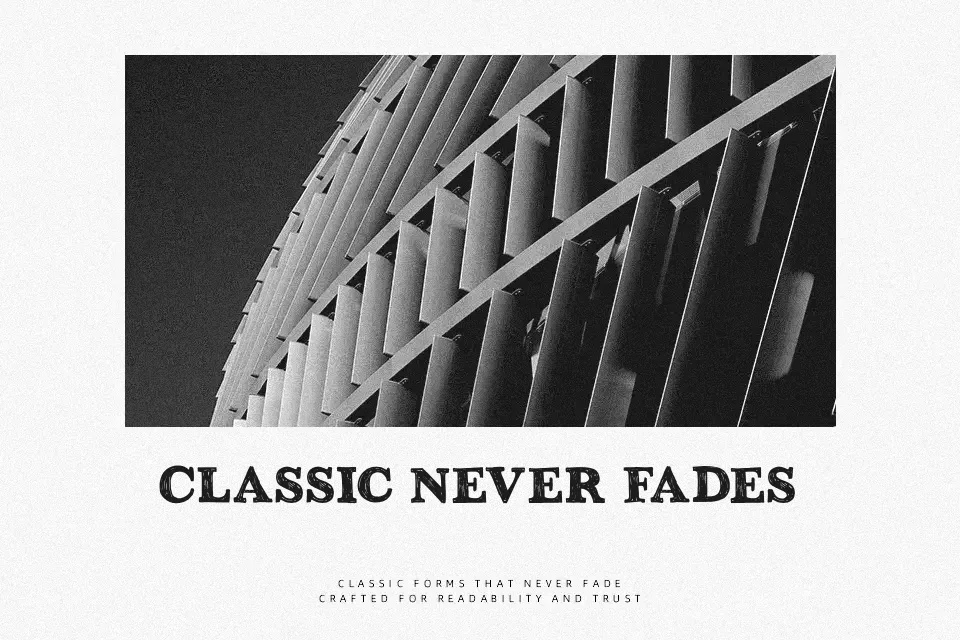
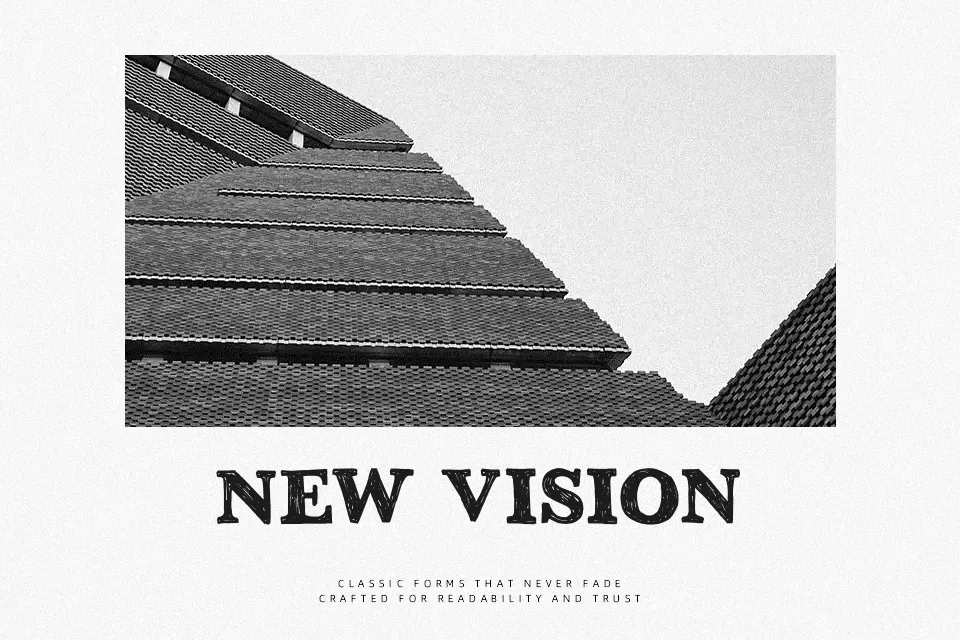
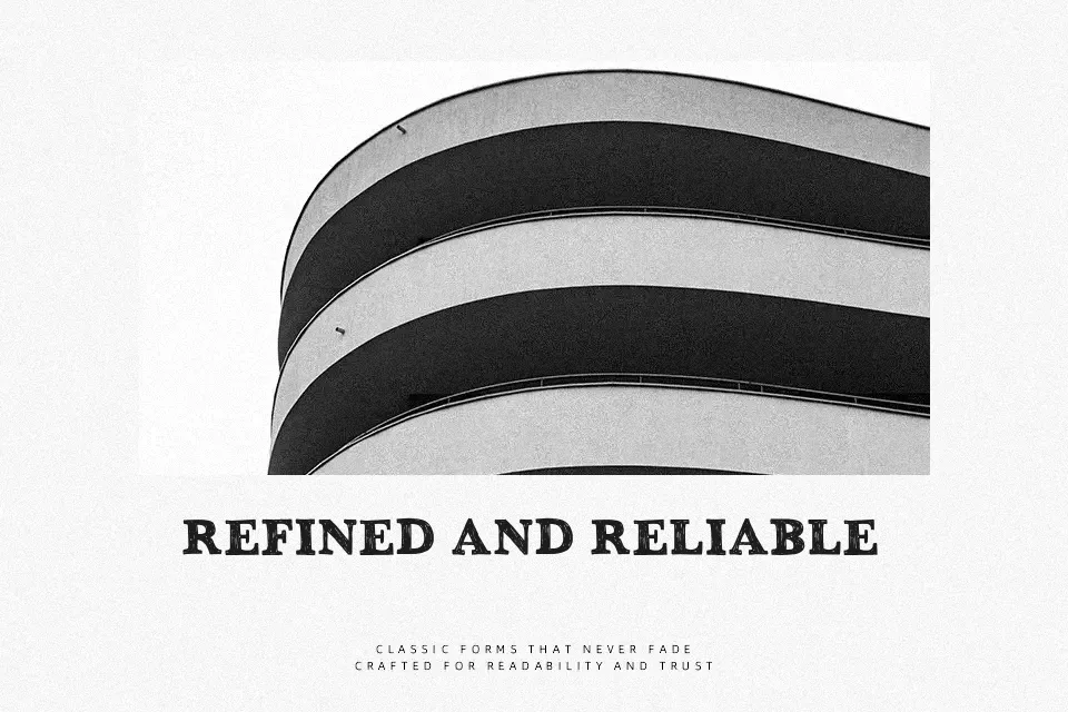
DK Greyfriars is a rough serif display face built on a classic Baskerville-like structure, then pushed into a weathered, hand-drawn finish. The strokes are fairly bold, the contrast is noticeable, and the edges look chipped rather than clean, which gives large words a printed, timeworn character. It reads best when you want a literary, old-poster, or heritage mood with a bit of grit. I’d use it for beer labels, event posters, chapter openers, or shop branding that wants history without going full blackletter. It is less convincing in small sizes, long reading passages, or interfaces where clarity matters more than texture.
Best For:
vintage pub branding
book cover titles
heritage style posters
packaging with an aged feel
Not Ideal For:
small body text
clean UI layouts
minimal corporate branding
dense mobile screens
Perfect for branding, editorial, and headline, with a artistic and decorative style.
License
Gallery