DK Douceur Font
Free for personal useAbout
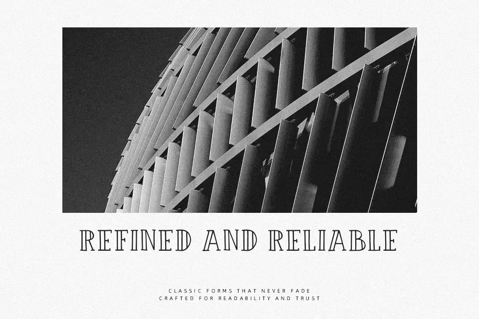
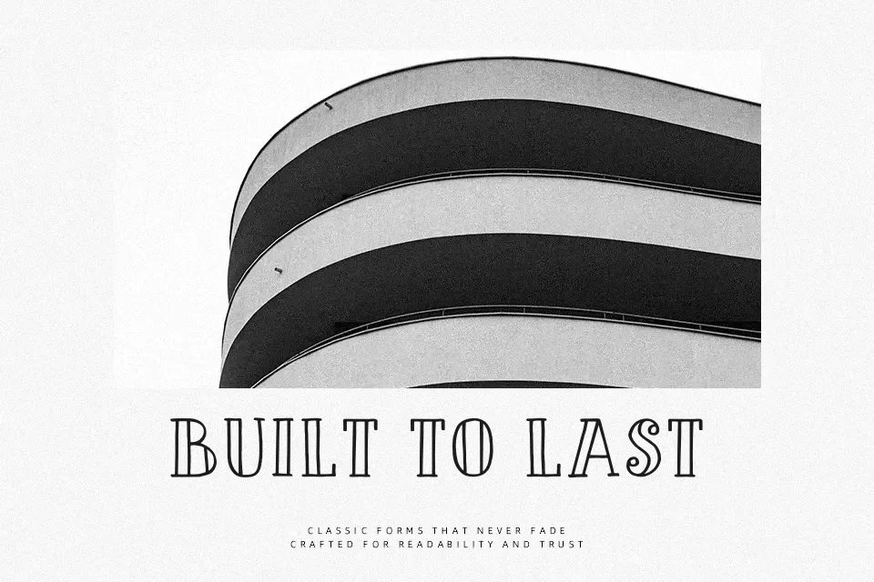
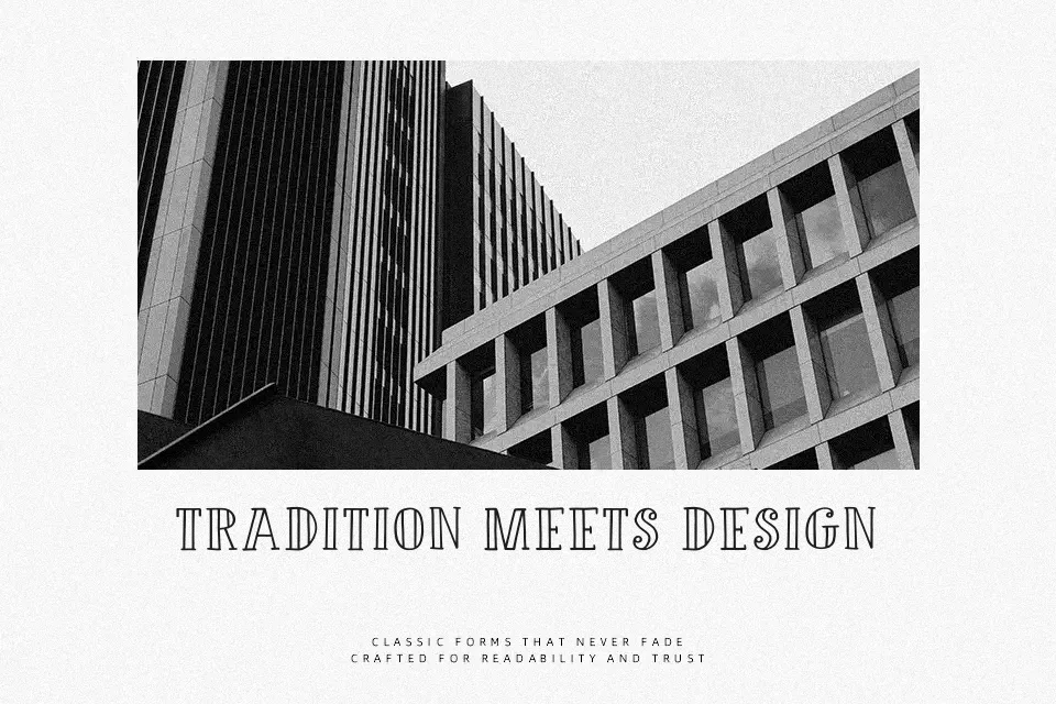
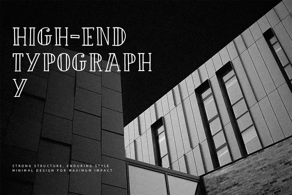
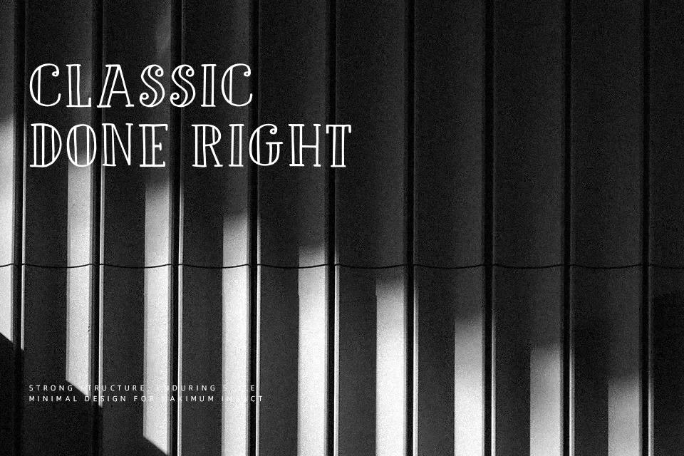
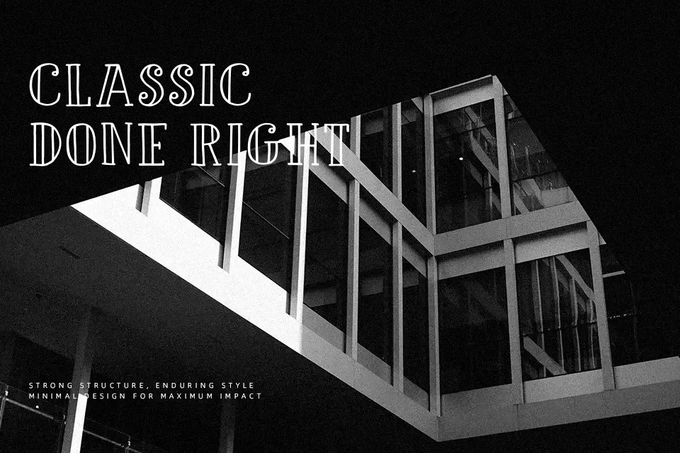
DK Douceur Font has a tall, condensed structure with thin strokes, small interior counters, and curled details that give it a refined vintage voice. The letterforms feel decorative rather than formal, with enough personality to carry a headline without extra styling. It reads best in medium to large sizes, especially on packaging, invitation pieces, boutique branding, or editorial covers that want a soft antique accent. I would use it when a layout needs elegance with a slightly whimsical edge. I would avoid it for body copy, dense menus, or modern interfaces, where the narrow shapes and ornament can start to feel fragile or fussy.
Best For:
boutique logo wordmarks
wine or perfume packaging
invitation headlines
editorial cover titles
Not Ideal For:
small body text
data-heavy layouts
minimal tech branding
mobile UI labels
Perfect for editorial, headline, and invitation, with a artistic and decorative style.
License
Gallery