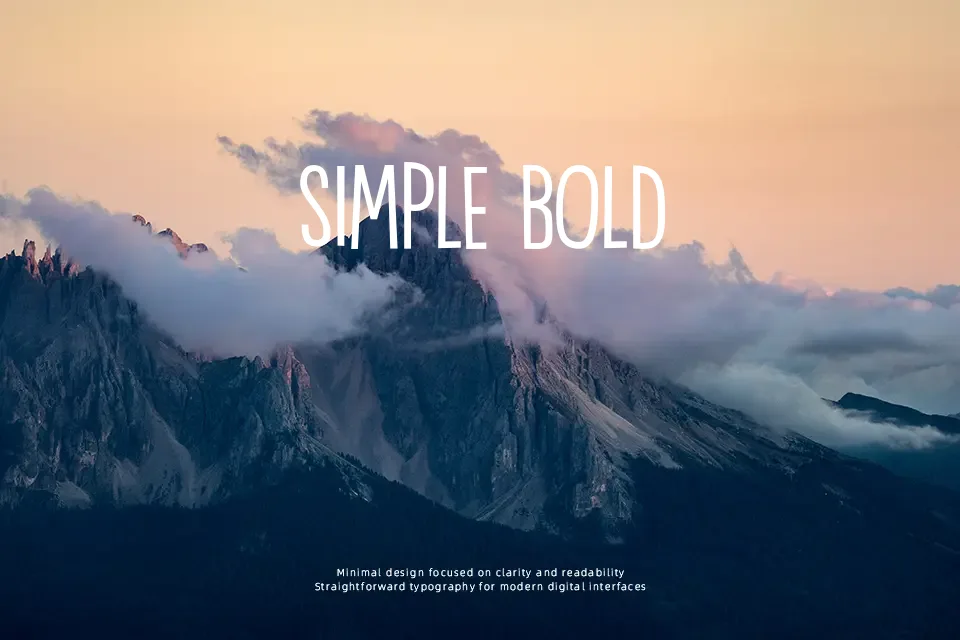
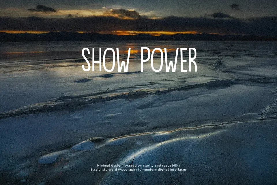
DK Bintang Font
Free for personal useAbout
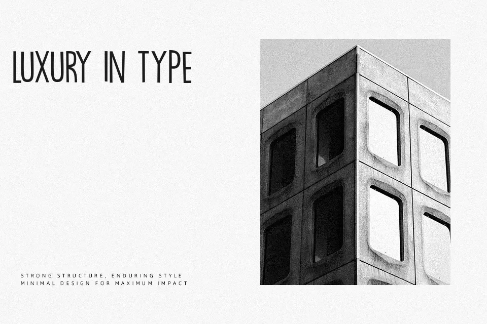
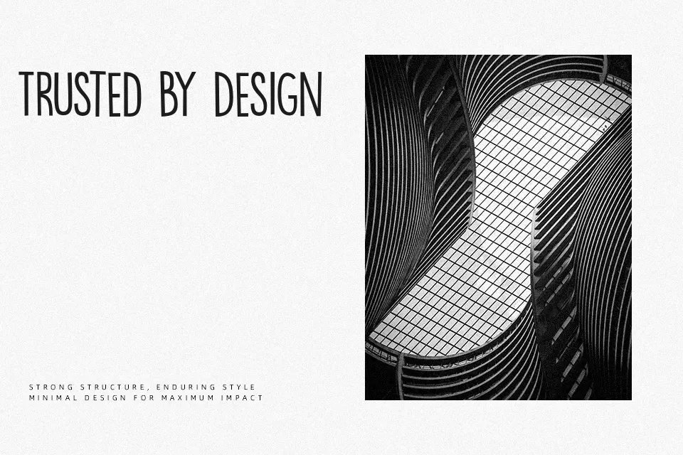
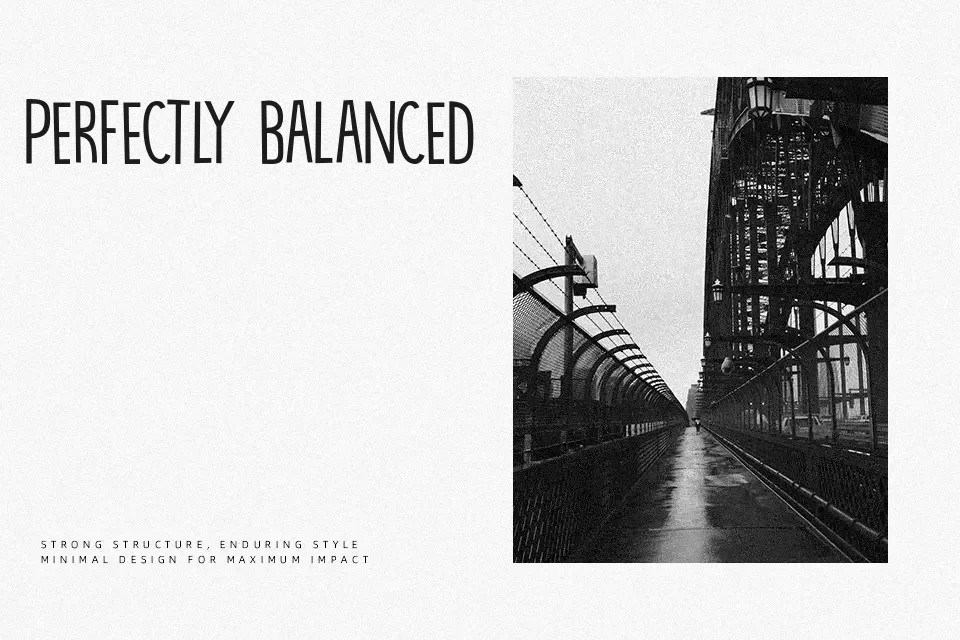
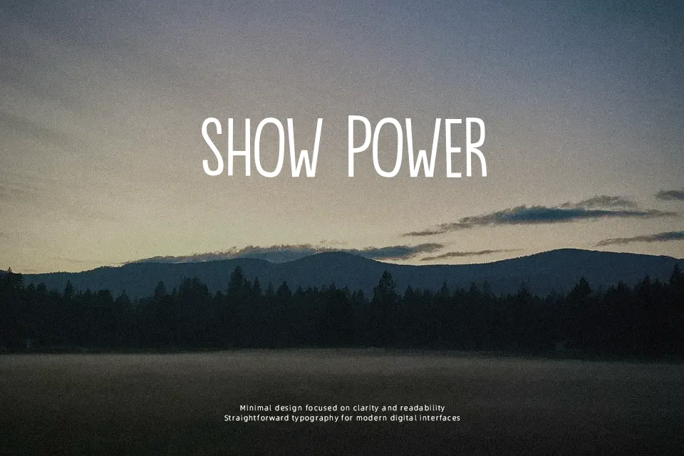
DK Bintang uses very tall uppercase forms, thin-to-medium strokes, tight internal spacing, and a straightforward condensed structure that leans more on silhouette than detail. The mood feels theatrical and a little retro, so it suits gig posters, indie film title frames, bar menus, or merchandise where a narrow headline needs personality without turning messy. I would use it when the word count is short and the layout needs vertical energy; for editorial paragraphs, app screens, or polished corporate branding, it starts to feel rigid, narrow, and too stylized at smaller sizes.
Best For: concert posters, title cards, bar signage, album artwork
Not Ideal For: body copy, app interfaces, formal corporate decks, dense editorial layouts
Perfect for branding, film, and headline, with a creative and condensed style.
License
Gallery