DK Badehaus Font
Free for personal useAbout
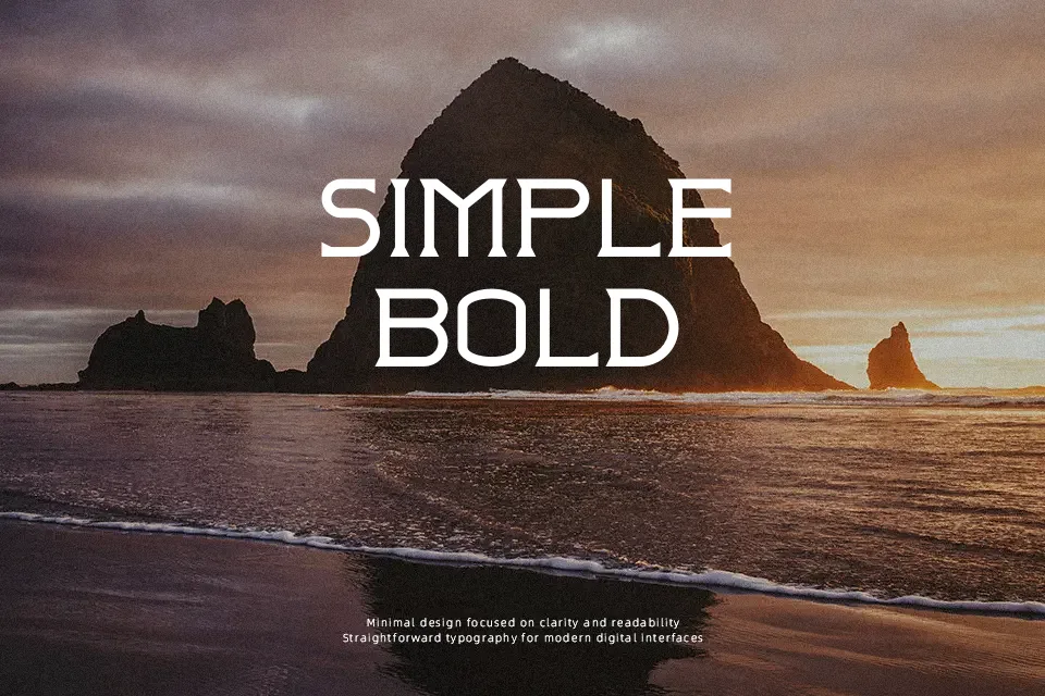
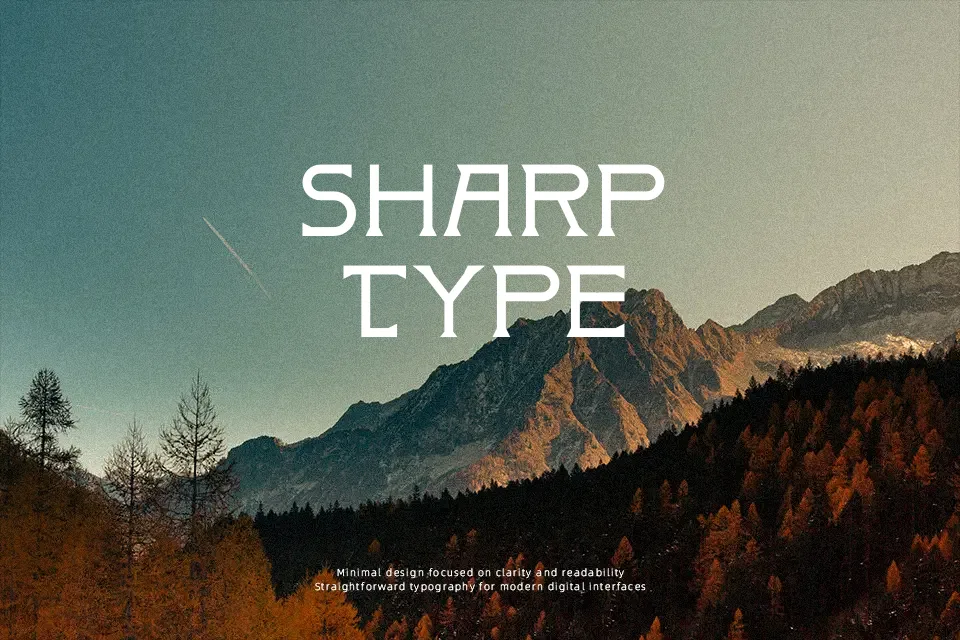
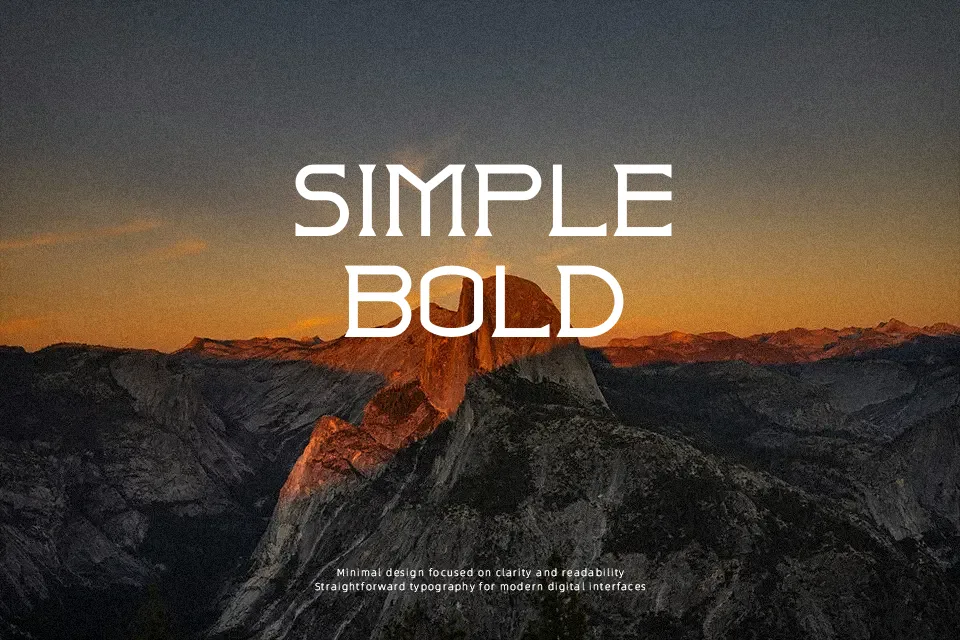
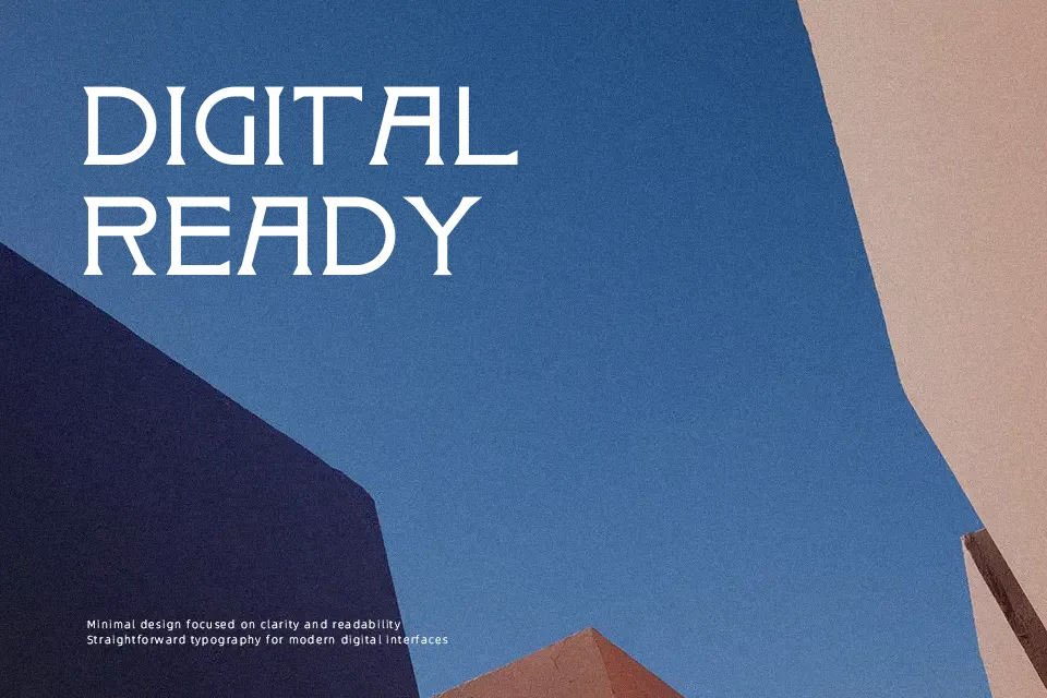
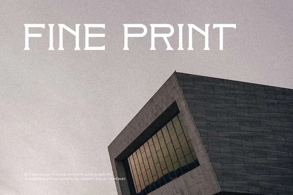
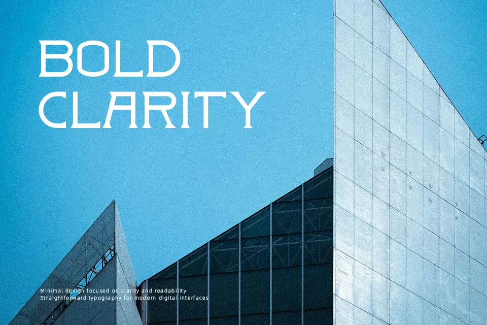
DK Badehaus Font has a lean, constructed look with monoline strokes, wide letterforms, and clean spacing that gives it a distinctly retro display character. The shapes feel rooted in early modernist signage, but the overall tone is more decorative than strict, especially in larger words. It reads best in short, prominent settings such as café menus, poster titles, product labels, or themed restaurant branding where the style can carry the message. I would use it when the layout needs a vintage accent without becoming overly ornate. I would avoid it for body copy, dense editorial pages, or interfaces where quick readability matters more than atmosphere.
Best For:
poster titles,restaurant branding,packaging labels,vintage signage
Not Ideal For:
body text,small UI labels,dense editorial copy,minimal corporate layouts
Perfect for branding, headline, and packaging, with a classic and decorative style.
License
Gallery