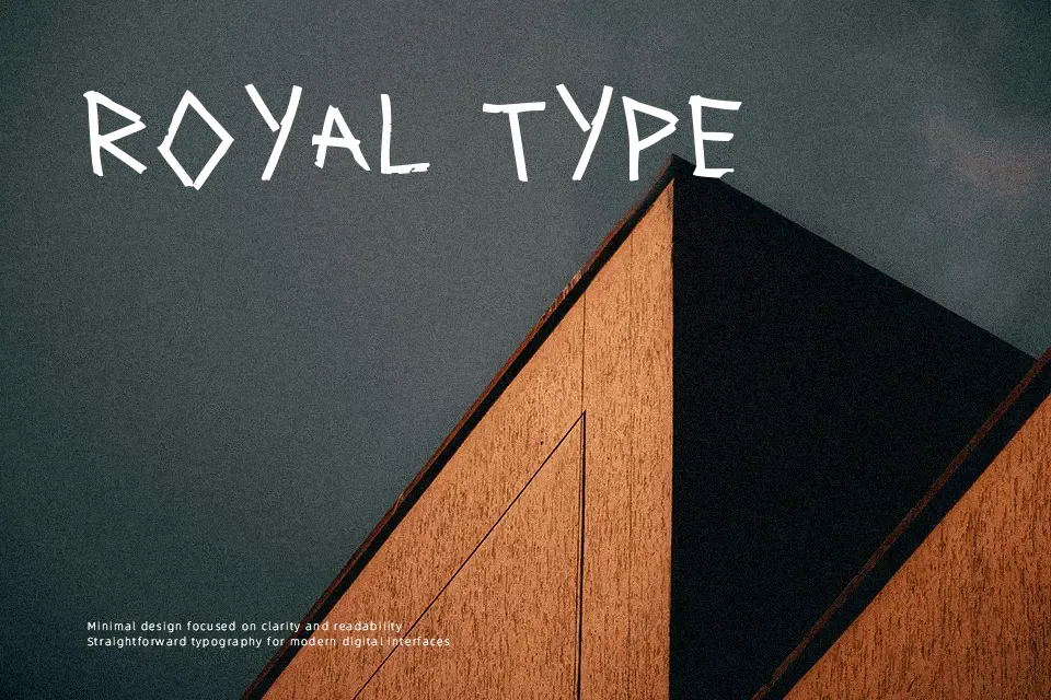
Correction Tape Font
Free for Commercial UseAbout
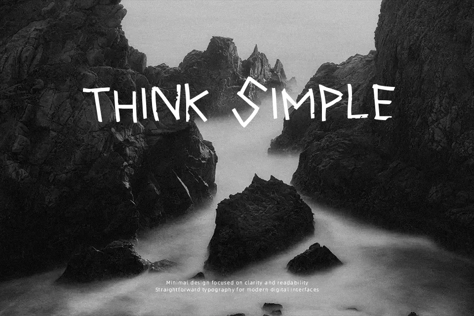
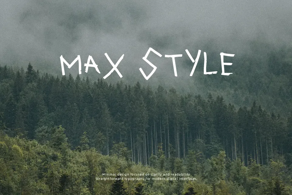
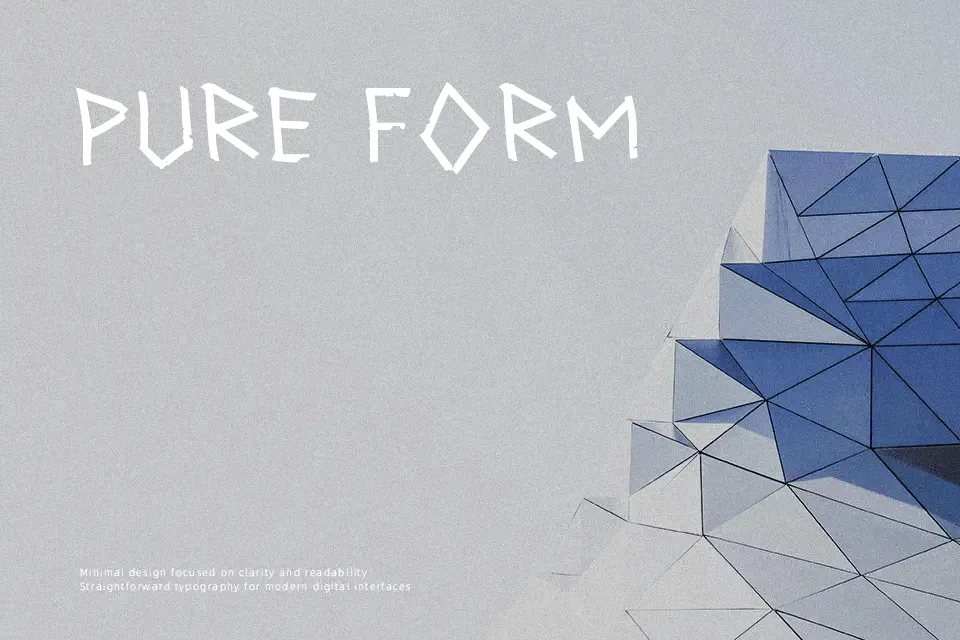
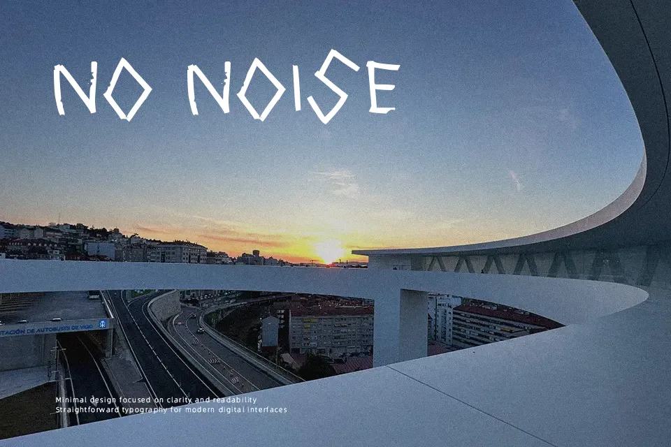
Correction Tape Font presents an analog, collage-inspired aesthetic constructed from segmented tape strokes with uneven joints and torn boundaries. The letterforms exhibit stout vertical proportions and uniform, heavy stroke weights that immediately command attention across large display compositions. Relatively tight horizontal spacing ensures cohesive word shapes, although this density slightly compromises glyph recognition when scaled down to intermediate subheadings. The design performs exceptionally well in bold editorial headers, zine covers, and festival merchandise requiring a gritty tactile edge. However, intricate silhouette textures deteriorate quickly in continuous body text, making the typeface ineffective for long paragraphs.
Best For:
– Music festival posters
– Underground zine headlines
– Streetwear apparel graphics
Not Ideal For:
– Extended book body text
– Corporate financial reports
– Mobile navigation UI labels
Perfect for film, headline, and music, with a bold and decorative style.
License
Gallery