Coordenadas Polares Font
Free for personal useAbout
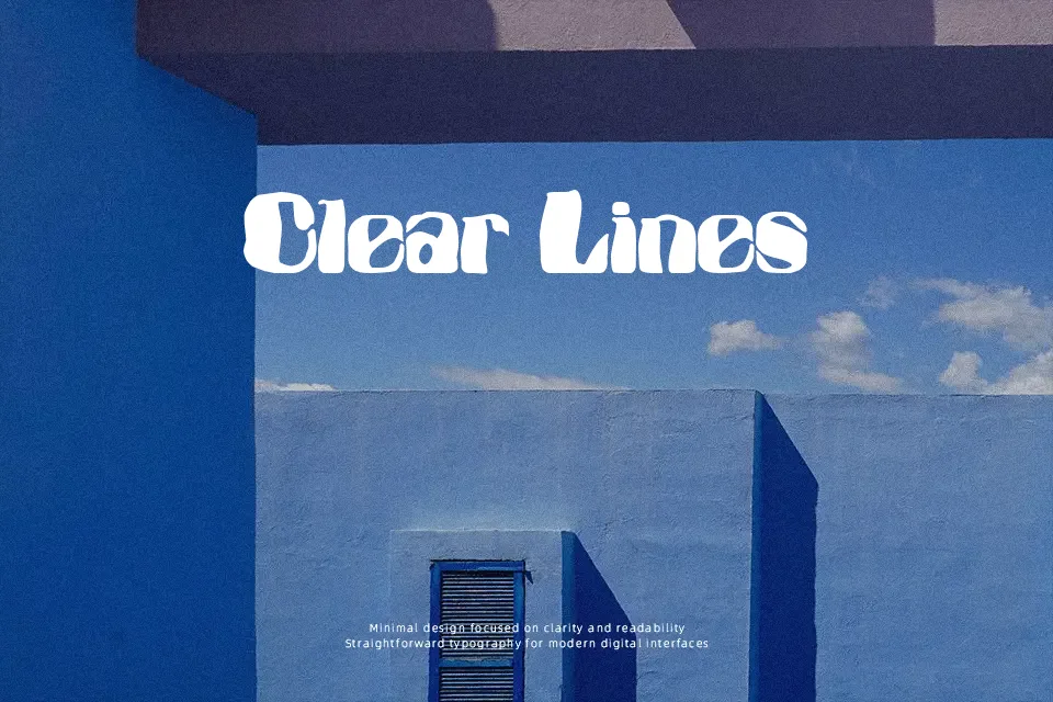
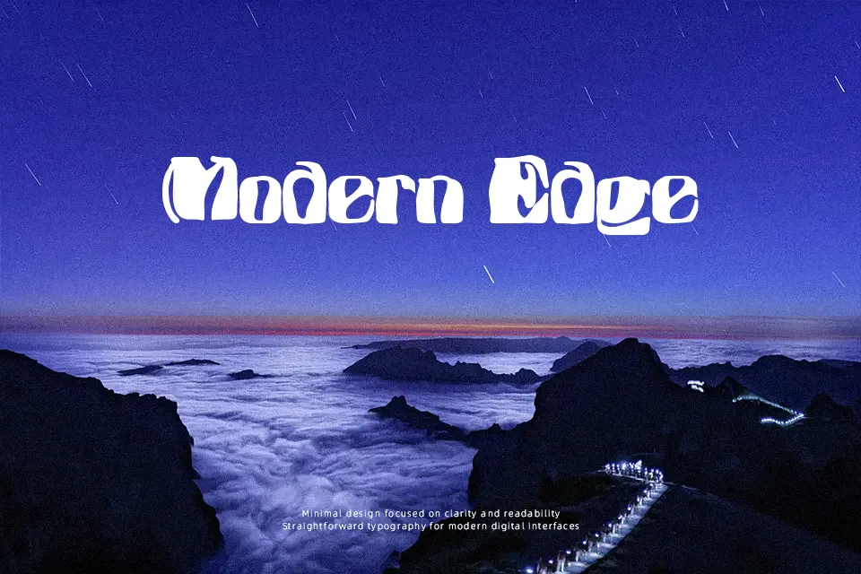
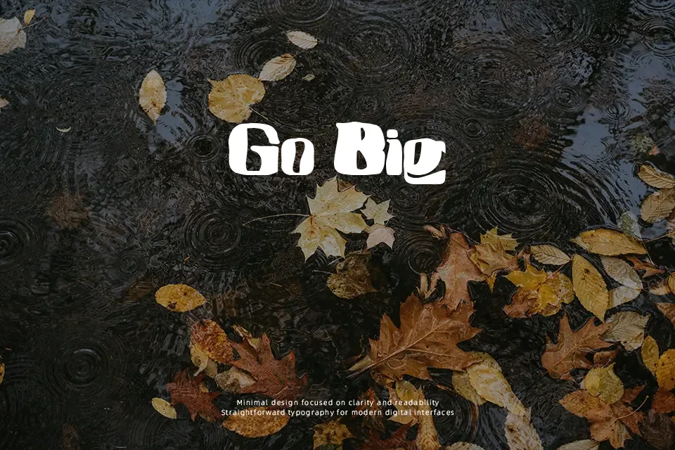
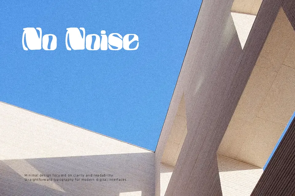
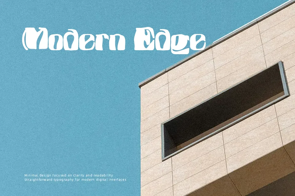
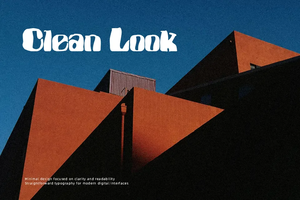
Featuring exaggerated coordinate warping across sturdy foundational slabs, Coordenadas Polares Font merges structured letterforms with dynamic digital manipulation. The stroke style incorporates substantial block serifs alongside abrupt angular shifts, creating inconsistent baseline weights and fluctuating glyph widths. Spacing between characters remains intentionally tight and irregular, accentuating the chaotic rhythm established by the stretched proportions. Because the distorted contours compromise baseline legibility, the typeface performs poorly in extended editorial body copy or micro typography. However, the design produces remarkable visual impact in large poster titles, underground flyer designs, and experimental record sleeves. The uneven stroke distribution rewards generous tracking when rendered at scale.
Best For: music festival posters, streetwear apparel graphics, experimental album covers, indie game title screens
Not Ideal For: long paragraph text, mobile interface labels, corporate business reports, dense book typography
Perfect for headline, logo, and music, with a bold and decorative style.
License
Gallery