Closer Font
Free for personal useAbout
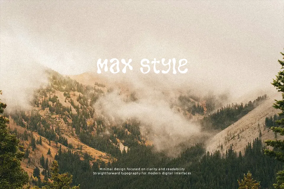
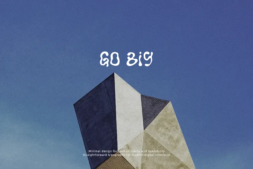
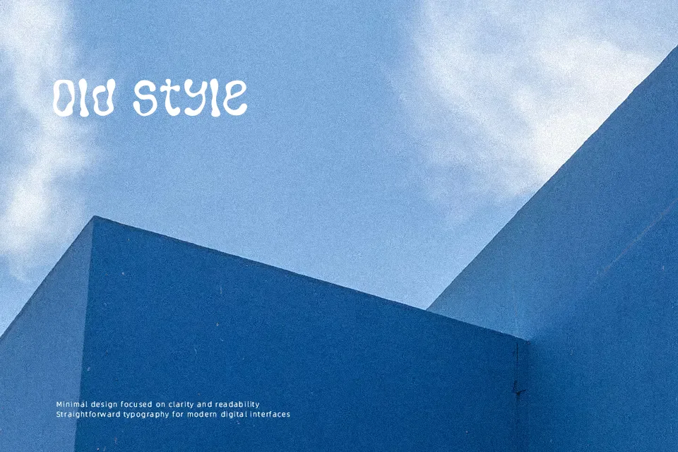
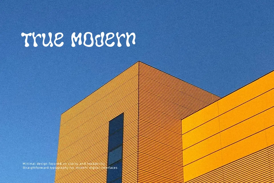
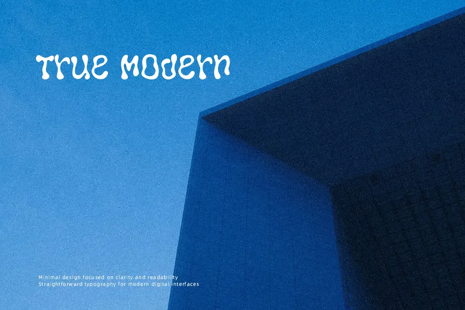
Closer Font commands immediate attention through heavy, fluid letterforms defined by melting contours, bulbous curves, and swollen terminal shapes. The design features dramatic stroke contrast where bloated curves taper abruptly into tight interior counters, producing an undulating visual rhythm. Across uppercase glyphs, proportions remain broad and bottom-heavy, resting tightly against neighboring characters with dense, interlocking spacing. This typeface delivers exceptional graphic impact for psychedelic album artwork, merchandise graphics, and oversized event posters. However, the extreme structural distortion severely hinders legibility at smaller point sizes. Dense letterforms reduce clarity when set in continuous text, making the font unsuitable for editorial body paragraphs or technical documentation.
Best For: music festival posters, streetwear apparel graphics, vinyl record cover art
Not Ideal For: long paragraph text, corporate reports, mobile interface body text
Perfect for headline, logo, and packaging, with a bold and decorative style.
License
Gallery