Chatkids Font
Free for Commercial UseAbout
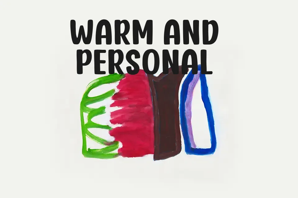
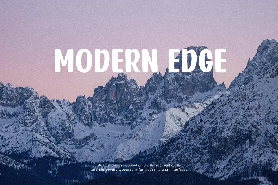
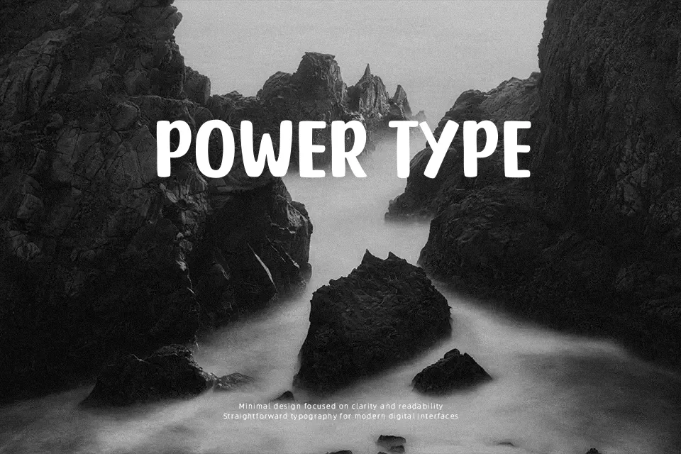
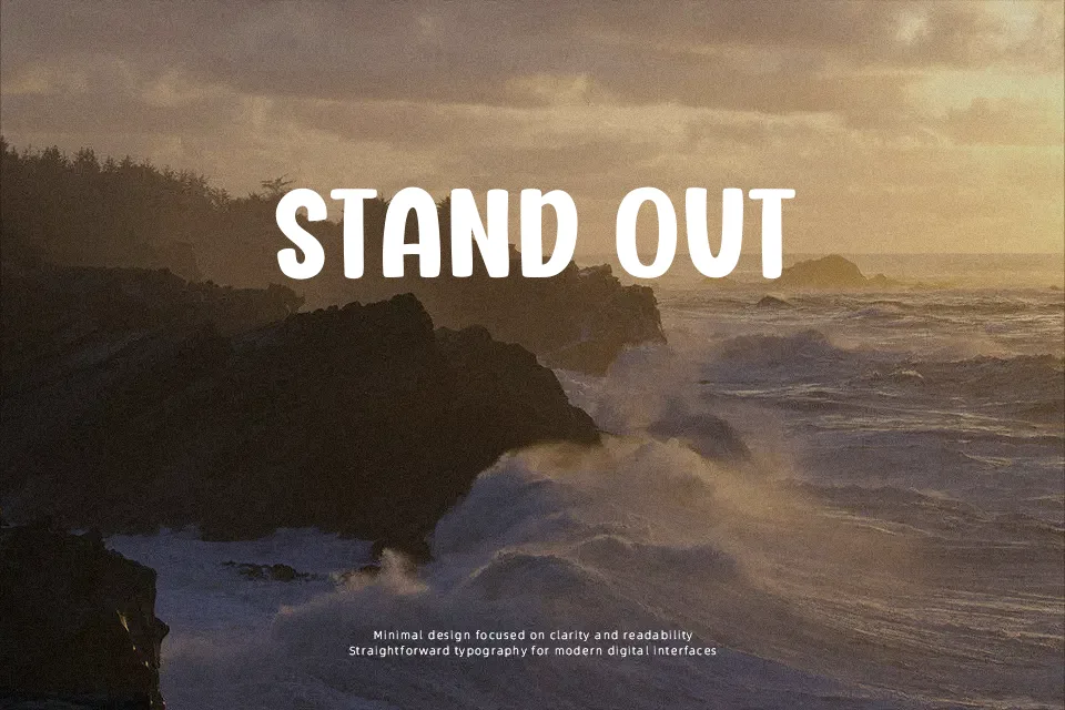
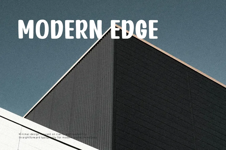
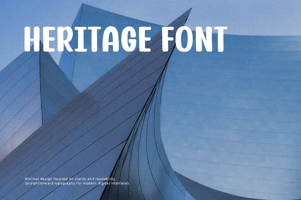
Chatkids Font is built with thick, softly rounded strokes and upright proportions that give each character an approachable, hand-crafted appearance. The letterforms display low stroke contrast, uniform weight distribution, and comfortable inner counters, which together support strong legibility across large headers and short promotional lines. Generous character spacing allows the typeface to retain its energetic rhythm on merchandise, children’s book titles, and game logos without visual crowding. However, the heavy weight and informal styling make the design less suitable for continuous body text or formal editorial layouts, where compact glyphs may reduce reading ease. The balanced spacing helps maintain clarity in prominent headline compositions.
Best For:
children’s book cover titles,toy packaging headers,animated series logos,youth apparel graphics
Not Ideal For:
continuous paragraph body text,formal corporate annual reports,dense legal documents,small mobile interface labels
Perfect for headline, kids, and logo, with a bold and cartoon style.
License
Gallery