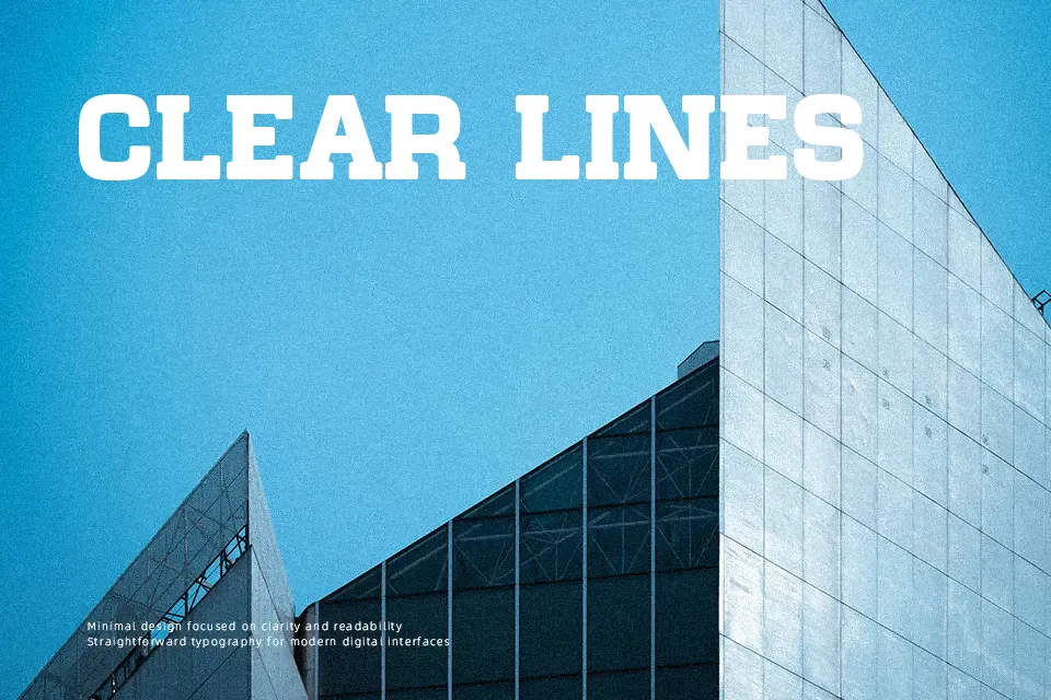
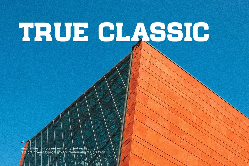
Chateau de Garage Font
Free for personal useAbout
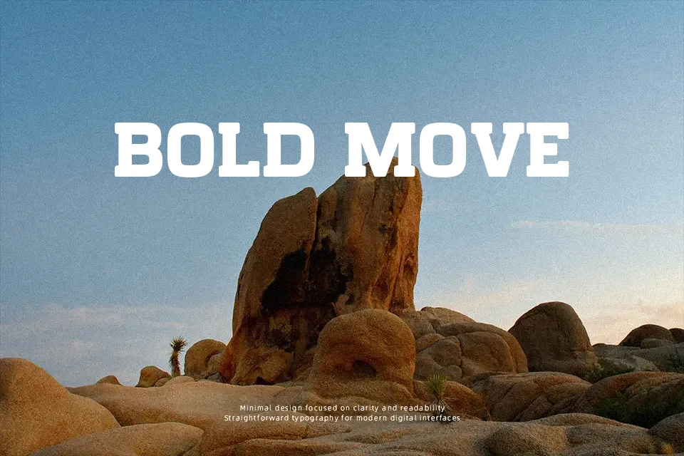
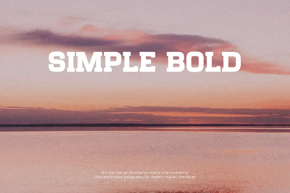
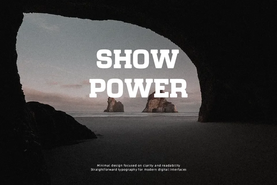
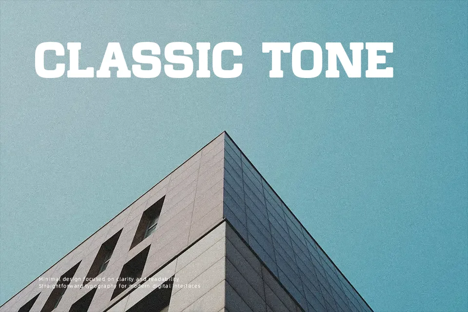
A distinct visual weight anchors Chateau de Garage Font, combining robust geometric slab serifs with gently rounded corners that soften its overall presence. The letterforms feature uniform stroke thickness, modest contrast, and generous proportions that ensure solid balance across uppercase characters. Tight horizontal spacing and substantial counters give titles an authoritative look suitable for craft brewery branding, poster headlines, and packaging layouts. However, the heavy strokes and close letter spacing significantly reduce legibility at small sizes, making the typeface unsuitable for extended body copy. Designers will find the font most effective when applied generously to bold, single-line display compositions.
Best For: vintage poster headlines, craft brewery packaging, apparel graphics, storefront signage
Not Ideal For: long paragraph text, mobile app body copy, small interface labels, legal documents
Perfect for branding, headline, and logo, with a bold and display style.
License
Gallery