Carlito Font
Free for Commercial UseAbout
Carlito carries the soft, humanist skeleton of Lato but follows Calibri’s metrics, so line breaks and page flow stay almost identical when you replace the default system font. Strokes are moderately low-contrast, apertures are open, and spacing is tuned for on-screen reading, which keeps dense text blocks legible without feeling mechanical. The family includes regular, bold, italic, and bold italic, enough to structure reports, slide decks, and interface text without juggling multiple typefaces. Visually, it sits in the same space as Calibri but feels a touch more neutral; that works nicely for software UIs, documentation, and enterprise templates, while being less convincing for highly expressive branding or character-driven logos.
Best For:
office-style documents and reports
presentation slides that need Calibri-compatible metrics
software UI text and dashboards
technical documentation and PDFs
Not Ideal For:
highly expressive logo design
ornate wedding or event stationery
playful kids products or toys
loud poster headlines that need strong personality
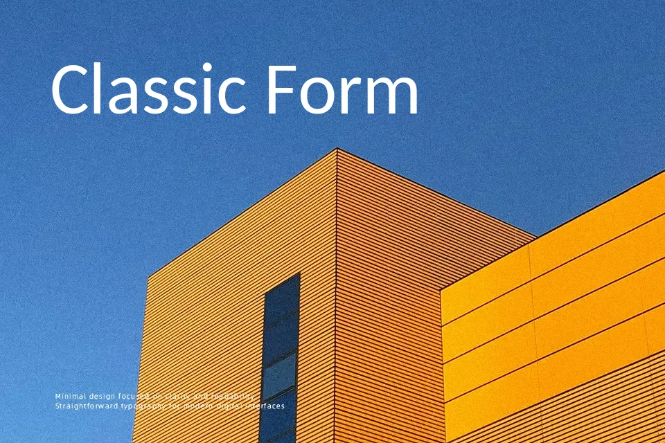
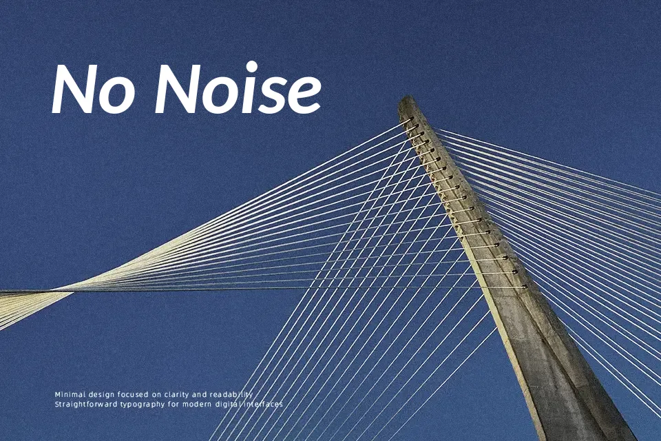
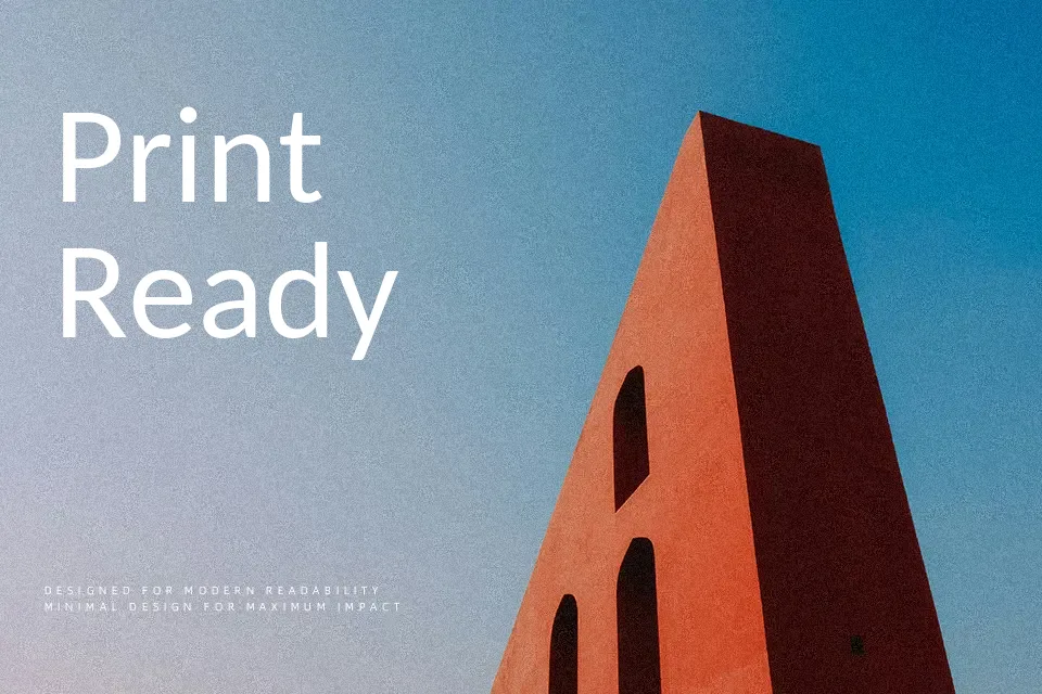
Perfect for body text, business card, and headline, with a calm and sans serif style.
License
Gallery