Caladea Font
Free for Commercial UseAbout
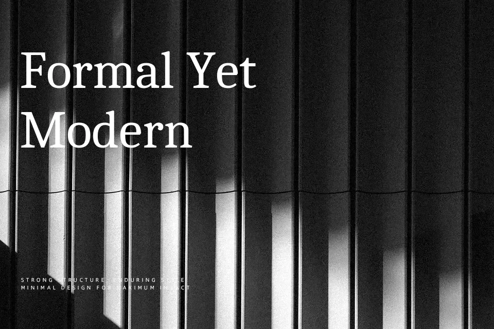
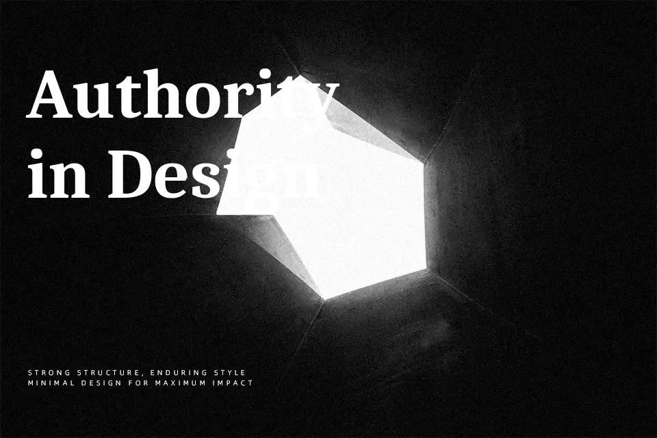
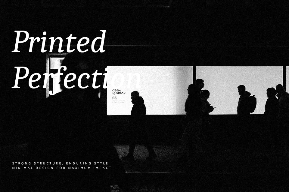
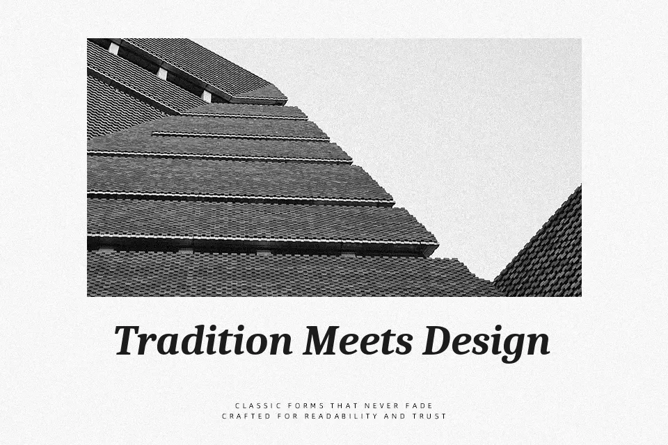
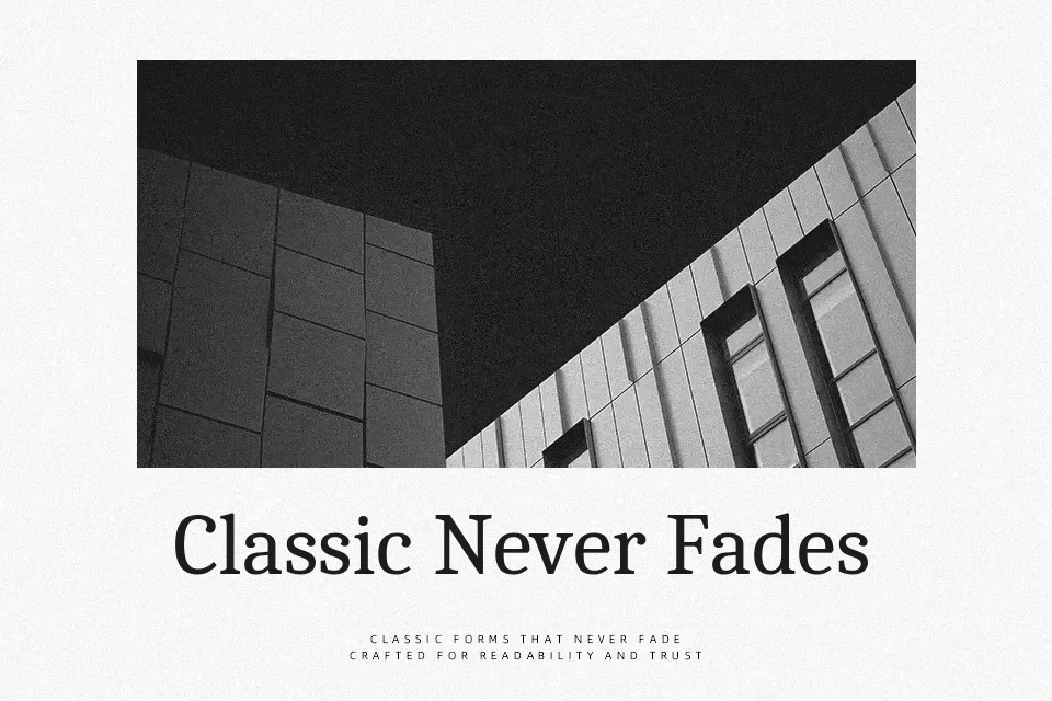
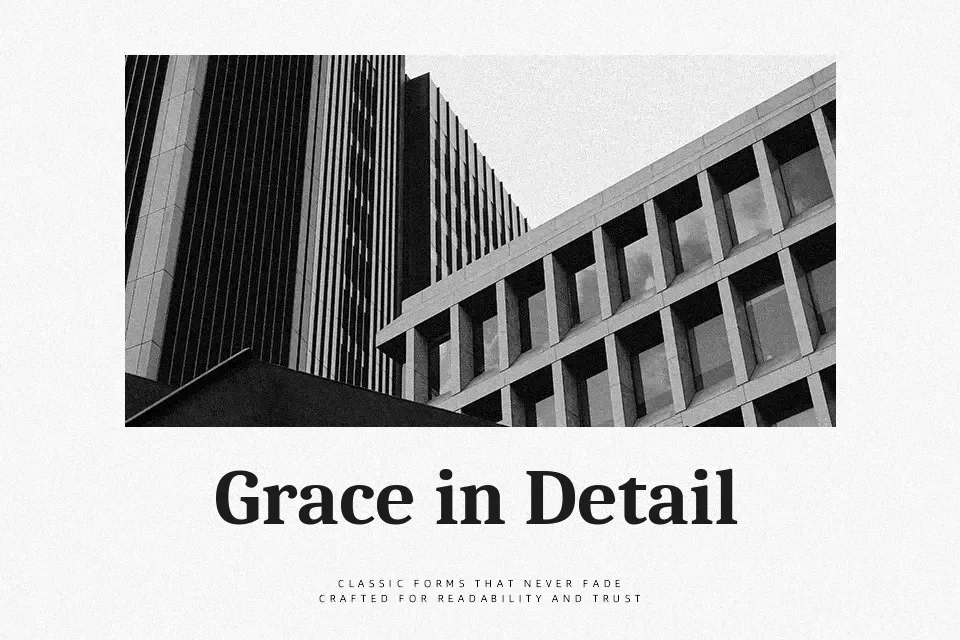
Caladea brings a compact serif structure with moderately high contrast, solid vertical stress, and relatively tight side bearings, which gives paragraphs a dense yet controlled texture. The curves feel soft and contemporary, so it reads less stiff than classic book serifs while still looking disciplined on the page. It comes in four styles—regular, bold, italic, and bold italic—which makes it practical for hierarchy in long-form reading, reports, and slide decks. Because the spacing is on the snug side and fine details thin out at very small sizes, it is better suited to body text from roughly 16 px upward and to confident headings rather than tiny captions or dense UI components. If you like the feel of Cambria but want something a bit more approachable and open, this family sits in that sweet spot.
Best For:
editorial body text
presentation decks and reports
approachable professional branding
education materials and handouts
Not Ideal For:
tiny UI labels or captions
very small legal text
highly ornamental display logos
Perfect for advertising, body text, and editorial, with a classic and serif style.
License
Gallery