Butterbrotpapier Font
Free for personal useAbout
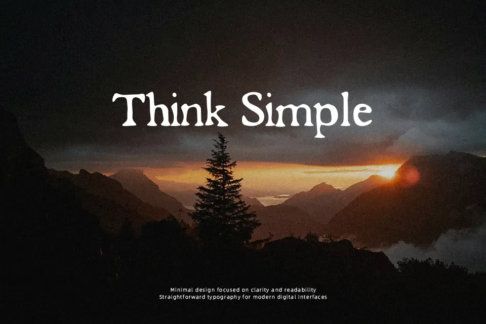
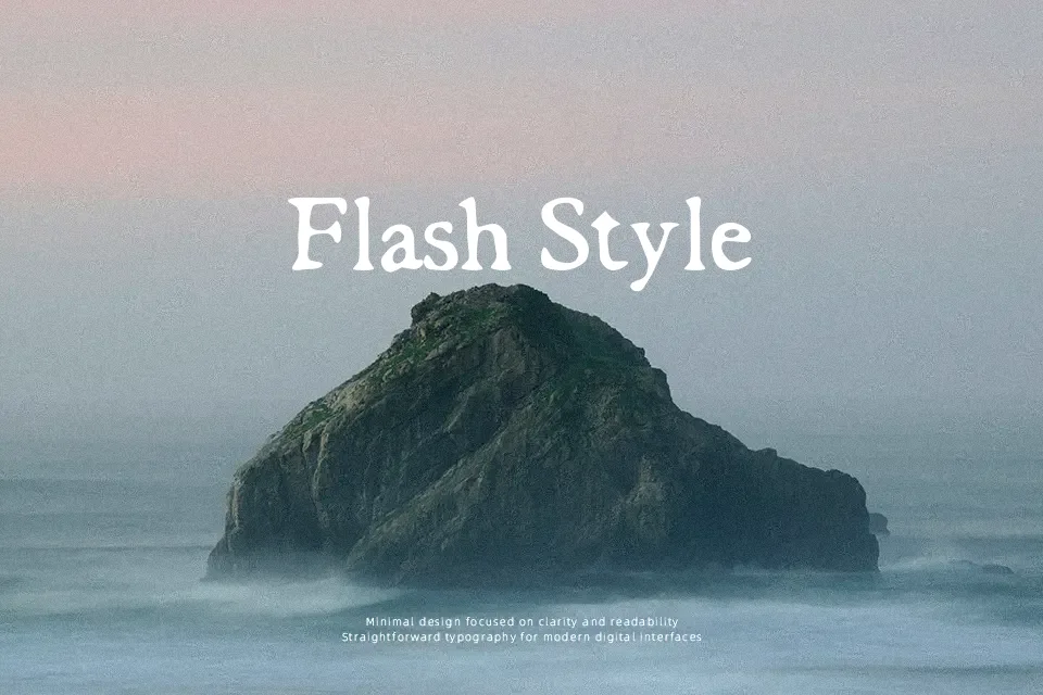
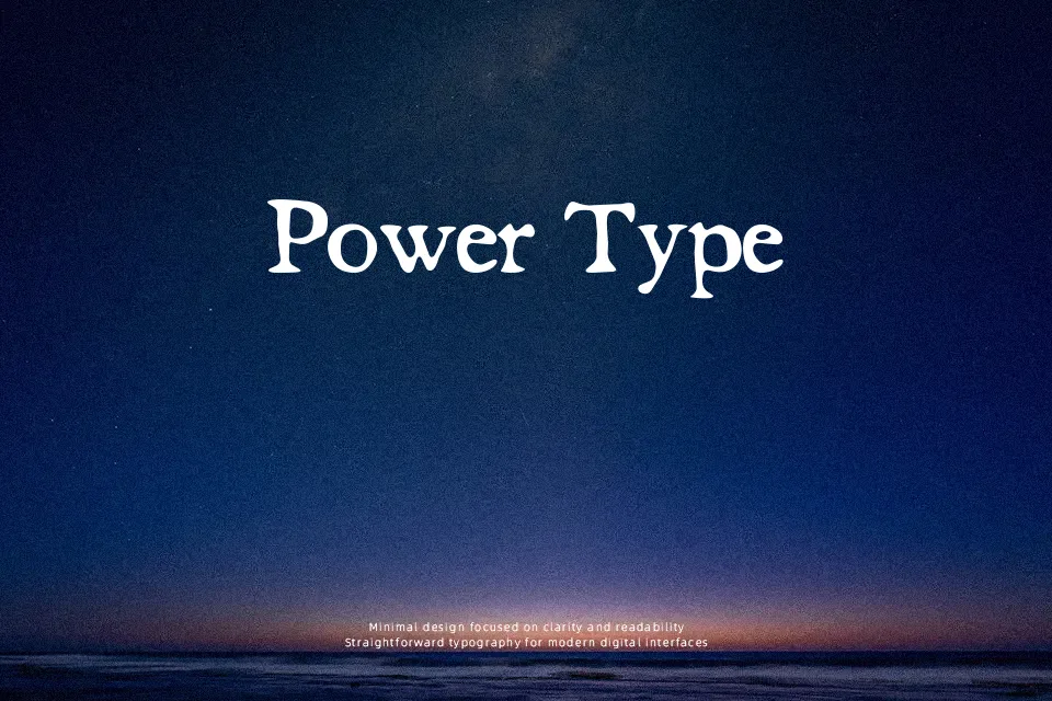
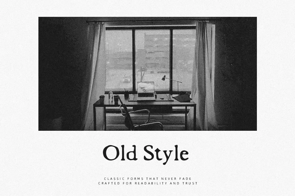
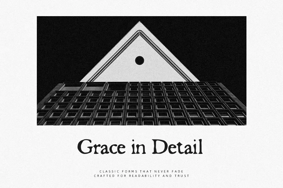
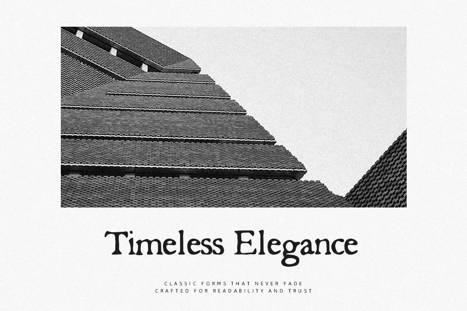
Butterbrotpapier looks like serif lettering scratched onto old paper: irregular outlines, slightly shaky verticals, and a distressed texture that makes every word feel weathered and tactile. The spacing is loose and inconsistent, so lines breathe but never look clean or corporate. It reads as decorative and a bit grunge, somewhere between a distressed typewriter and a hand-inked sign. This works nicely for headings on posters, DIY music artwork, underground event flyers, or packaging that leans into a rustic or alternative tone. It struggles in body copy, small sizes, or projects that demand strict legibility and a professional, neutral voice.
Best For:
Grunge or indie music posters and flyers
Rustic or handmade product labels and packaging
Zines, art books, or experimental editorial titles
Moody social media graphics and cover images
Not Ideal For:
Long paragraphs or small-size body text
Clean corporate branding or UI text
Formal editorial layouts or reports
Projects requiring strict accessibility and clarity
Perfect for headline, music, and packaging, with a artistic and decorative style.
License
Gallery