Brodille Font
Free for personal useAbout
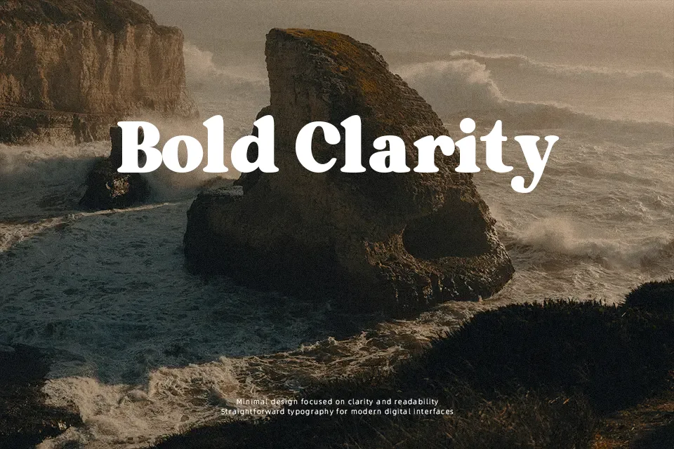
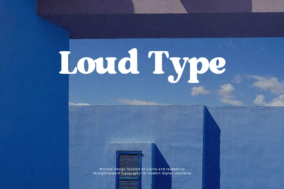
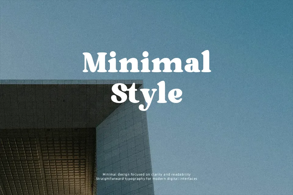
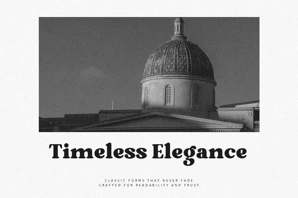
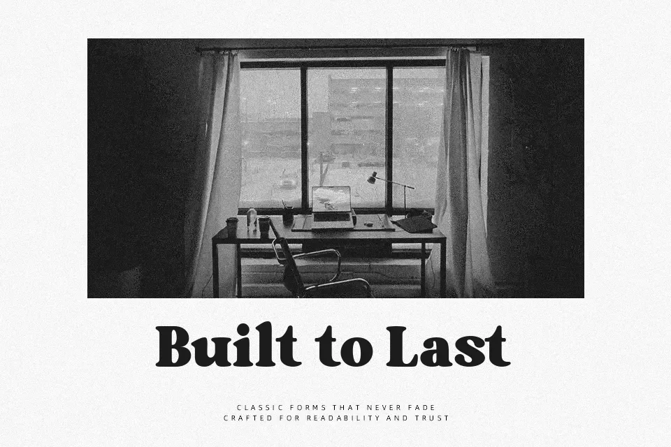
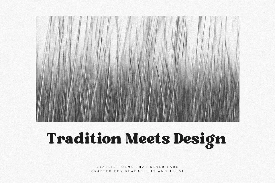
Brodille is a thick, high-contrast serif display face with compact spacing, blocky curves, and confident verticals that immediately push text into the foreground. The shapes feel like a blend of 80s fashion mastheads and vintage poster lettering, so every word carries a bit of attitude rather than sitting quietly in the layout. I find it works best when you let it shout in large sizes for logos, magazine or music covers, thumbnails, and bold social graphics, and pair it with a calmer sans or serif for any supporting copy. It struggles in dense paragraphs or small UI elements, where the heavy weight and stylized serifs start to feel cramped and tiring to read.
Best For:
Large retro-style headlines and titles in posters or print layouts
Logo and wordmark exploration for fashion, music, or creative brands with a nostalgic edge
Cover designs for magazines, albums, or thumbnails that need a loud vintage focal point
Not Ideal For:
Long body text or editorial layouts that require comfortable continuous reading
Small UI labels, buttons, or captions where heavy forms lose clarity
Very minimal or neutral brand systems that avoid strong retro character
Perfect for branding, headline, and logo, with a artistic and display style.
License
Gallery