Brixton Wood Font
Free for personal useAbout
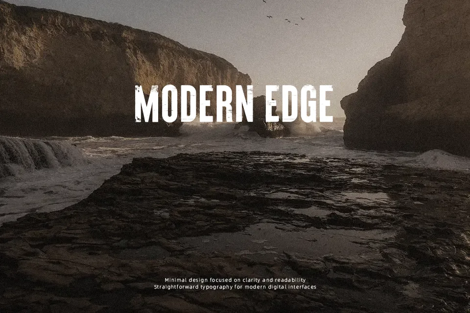
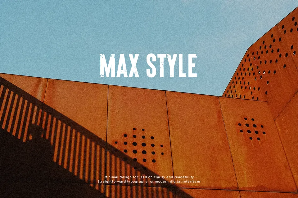
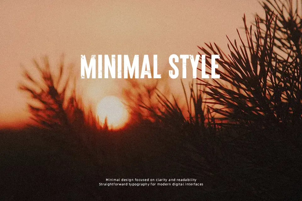
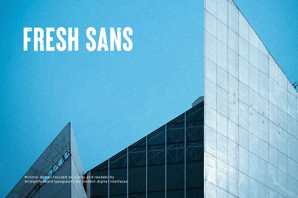
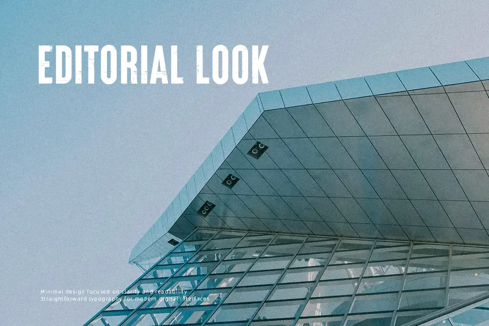
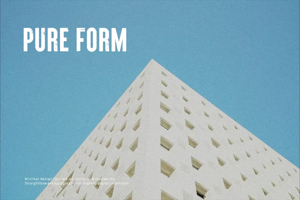
Brixton Wood pushes heavy all-caps forms through a distressed wooden texture, so strokes feel chunky, rough, and tactile rather than smooth or polished. The spacing is fairly tight and blocky, which makes words lock together into solid, poster-like shapes instead of airy text lines. Overall it reads as a decorative, hand-printed display face with a vintage letterpress tone, not something you’d set long paragraphs in. It works well when you need one or two powerful words on a cover, label, or social graphic, especially for rustic brands, music artwork, or craft-focused projects. If your layout needs small sizes, clean interfaces, or subtle editorial body copy, this font will likely feel too rough and heavy-handed.
Best For:
rustic branding wordmarks and badges
bold poster or flyer headlines with texture
album covers and merch for rock or indie music
packaging for craft goods or handmade products
Not Ideal For:
body text or long reading passages
small UI labels or app interfaces
formal corporate reports or presentations
minimalist layouts that rely on clean lines
Perfect for branding, headline, and logo, with a artistic and decorative style.
License
Gallery