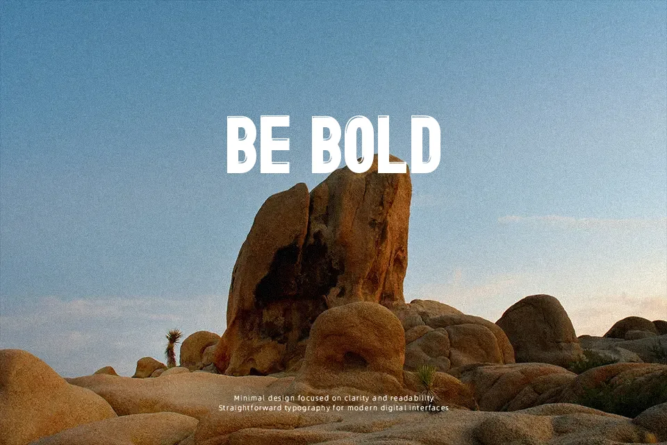
Brillante St Font
Free for personal useAbout
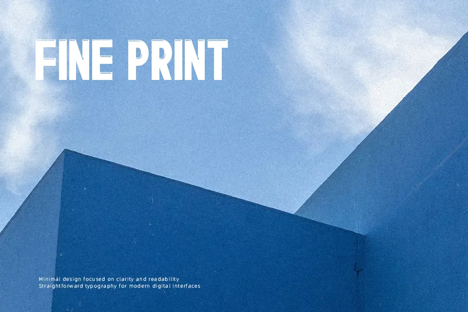
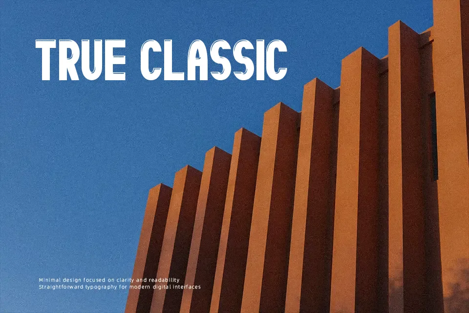
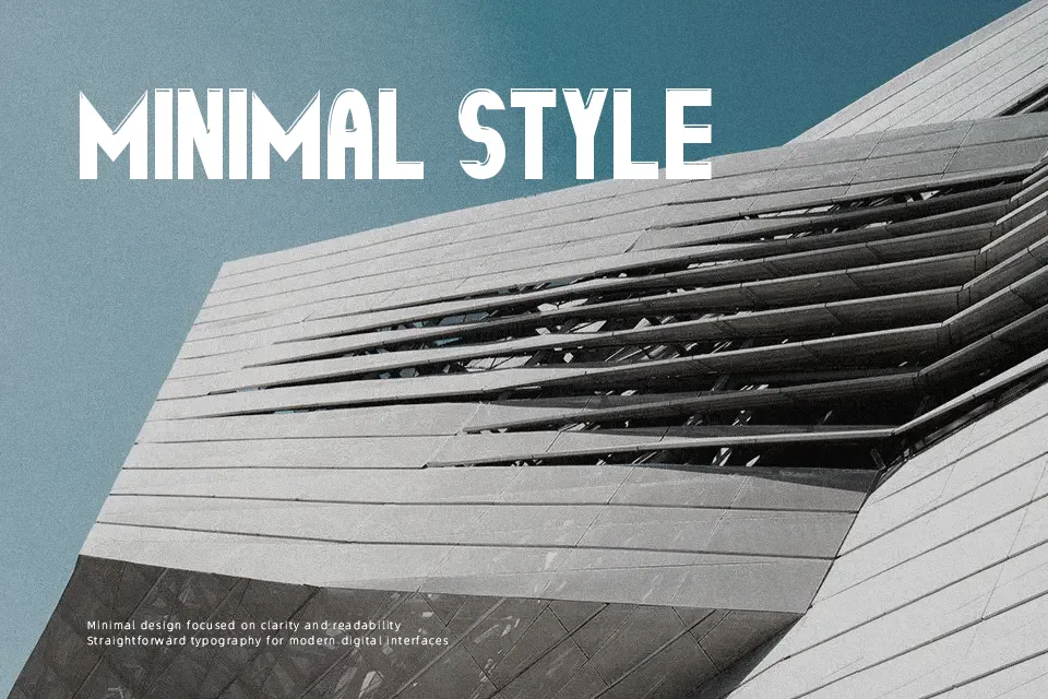
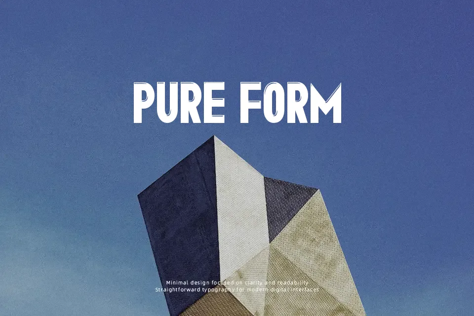
Brillante St leans into thick, condensed letterforms with a subtle shadowed feel, so lines look dense and commanding even in a narrow space. The strokes are heavy, spacing is tight, and everything is built around uppercase structure, which gives it a punchy, blocky rhythm on the page. Visually it sits in the decorative display family, but with a modern, straightforward attitude rather than ornate flourishes. In practice it works well when you let it shout: posters, bold logo wordmarks, or title cards that can tolerate reduced legibility at small sizes. It is far less convincing when used for long paragraphs, subtle editorial layouts, or tiny UI labels where its weight and compression quickly become tiring to read. If you like strong geometric display faces, this feels like a slightly denser, more shadowed cousin of other bold caps fonts.
Best For:
bold poster headlines and banners
compact logo wordmarks that need strong impact
branding for sports, music, or entertainment events
short, high-contrast social media graphics
Not Ideal For:
body copy or long reading text
small UI labels or app interfaces
formal editorial layouts needing nuance
minimalist brands that favor quiet typography
Perfect for branding, headline, and logo, with a bold and decorative style.
License
Gallery