Bracille Font
Free for personal useAbout
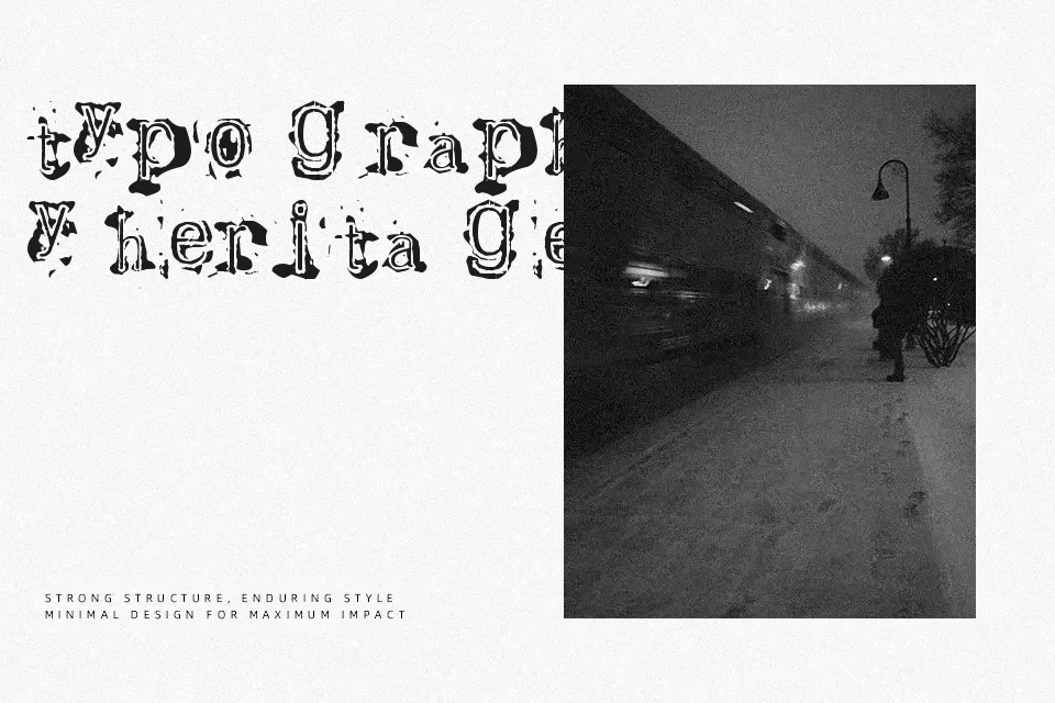
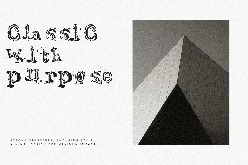
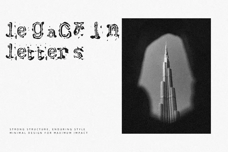
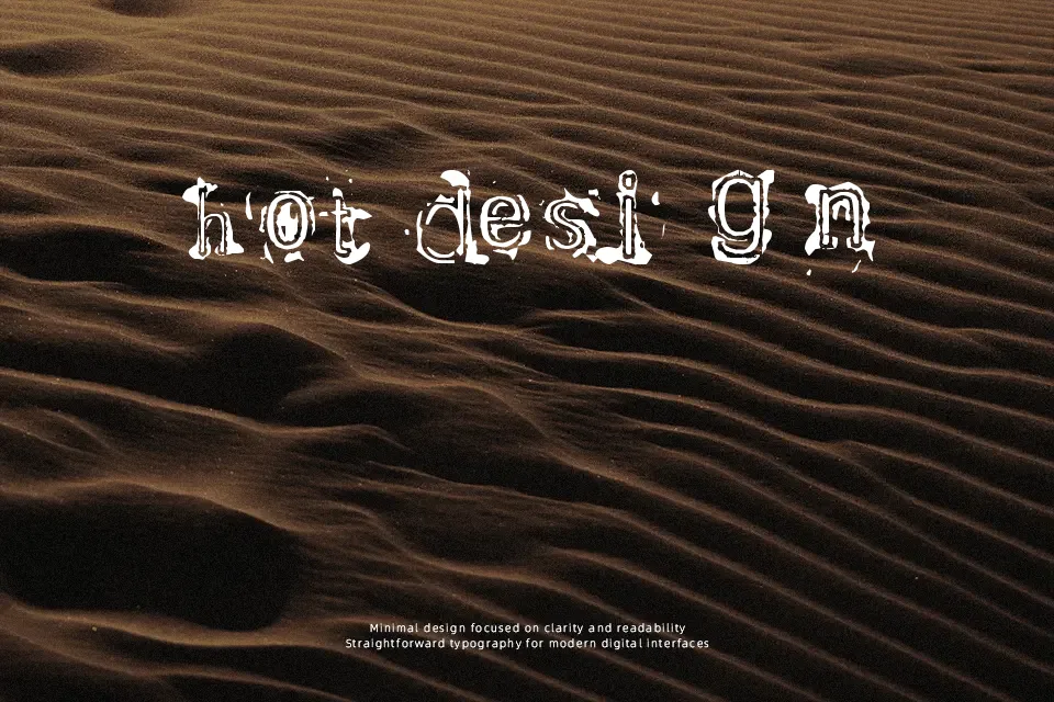
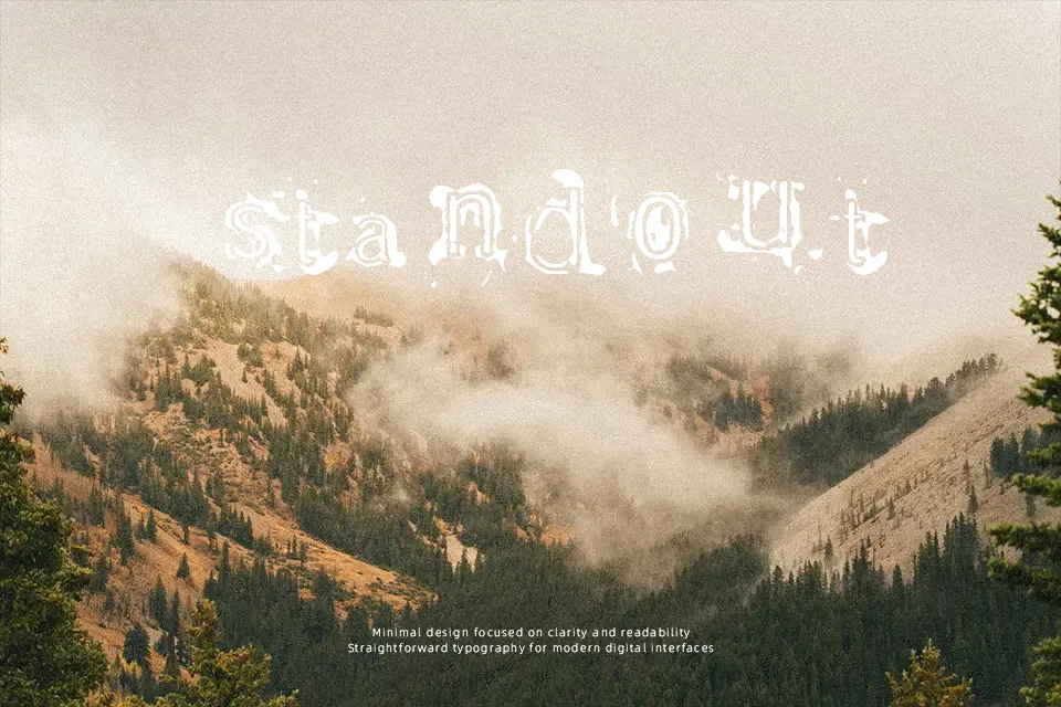
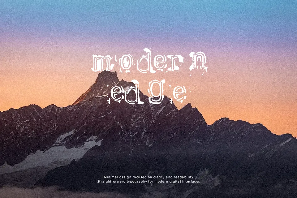
Bracille is a strong display serif with thick strokes, blocky proportions, and slightly irregular outlines that read as worn ink on old typewritten pages. The spacing is fairly tight, especially in uppercase, which helps headlines feel compact and forceful rather than airy. Overall it carries a retro, grunge-leaning look that feels more rugged than elegant, so it works when you want texture and attitude rather than clean neutrality. It shines on logos, posters, gig flyers, labels, or cover art where the font is the main graphic element, but it becomes heavy and tiring in long paragraphs or small sizes. If you’re torn between a clean slab serif and a distressed display face, Bracille sits squarely on the gritty side of that spectrum.
Best For:
retro logo wordmarks and badges
posters or flyers for music and events
vintage-style labels and packaging
bold headlines on album or book covers
Not Ideal For:
long editorial body text or UI copy
projects needing a clean, corporate tone
small-size captions where fine details matter
Perfect for branding, logo, and music, with a artistic and display style.
License
Gallery