Box Lines Font
Free for personal useAbout
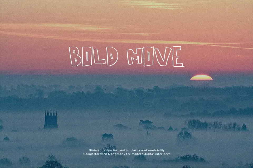
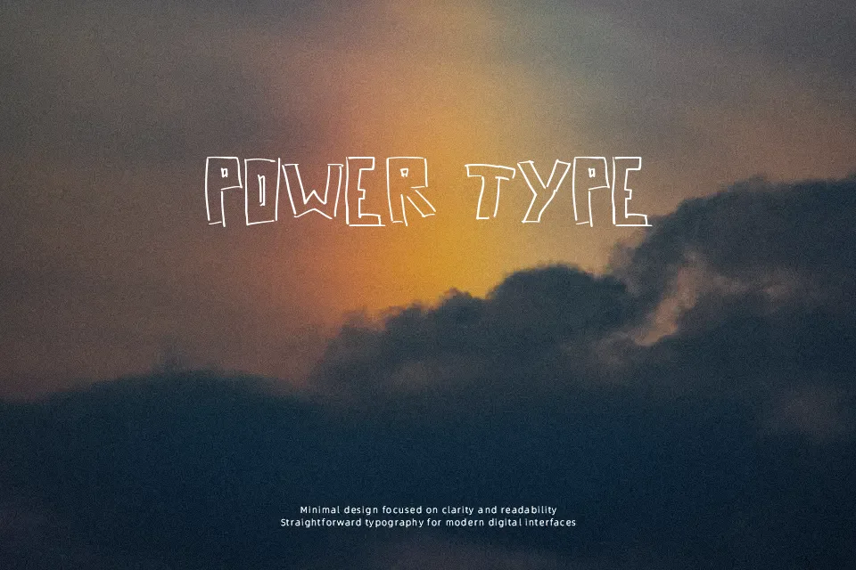
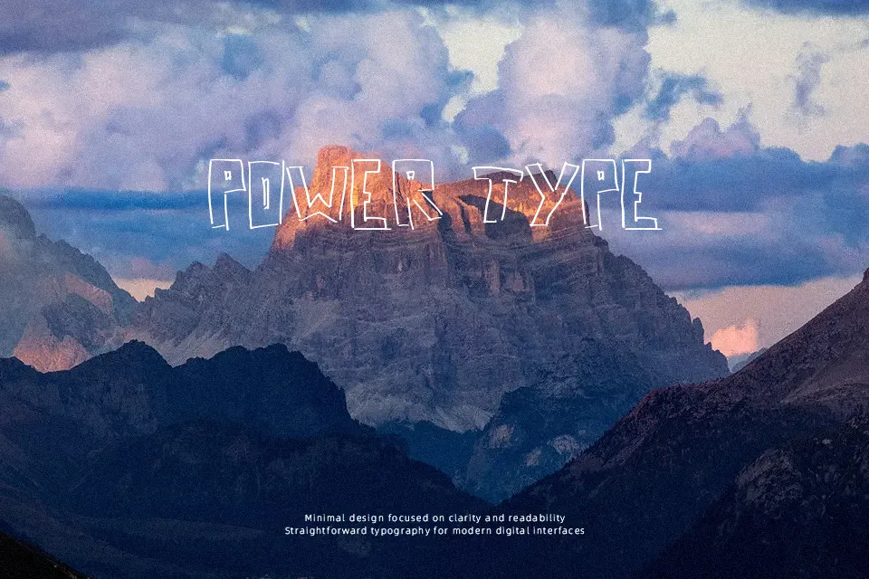
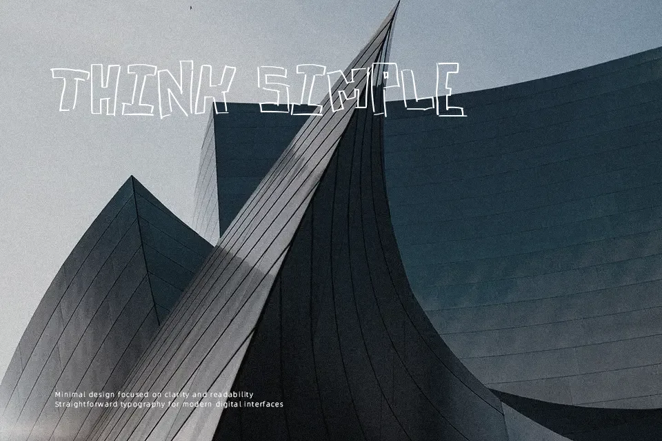
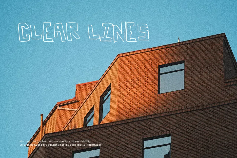
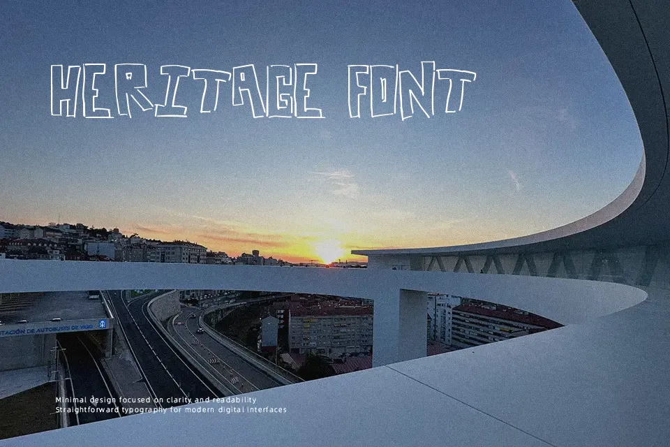
Box Lines Font draws each character with loosely constructed rectangular outlines, so letters feel rough, hand-drawn, and a little unstable rather than mechanically precise. Strokes are uneven, gaps appear between lines, and spacing can feel jittery, which creates a noisy, energetic rhythm in words. The overall impression leans decorative and cartoonish, closer to a doodled title than a traditional display face. It shines when you want headlines that look messy on purpose—zine covers, low-fi flyers, DIY event posters, or graphics for quirky gaming channels. In long reading or small sizes, the broken outlines become visual clutter and legibility drops quickly. If you need a clean, professional voice, this one is better kept for accent text instead of core branding.
Best For:
Playful event posters and flyers
DIY zines and photocopied artwork titles
Edgy YouTube or gaming thumbnails
Short, attention-grabbing headlines in graphics
Not Ideal For:
Body copy or dense paragraphs
Formal corporate branding or reports
Small-size text on mobile interfaces
Clean, minimalist editorial layouts
Perfect for advertising, gaming, and headline, with a artistic and cartoon style.
License
Gallery