Bona Nova Font
Free for Commercial UseAbout
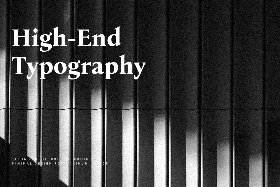
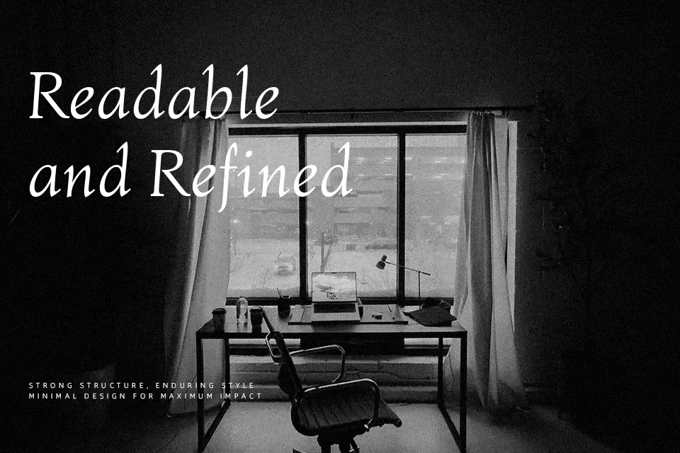
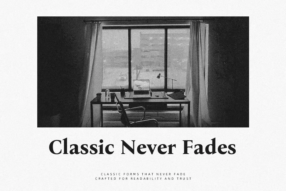
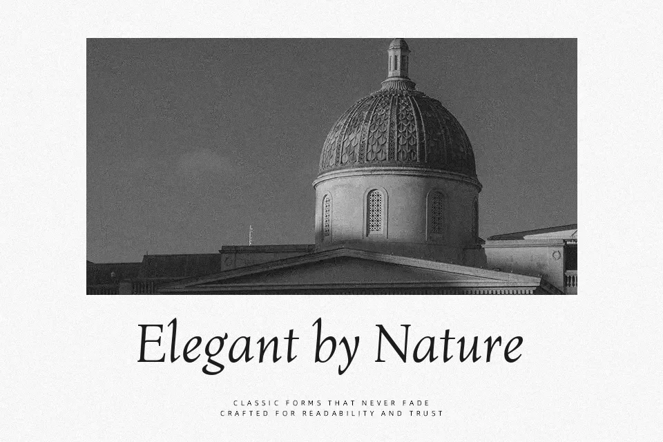
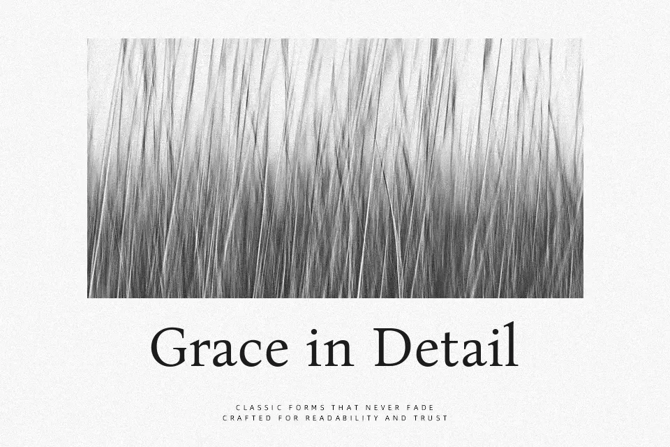
Bona Nova takes the bones of a traditional Roman serif and softens them with subtly organic curves, moderate contrast, and slightly compact letterforms, so text feels composed rather than stiff. The serifs stay crisp enough for small body sizes, while the rhythm of the strokes holds together nicely in multi-column layouts and long-form reading. In headings, the capitals have enough personality to carry book covers, museum posters, or identity work for institutions that want to look cultured without sliding into nostalgia. I tend to avoid it for hyper-minimal tech products or ultra-loud, experimental graphics; its voice is more literary than futuristic, and it works best when you let it speak at a measured pace.
Best For:
editorial layouts
book covers and interiors
cultural or institutional branding
long-form web articles
Not Ideal For:
ultra-modern tech interfaces
highly expressive display lettering
very small UI labels
aggressive streetwear graphics
Perfect for body text, branding, and editorial, with a calm and serif style.
License
Gallery