Blinders Font
Free for personal useAbout
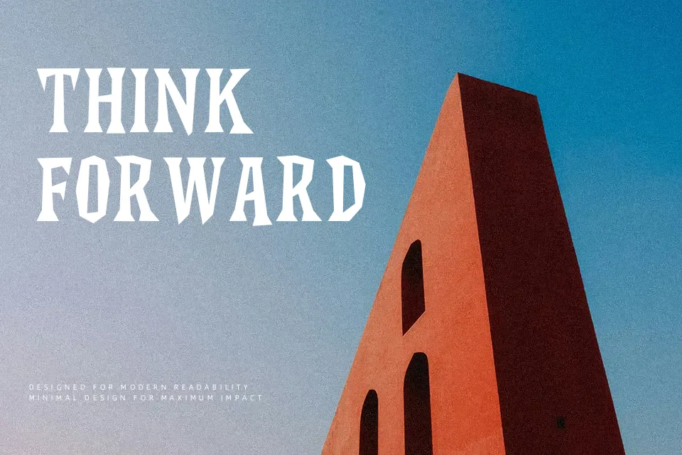
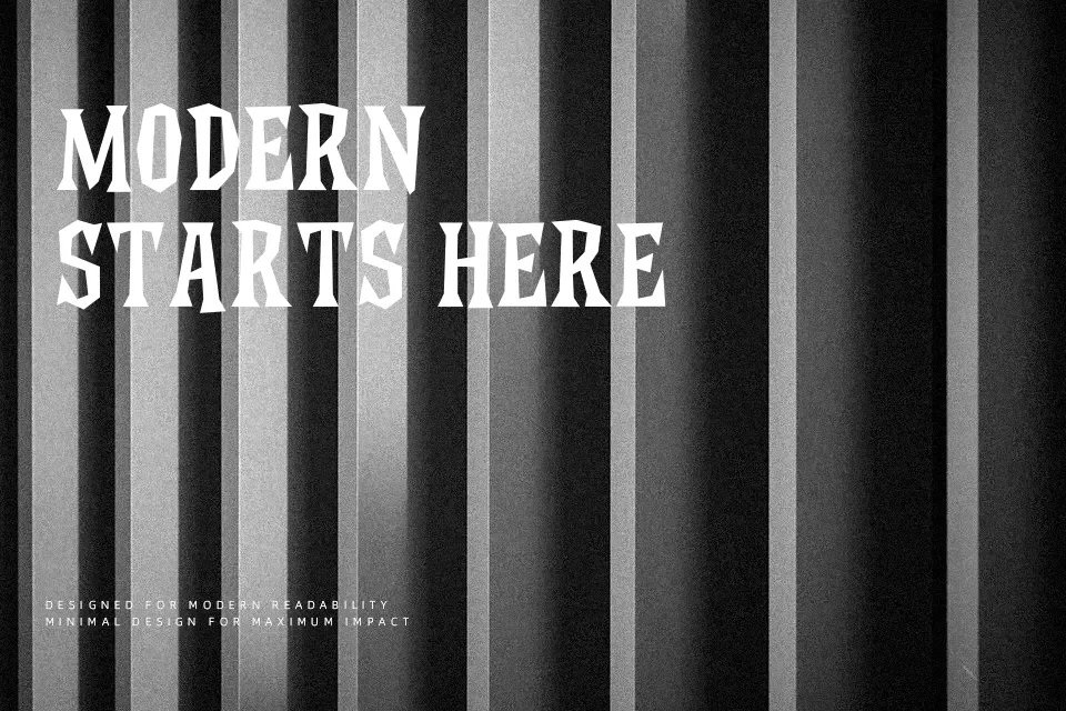
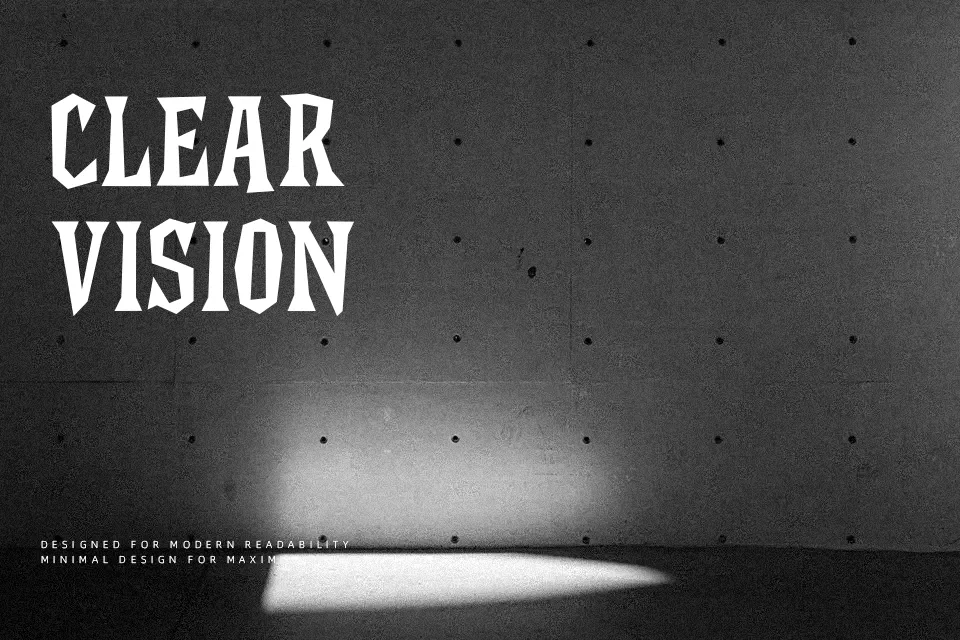
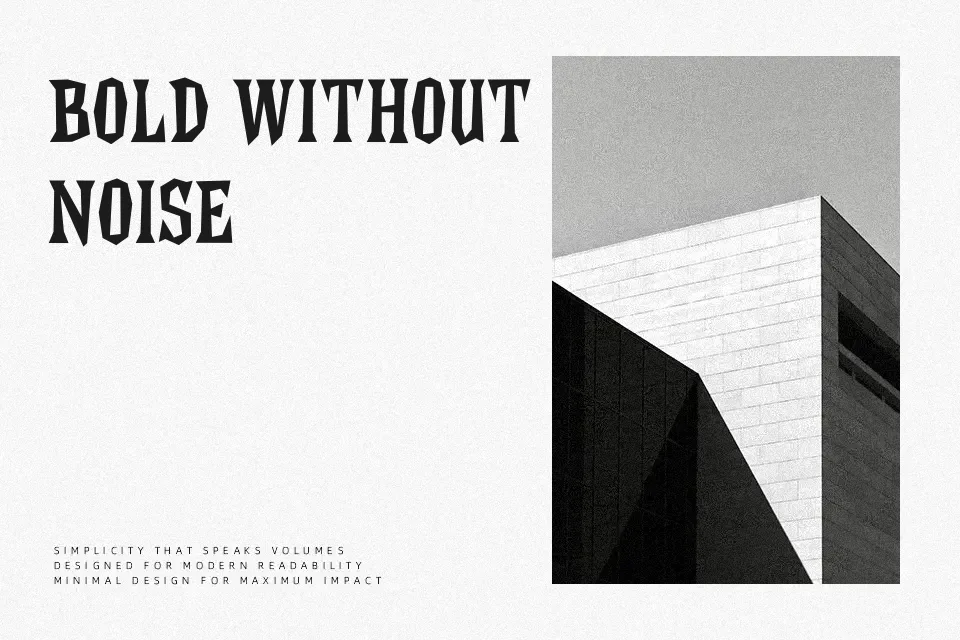
Blinders Font leans toward a retro sans serif look with a tidy structure, straightforward strokes, and a display-first presence that reads best at larger sizes. Its style feels polished rather than playful, so it works nicely for logo concepts, packaging titles, posters, and editorial headers that want a vintage tone without heavy decoration. I would use it when a layout needs character but still has to stay controlled. I would skip it for long reading text or dense UI copy, where a more neutral text face will hold up better.
Best For:
logo concepts,poster headlines,branding mockups,packaging titles
Not Ideal For:
body text,small UI labels,dense paragraphs,formal documents
Perfect for branding, headline, and logo, with a clean and display style.
License
Gallery