Bench Grinder Titling Font
Free for Commercial UseAbout
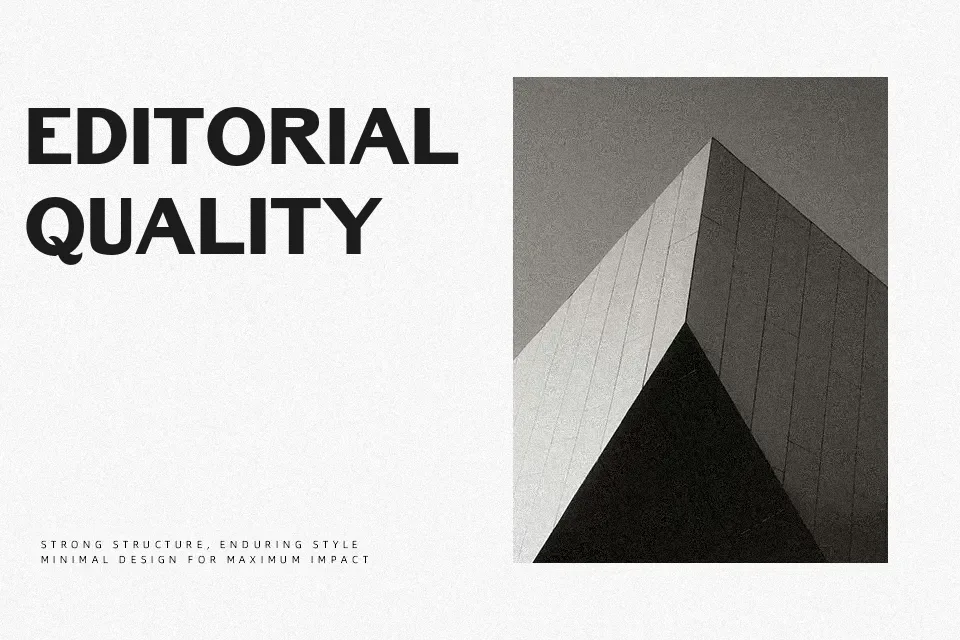
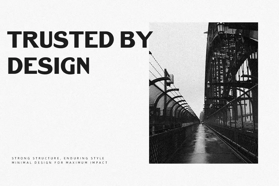
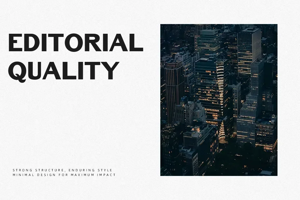
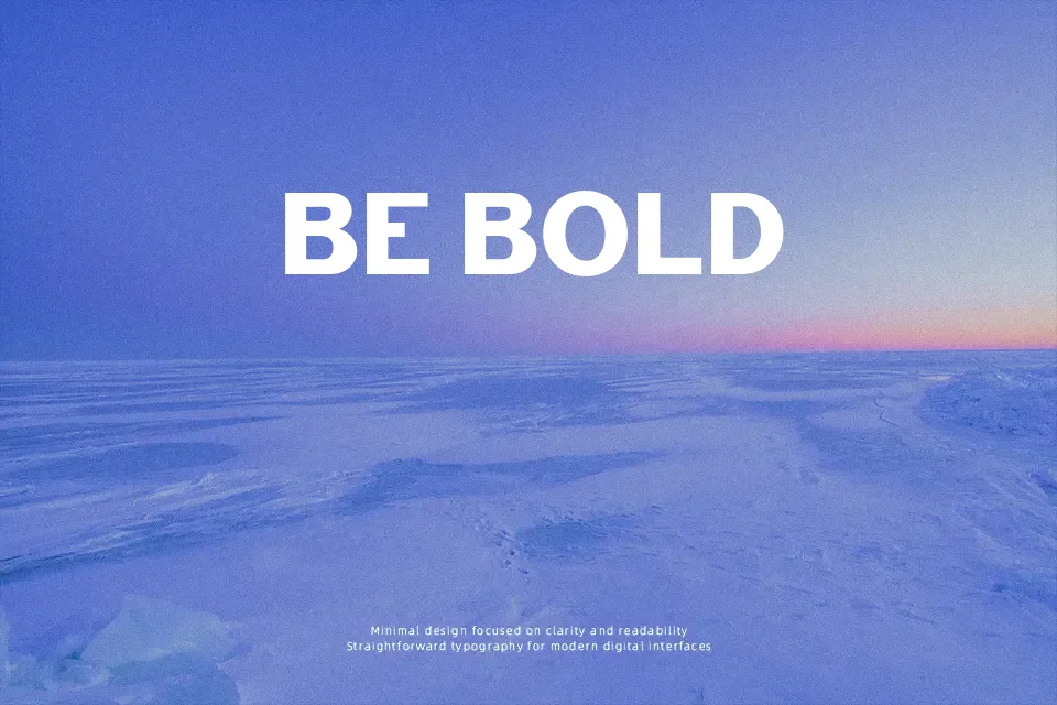
There’s a deliberate roughness to Bench Grinder Titling — and that’s exactly the point. Built on all-caps, blunt-edged strokes inspired by 19th-century metal headline type with the serifs filed clean off, the letterforms carry a compact, industrial weight that hits hard at display sizes. The spacing is tight, the structure unrefined by design, giving posters, album covers, and packaging an unvarnished credibility that over-polished typefaces can’t fake. Works especially well when the visual message needs edge — think hard rock merchandise, underground event flyers, or bold print campaigns. Where it stumbles: anything requiring lowercase body text or a refined, corporate tone will expose its limitations fast. Not every project calls for grit, and forcing this font into polished brand identities tends to look out of place.
Best For:
– Gig posters and music event headlines
– Hard rock or streetwear brand logos
– Bold packaging that leans industrial or vintage
– Sports and action-themed editorial headers
Not Ideal For:
– Long-form body text or paragraphs
– Corporate reports or professional business materials
– Feminine or luxury branding
– Any design requiring a lowercase character set
Perfect for branding, headline, and logo, with a bold and condensed style.
License
Gallery