Belle Epoque Font
Free for Commercial UseAbout
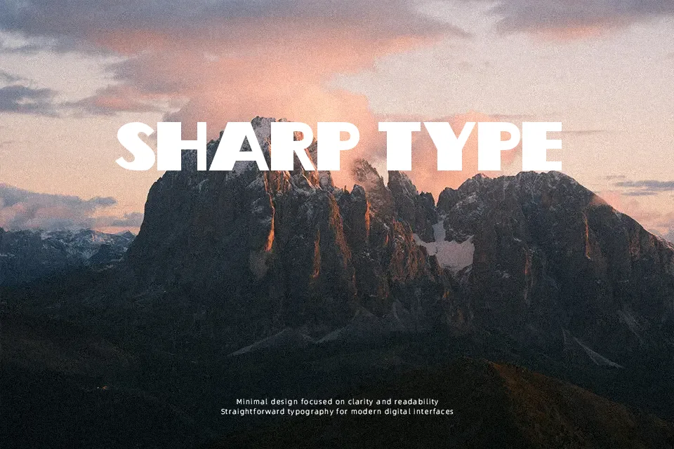
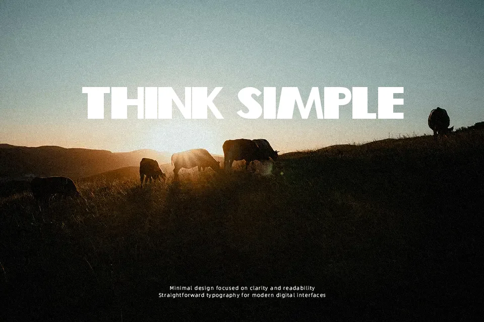
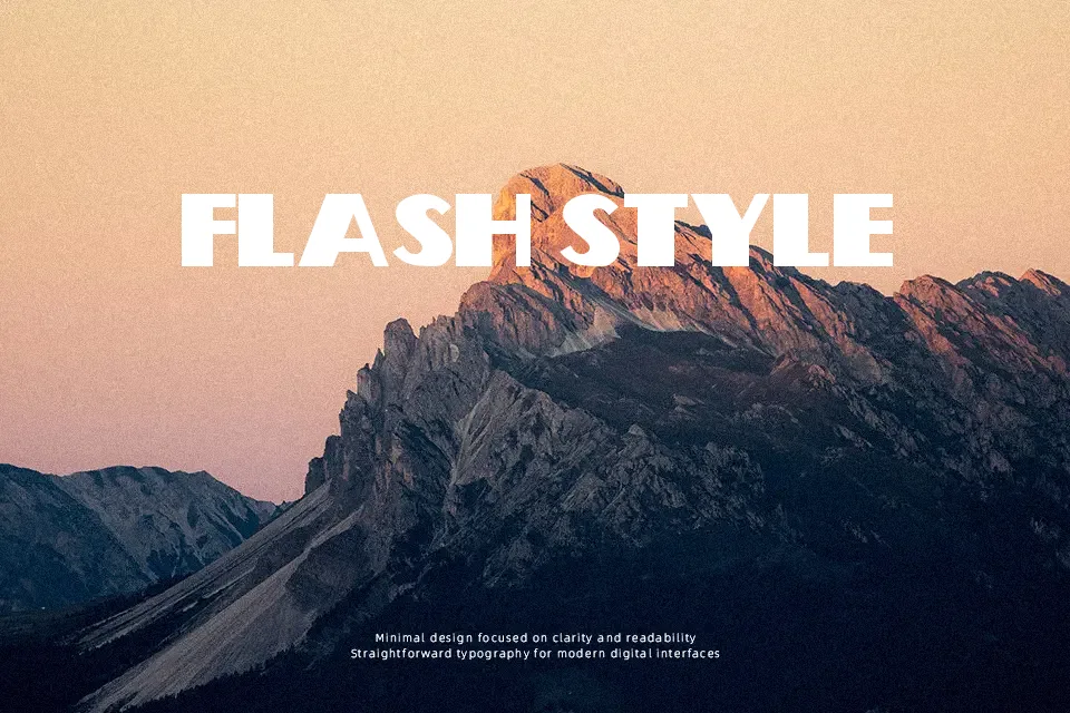
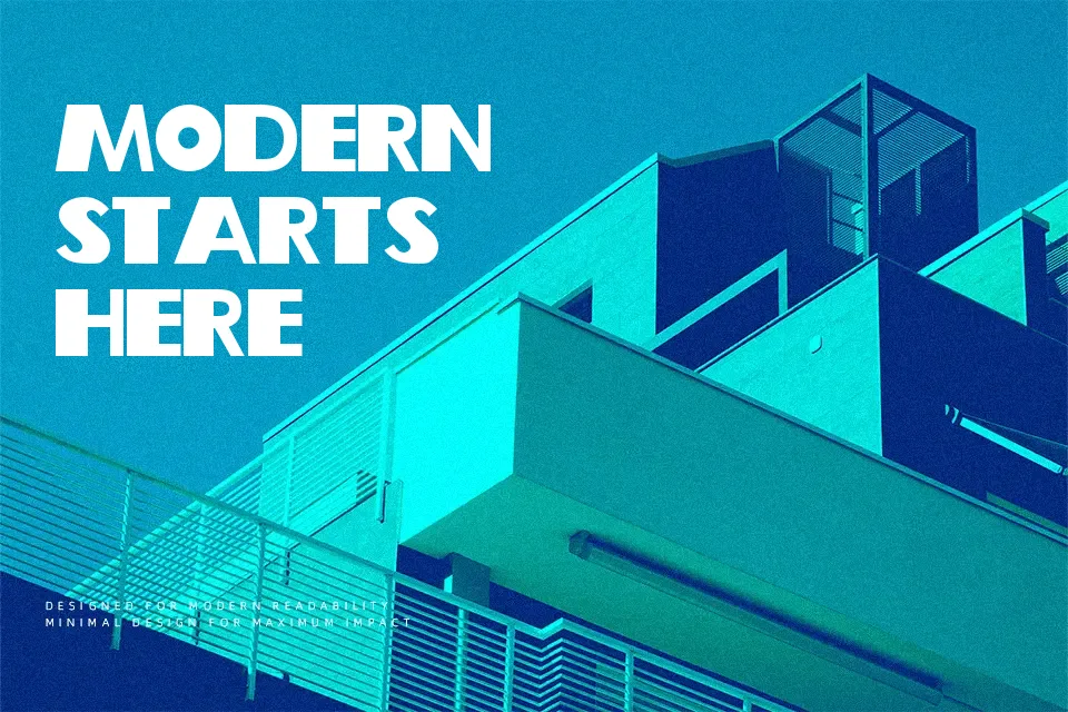
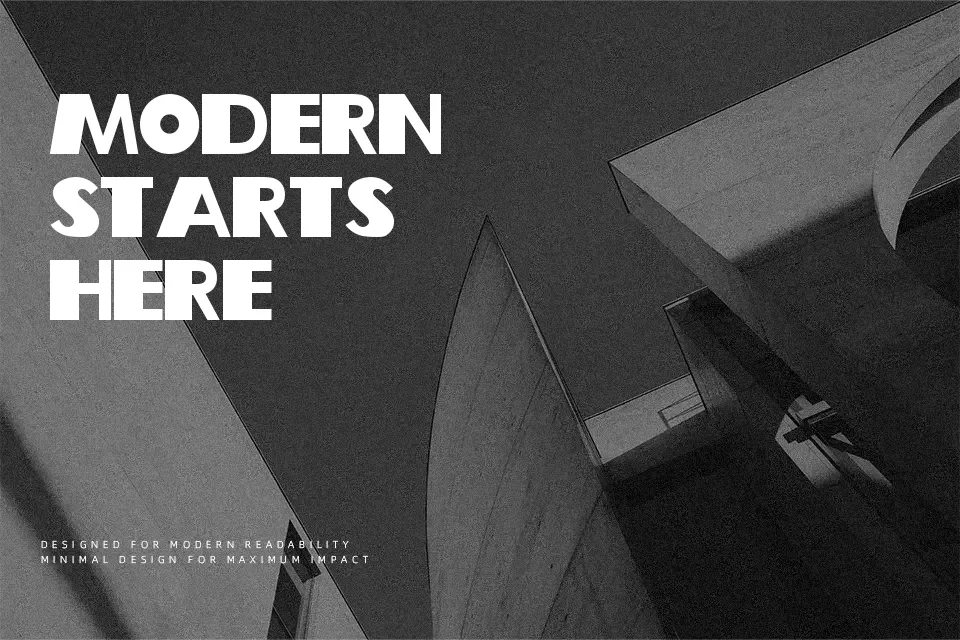
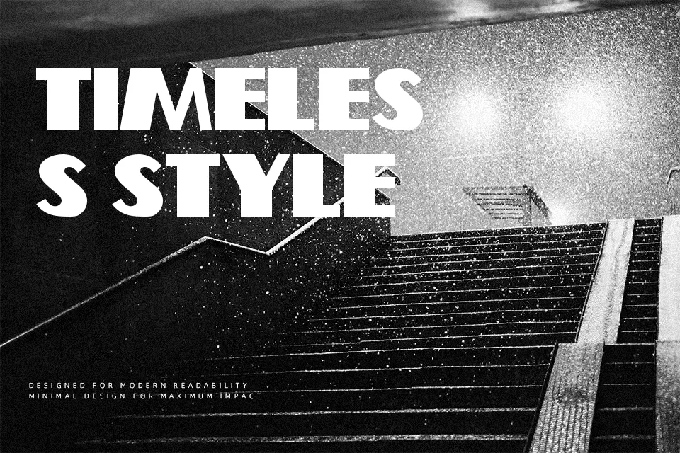
Woodcutter’s Belle Epoque carries a heavy, even stroke weight across semi-expanded letterforms — no dramatic thick-thin contrast, no flourish — just a composed, assertive presence. The characters land somewhere between Art Deco geometry and blunt display confidence, making it a solid pick for vintage poster headers, boutique logo lockups, and editorial pull quotes that need to fill space with authority. Uppercase letters are the real strength here; they hold visual weight well at large sizes. However, the font ships with partial accent coverage, which can create inconsistencies in multilingual layouts. It also loses its impact at small sizes — this is not a font built for body copy or UI labels. If you’ve worked with similar bold retro display faces, expect comparable readability tradeoffs: striking in bursts, tiring in volume.
Best For:
– Retro poster or event flyer headlines
– Boutique brand or logo wordmarks
– Restaurant or café menu section headers
– Packaging labels with a vintage aesthetic
Not Ideal For:
– Long-form body text or paragraph copy
– Multilingual designs requiring full accent character sets
– Corporate or formal professional documents
– Small-scale UI labels or captions
Perfect for branding, headline, and logo, with a bold and decorative style.
License
Gallery