Bebas Neue Font
Free for Commercial UseAbout
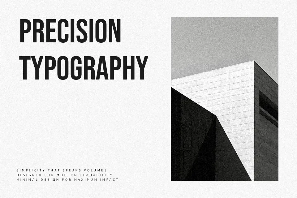
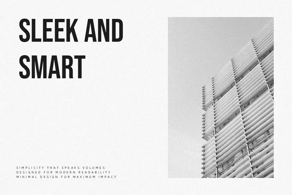
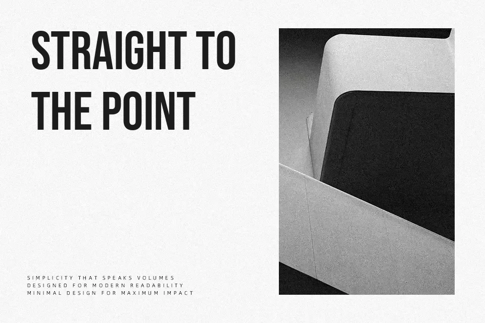
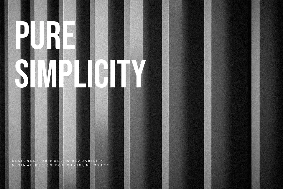
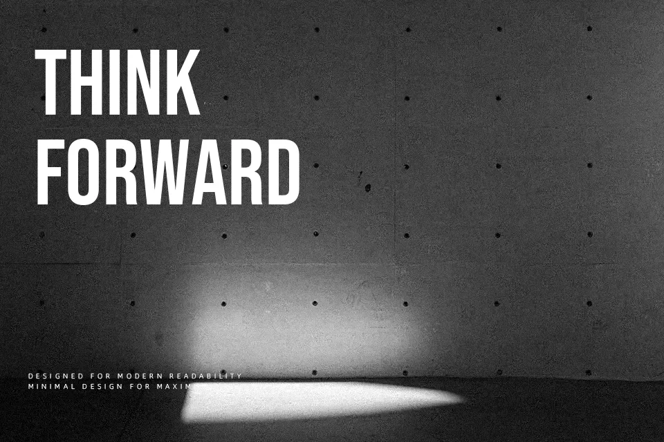
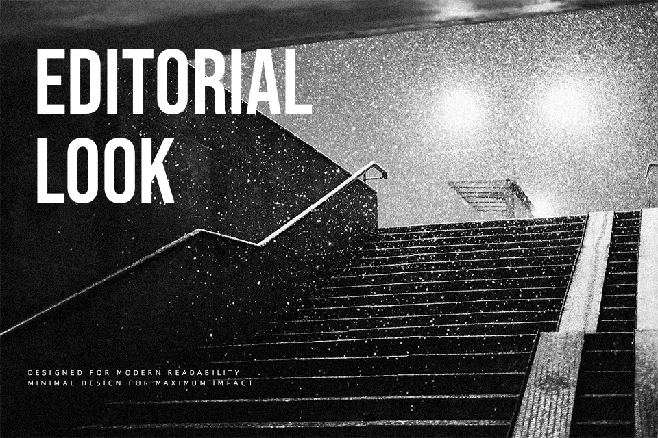
Bebas Neue leans on narrow, uppercase shapes, even stroke widths, and tight spacing to create a strong, vertical rhythm that immediately feels structured and modern. The design is straightforward and unadorned, with no unnecessary curves, which keeps large words surprisingly legible even at extreme sizes. I tend to use it when a project needs punchy, graphic headlines—think streetwear branding, YouTube thumbnails, banner ads, or menu boards where hierarchy has to be obvious at a glance. However, its condensed all‑caps construction can feel harsh or monotonous in long copy, body text, or highly formal editorial layouts, so pairing it with a more relaxed text face usually produces a better reading experience.
Best For:
bold headlines
poster layouts
logo wordmarks
packaging titles
Not Ideal For:
long paragraphs
formal documents
dense editorial text
small UI labels
Perfect for advertising, branding, and headline, with a bold and condensed style.
License
Gallery