Bar Booth at Matts Font
Free for personal useAbout
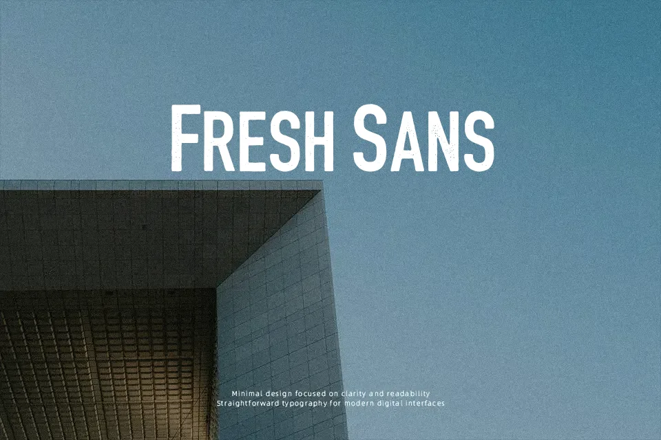
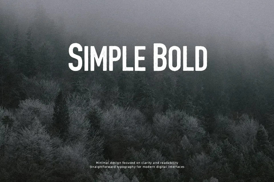
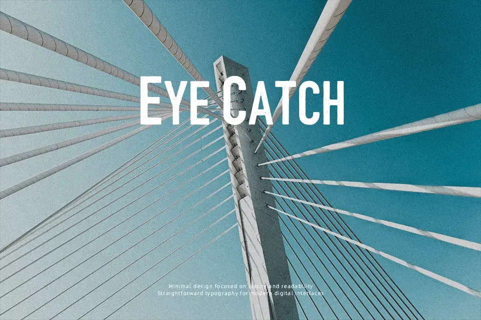
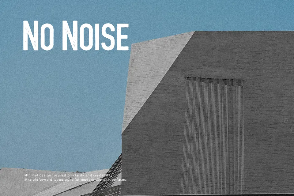
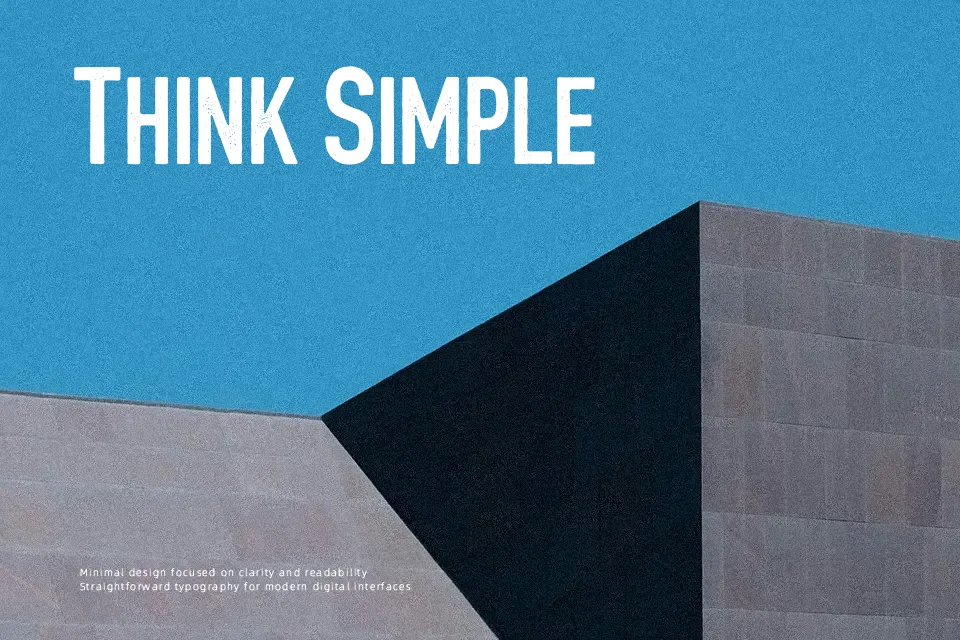
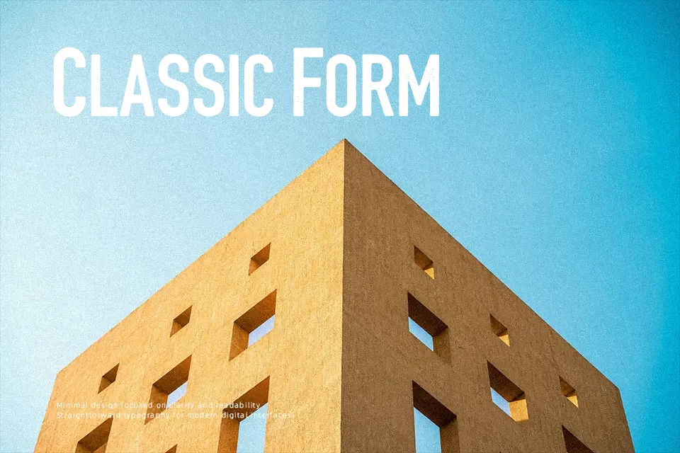
Every letterform in Bar Booth at Matts carries the wear of something lived-in. The font is a stressed small-caps display face — thick strokes, eroded edges, and tight caps spacing that feels pulled straight off a venue wall or dive bar chalkboard. Designed for high-resolution output, it holds up well in large-format print: band posters, event flyers, pub signage, even craft brewery labels where roughed-up texture adds authenticity. The catch is real: there are no true lowercase letters — only small caps — which means you lose expressive hierarchy and can’t mix weights naturally in body copy. It works best when the entire composition leans into a single loud statement, not when a layout requires tonal variety across heading levels.
Best For:- Band and concert poster headers
– Pub or craft brewery menu titles
– Vintage event signage and flyers
– Music venue or bar branding
Not Ideal For:- Long-form body text or paragraphs
– Corporate or professional business documents
– Designs requiring mixed case typographic hierarchy
– Digital UI or small-screen applications where distress detail degrades
Perfect for advertising, branding, and music, with a bold and display style.
License
Gallery