Baloo Chettan 2 Font
Free for Commercial UseAbout
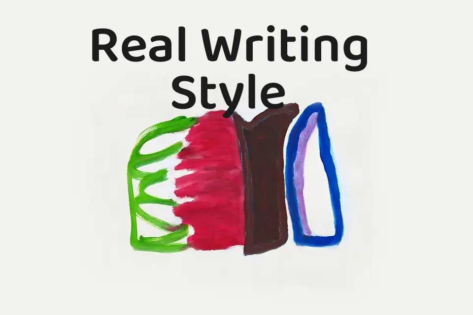
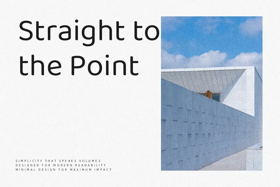
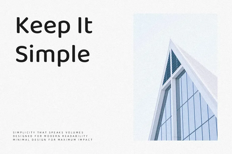
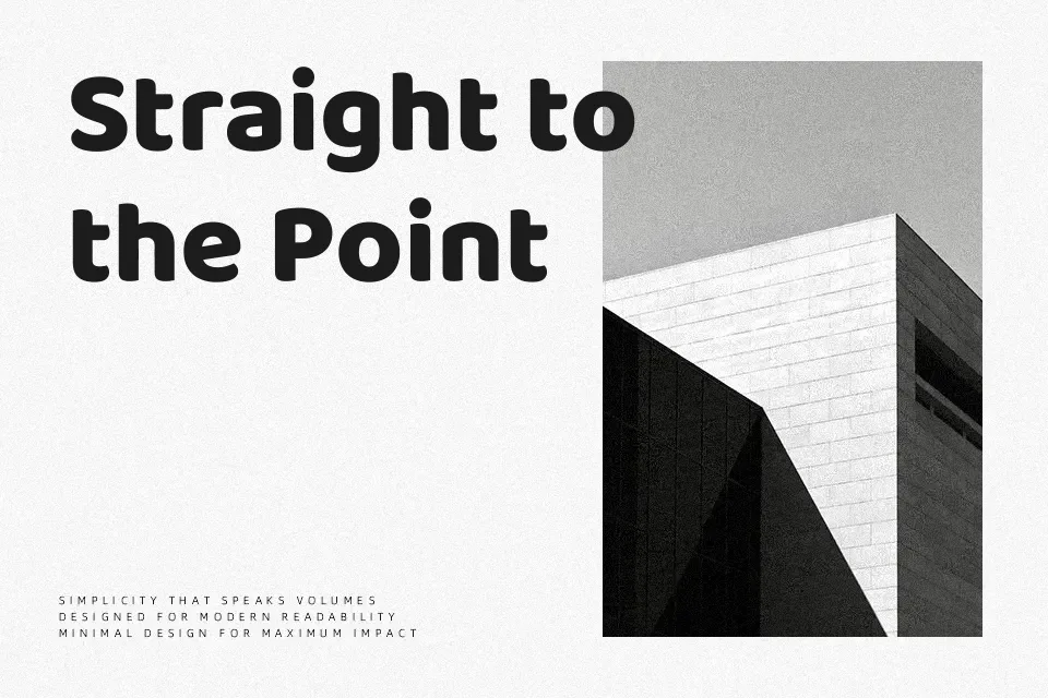
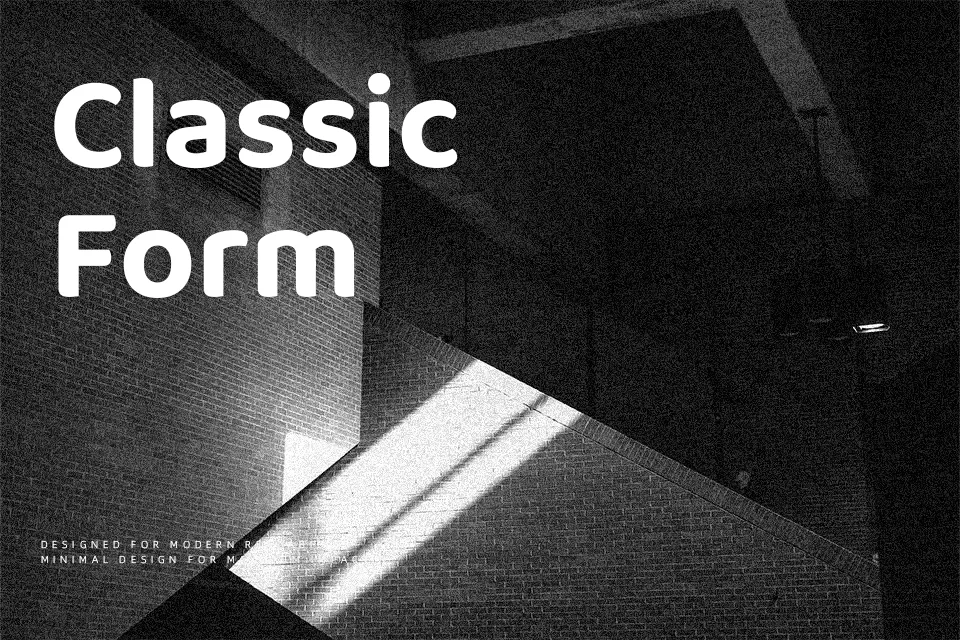
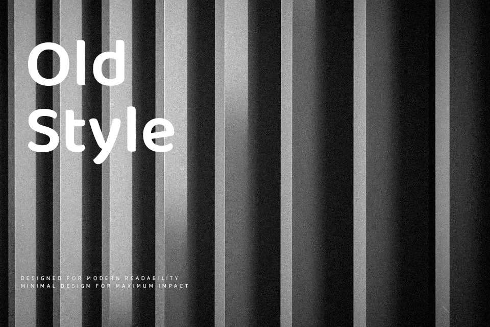
Baloo Chettan 2 has plump letterforms, low contrast strokes, and generous counters that give text a soft, bouncy feel without losing legibility. The spacing is open enough to breathe, yet tight enough that headlines feel cohesive and compact. It reads as casual and approachable, closer to a display family than a workhorse text face, and the multiple weights from regular through extra bold make it flexible for hierarchy in posters or UI cards. I tend to reach for it when designing kid-oriented packaging, festival graphics, or regional tech banners that need Malayalam support, but I avoid it for dense editorial layouts or very serious corporate reports where its friendliness can feel out of place.
Best For:
bold headlines
kids product packaging
regional branding with Malayalam text
playful app or game interfaces
Not Ideal For:
long paragraphs
formal corporate documents
minimalist luxury branding
dense editorial layouts
Perfect for branding, headline, and kids, with a bold and display style.
License
Gallery