Bad Skizoff Font
Free for Commercial UseAbout
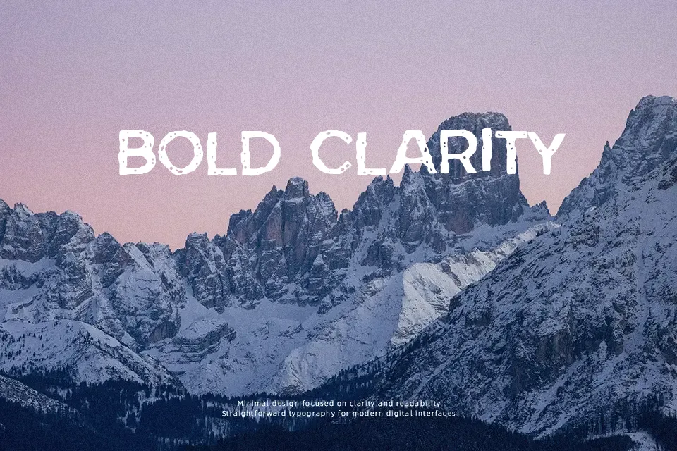
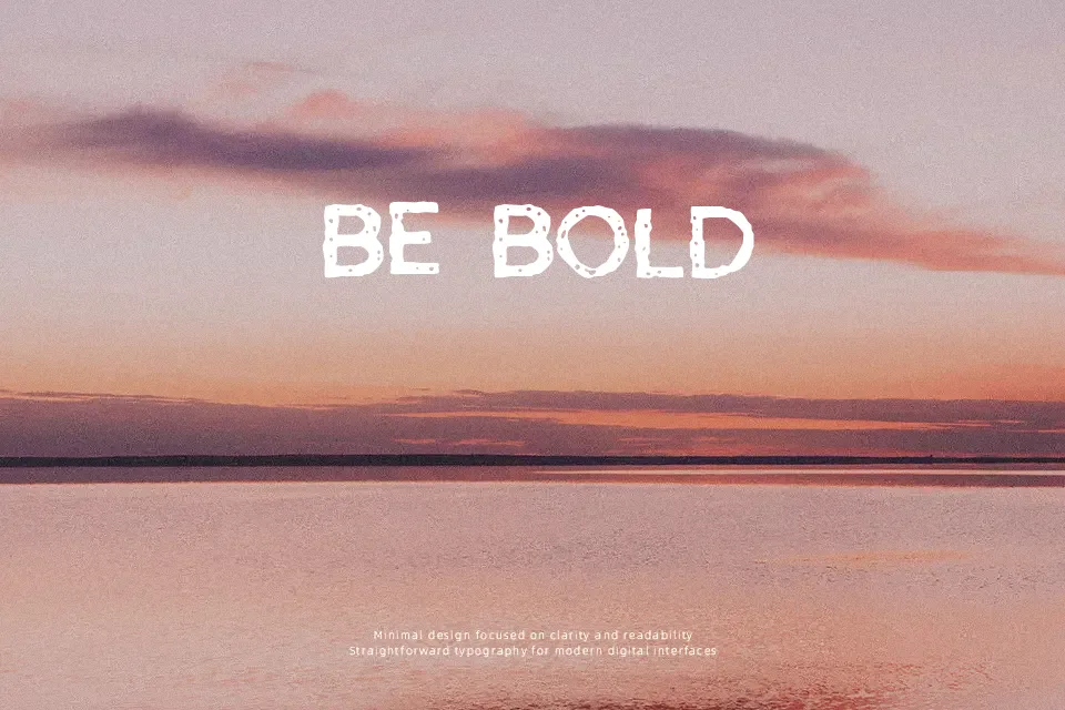
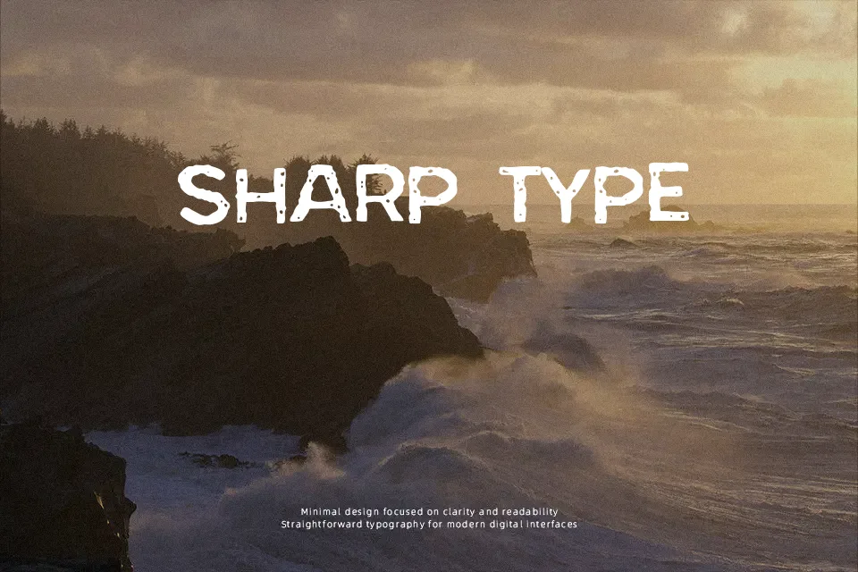
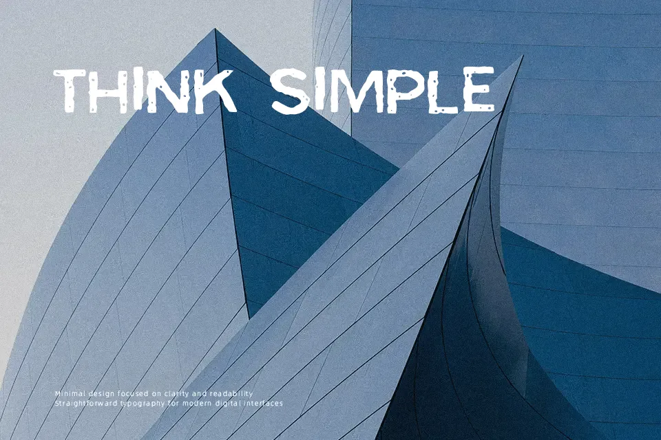
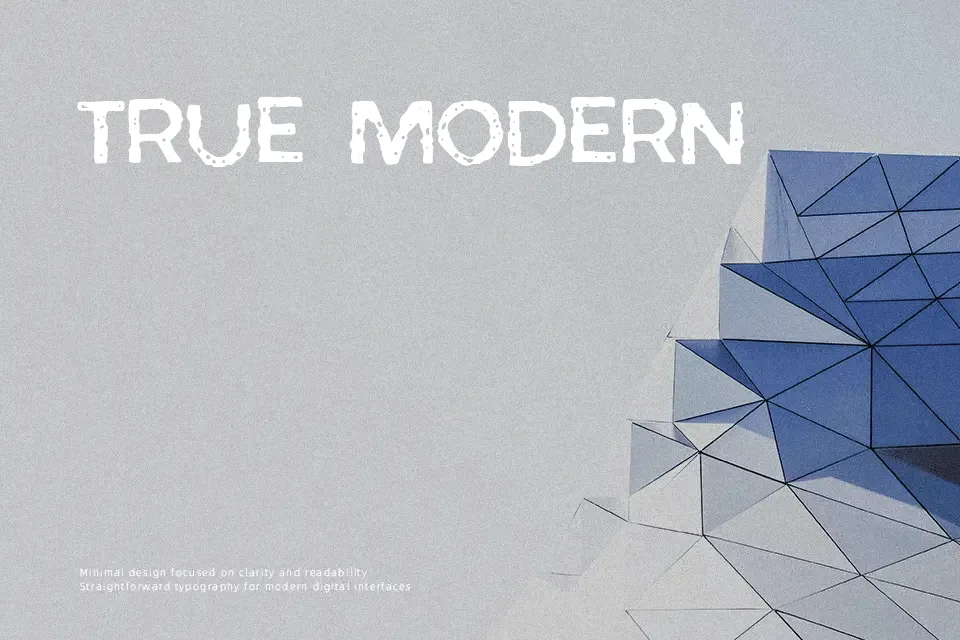
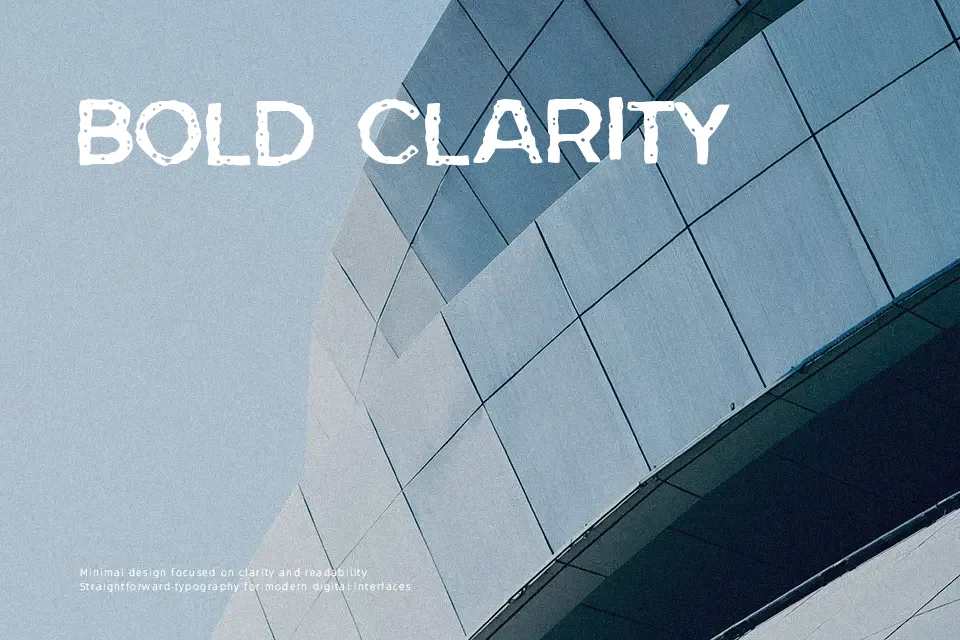
Bad Skizoff leans into a rough, comic-style display look, with chunky strokes, uneven outlines, and a slight 3D feel that makes letters pop off the background. The spacing is relatively tight, shapes feel spontaneous, and the texture gives designs a casual, grungy edge rather than a polished finish. It works well when you need loud, characterful titles for gaming overlays, YouTube thumbnails, streetwear graphics, or underground event posters. However, its sketchy forms and busy contours quickly hurt readability in small sizes or long paragraphs, so it should stay in short headlines or logo-style marks instead of text-heavy layouts.
Best For:
gaming channel thumbnails
streetwear or sticker-style logos
flyers for alternative music events
bold header text on edgy posters
Not Ideal For:
long paragraph text
formal corporate branding
interfaces or app UI
print projects requiring strict legibility
Perfect for gaming, logo, and music, with a artistic and comic style.
License
Gallery